Religious Painting Master Palette
Shadowed Bister
Shadowed Low-key - values weighted toward shadow, the palette of dim interiors and overcast skies.
Bister Dark warm brown - a traditional ink and wash pigment made from wood soot.

Palette Analysis
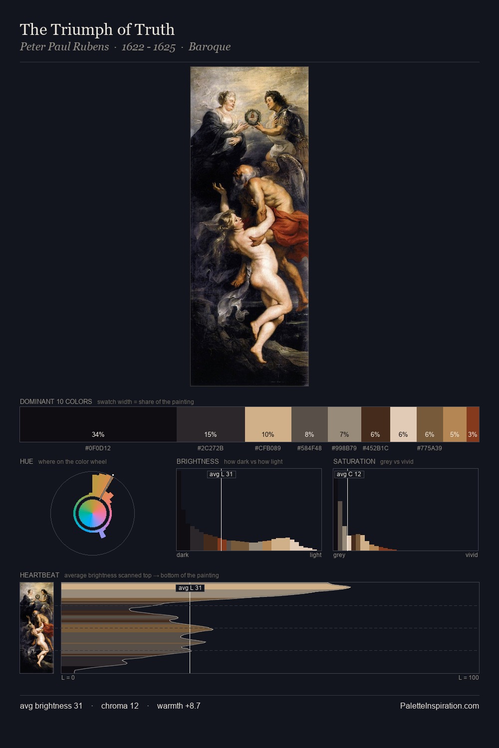
religious painting as a style is partly defined by its colour: this palette makes that definition concrete. Mid-key values give religious painting its characteristic quietness - nothing blazes, nothing disappears. The dominant temperature is warm, with earth tones and fire-hues setting the emotional key. Every colour is desaturated; the palette proceeds through near-neutrals and gently-coloured greys. Only 8.7% is devoted to #5C3828, yet that small allocation delivers the palette's entire chromatic tension. From deepest dark to palest light, the palette traverses 62 units of the value scale - a span that creates natural depth. Any work aspiring to the religious painting sensibility would find reliable footing in these values.
Example use cases
- theater design
- jewelry brands
- tobacco-adjacent retail
- event branding
- film & entertainment
I Love This!
Use This Palette
Copy, export, or download for your project
Copy, export, or download for your project
Copy:
Download:
Share: