Religious Painting Palette 2
Pale Ivory
Pale High-key and low-chroma - delicate, bleached, washed with light.
Ivory Warm creamy white - the color of natural ivory, warmer than pure white.

Palette Analysis
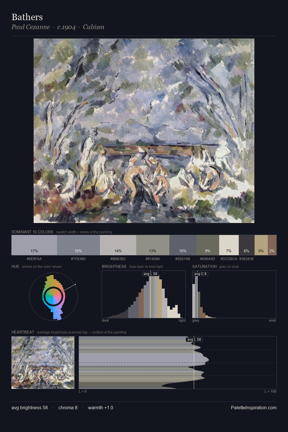
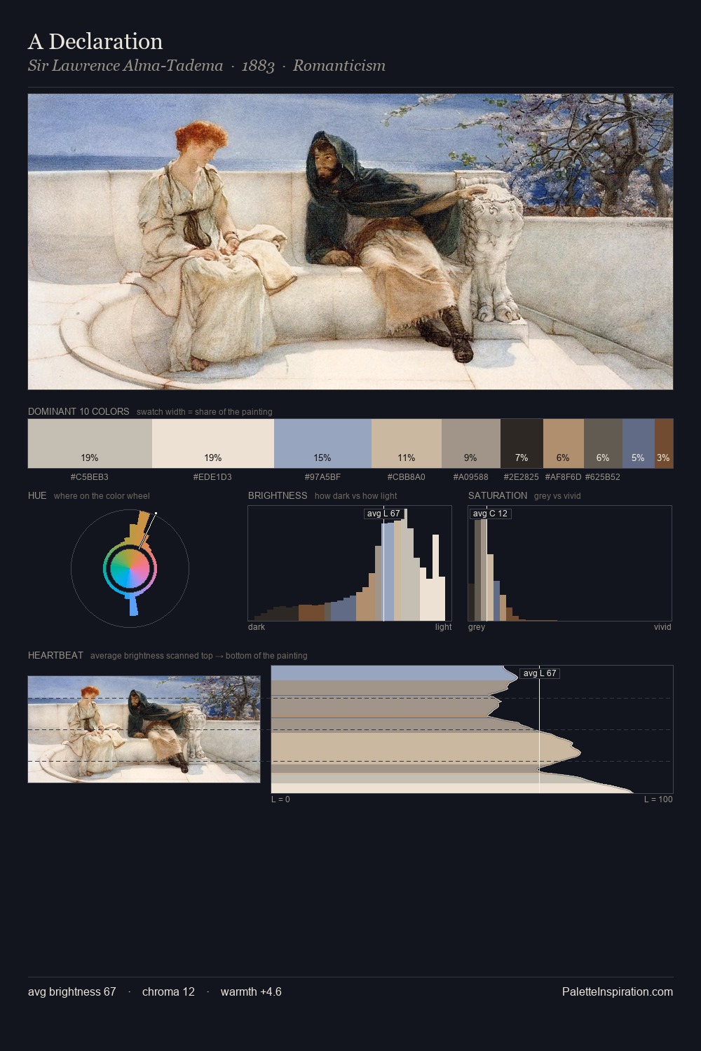
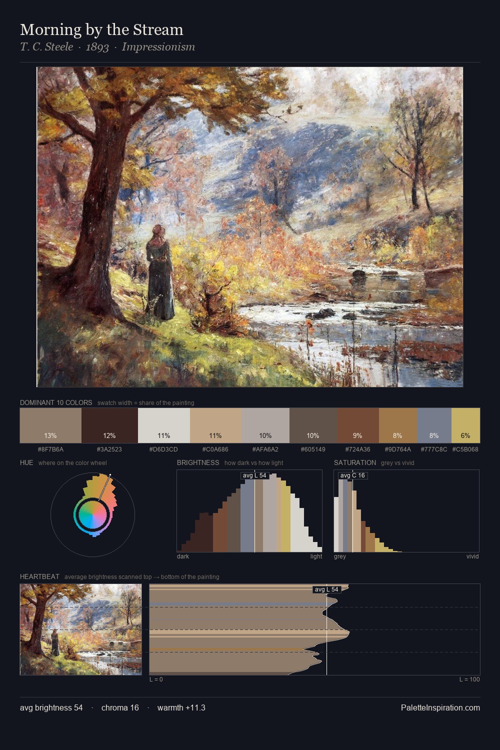
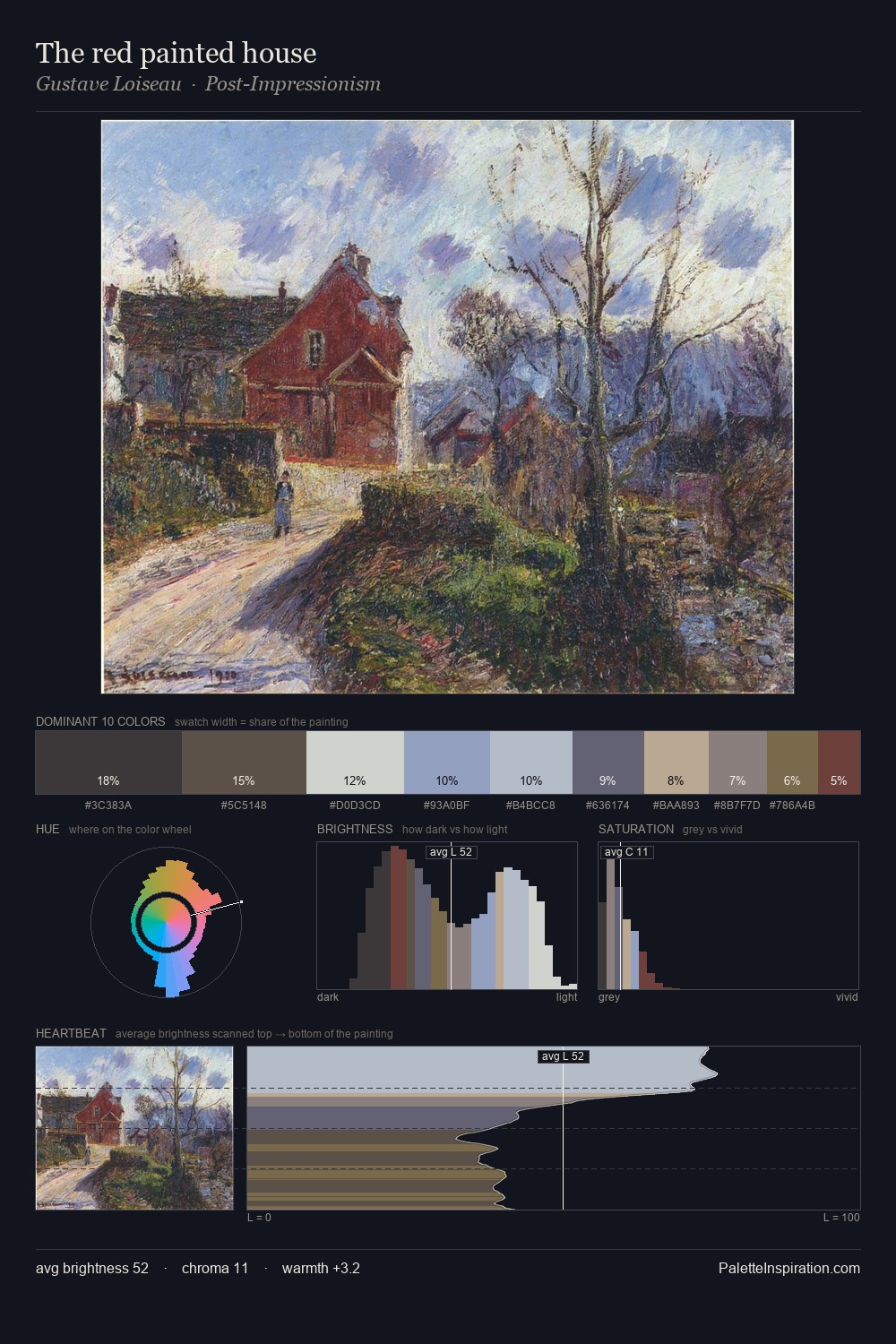
religious painting is high in key: pale, luminous, and filled with optical air. Heat pervades this palette; warm chromatic identities outweigh cool ones at almost every weight. Chroma is kept low across all colours, producing the soft, enveloping quality that characterises tonal painting. Only 4.8% is devoted to #775042, yet that small allocation delivers the palette's entire chromatic tension. From deepest dark to palest light, the palette traverses 59 units of the value scale - a span that creates natural depth.
Example use cases
- museums & galleries
- academic publishing
- heritage brands
- auction houses
- exhibition design
I Love This!
Use This Palette
Copy, export, or download for your project
Copy, export, or download for your project
Copy:
Download:
Share: