Religious Painting Palette 48
Nocturnal Sienna
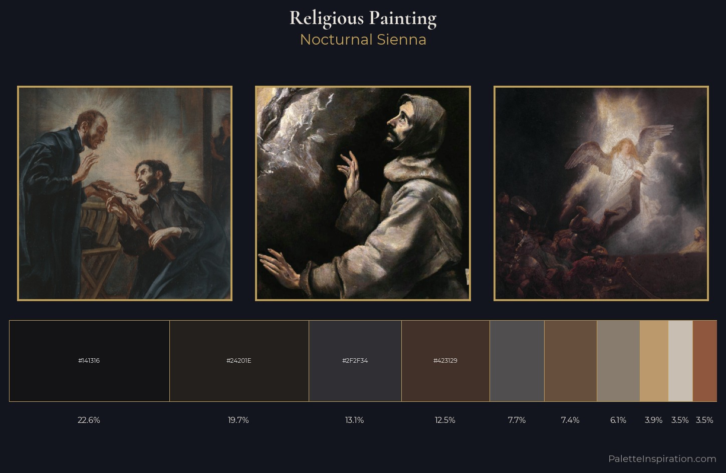
Nocturnal Night-register palette - very low values, the world after dark.
Sienna Warm red-brown earth - named after the Sienese pigment, a fundamental artist earth color.
Palette Analysis
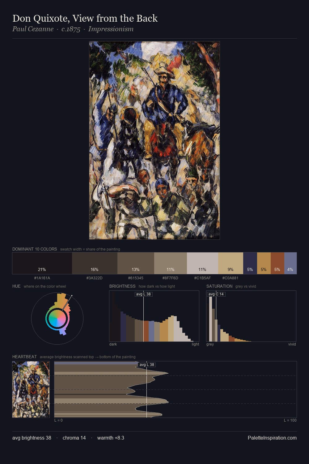
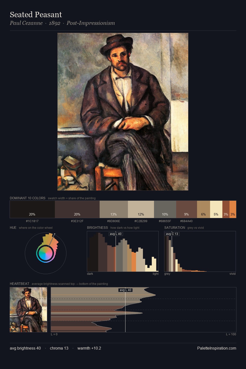
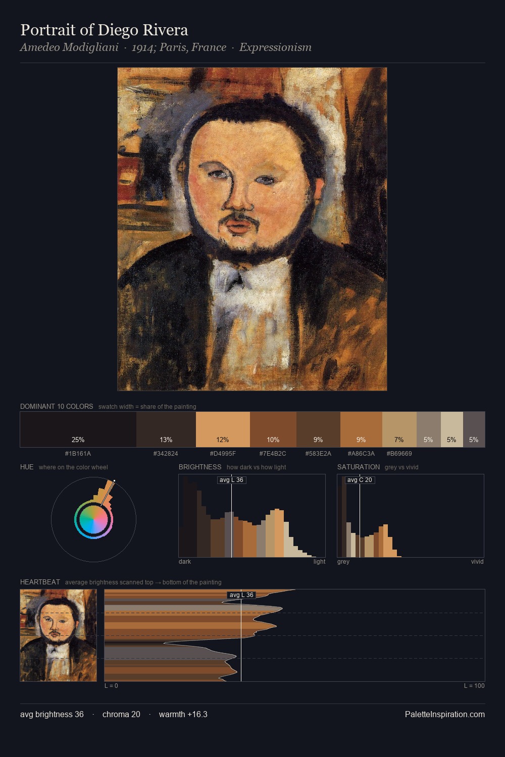
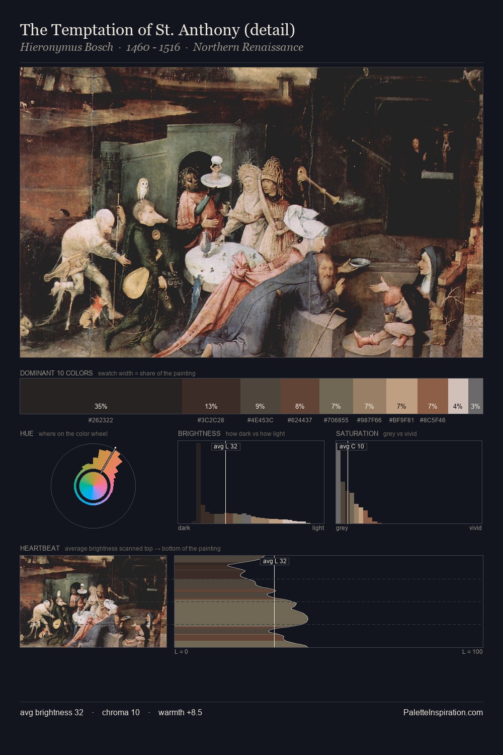
The palette of religious painting sits in the lower register of the value scale - dense, contained, and weighted. Yellow, ochre, sienna: warm hues deployed as the palette's primary energy. Saturation is deliberately withheld - the beauty here lies in the near-monochromatic gradations rather than colour difference. Only 7.4% is devoted to #66503D, yet that small allocation delivers the palette's entire chromatic tension. A value spread of 62 units gives the palette both depth and air - shadows are genuinely dark, lights genuinely light. Together these qualities place the palette firmly in the tonal tradition - concerned with mood and atmosphere rather than chromatic display.
Example use cases
- film & entertainment
- fine dining
- spirits branding
- menswear
- theater design
I Love This!
Use This Palette
Copy, export, or download for your project
Copy, export, or download for your project
Copy:
Download:
Share: