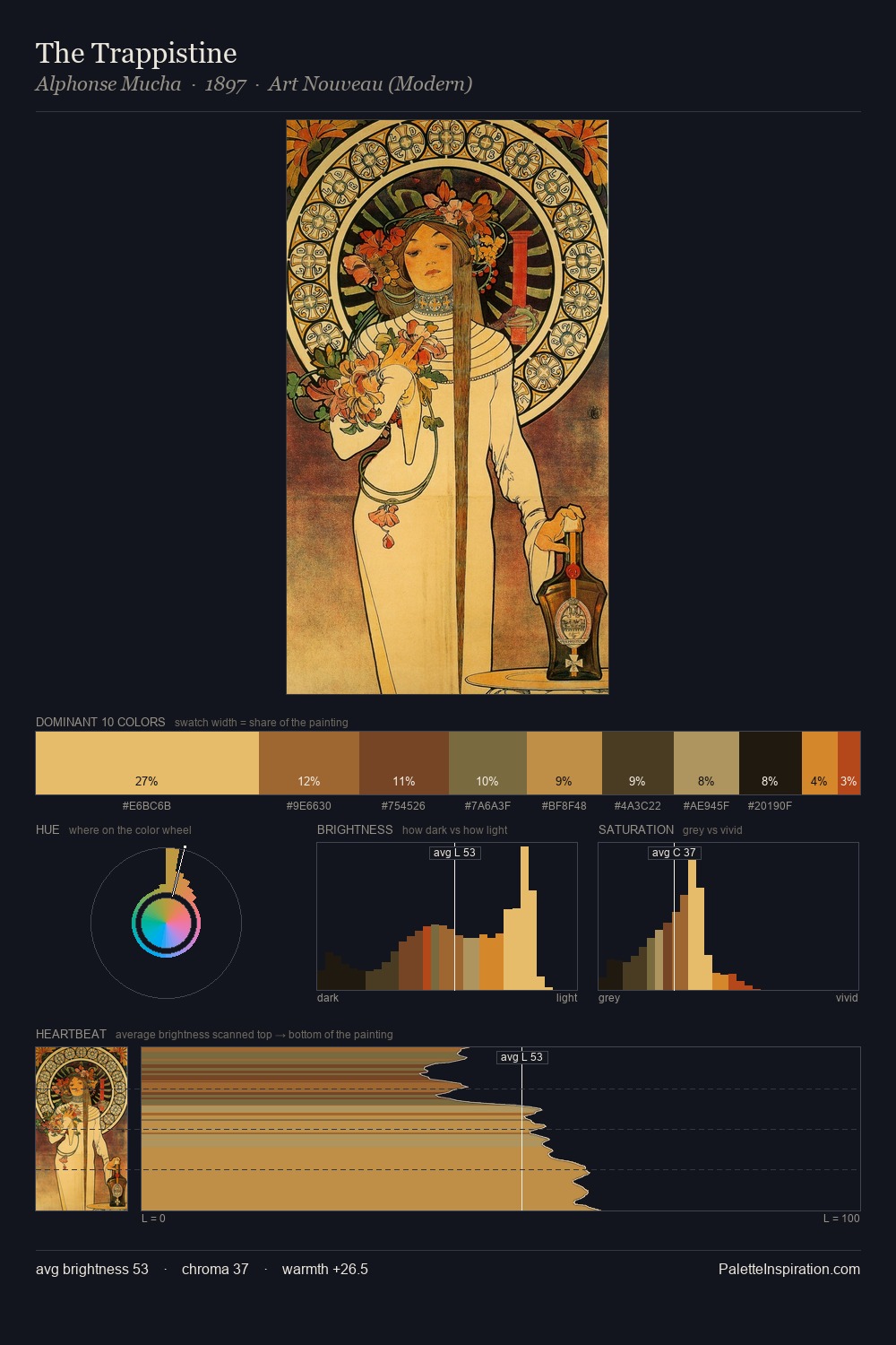
Religious Painting Palette 10
Muted Vermillion
Muted Deliberately desaturated - chroma pulled toward gray, the restraint of tonal painting.
Vermillion Brilliant red-orange - the classic mercury sulfide pigment, vivid and warm.

Palette Analysis
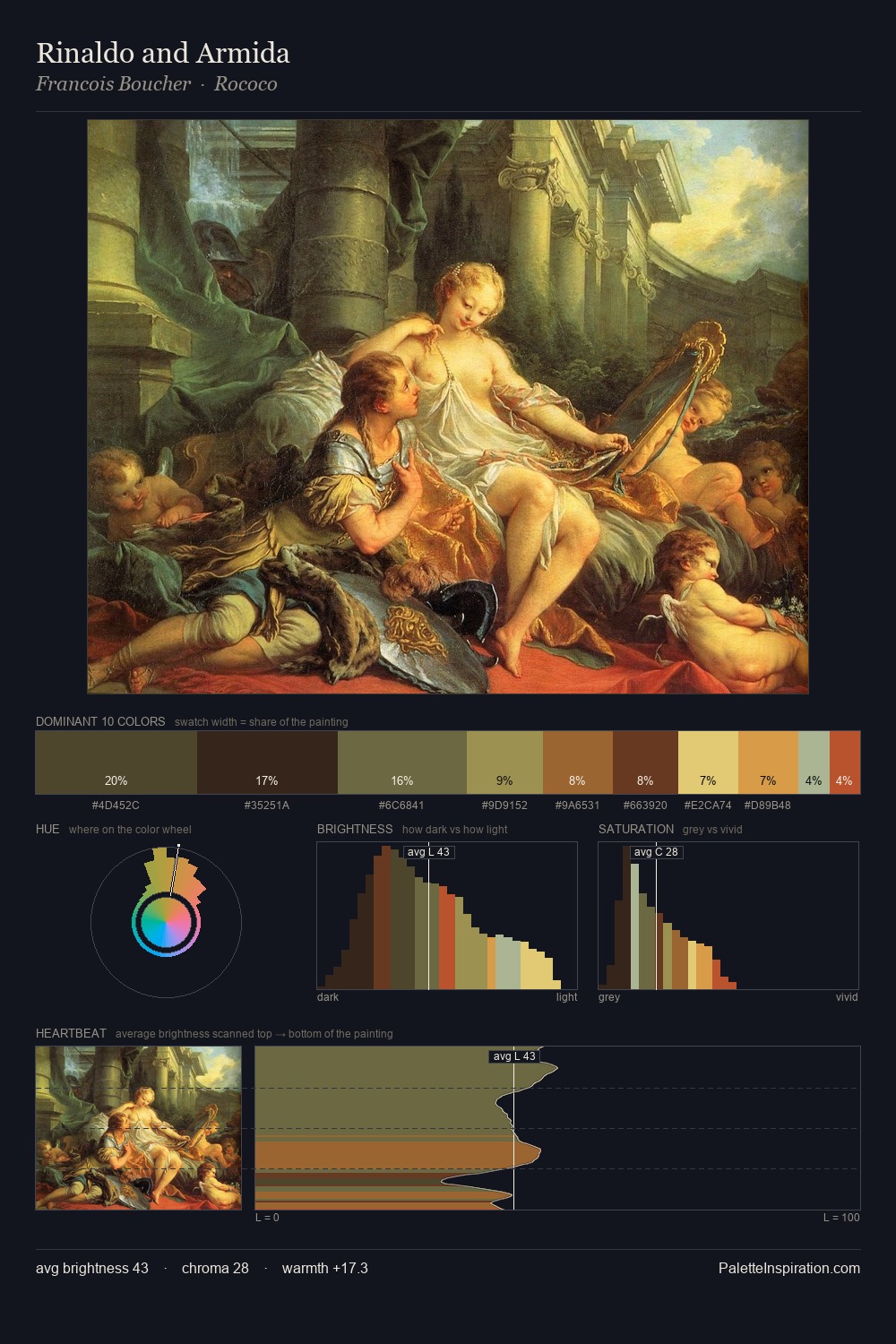
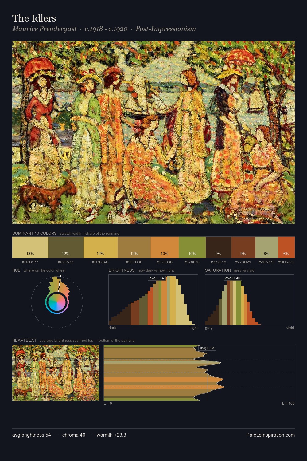
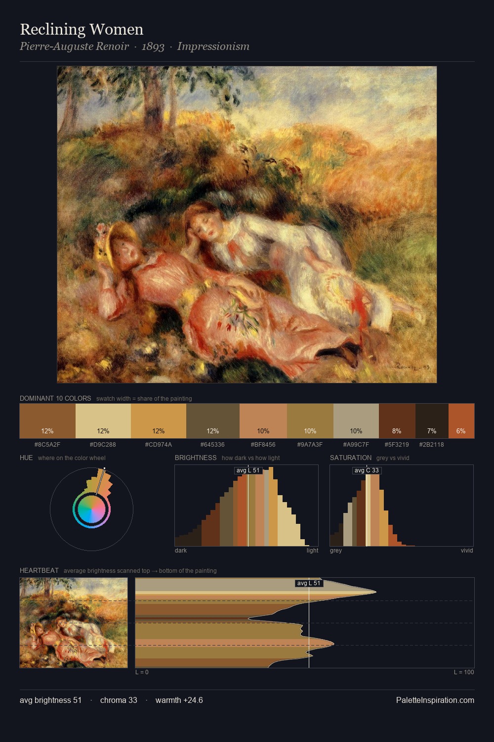
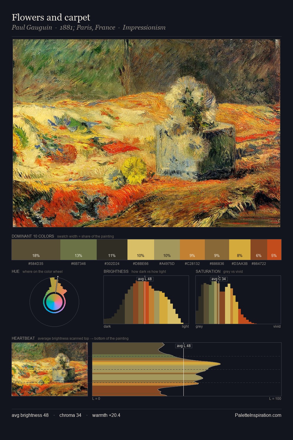
religious painting occupies the comfortable middle of the value scale, avoiding both extremes to hold the eye in a sustained middle grey. The palette orchestrates warmth above all else - reds, ambers, and siennas take the lead. Chroma is moderate: colours carry enough saturation to be read as colour, but the palette stops well short of garish intensity. The most saturated colour, #E4CA81, is reserved to 6.7% of the surface, where it acts as a focal punctuation. The full value range is 56 units: broad enough to build convincing three-dimensional form.
Example use cases
- publishing
- corporate identity
- consumer apps
- hospitality
- design agencies
I Love This!
Use This Palette
Copy, export, or download for your project
Copy, export, or download for your project
Copy:
Download:
Share: