Northern Renaissance Palette 8
Palette Analysis
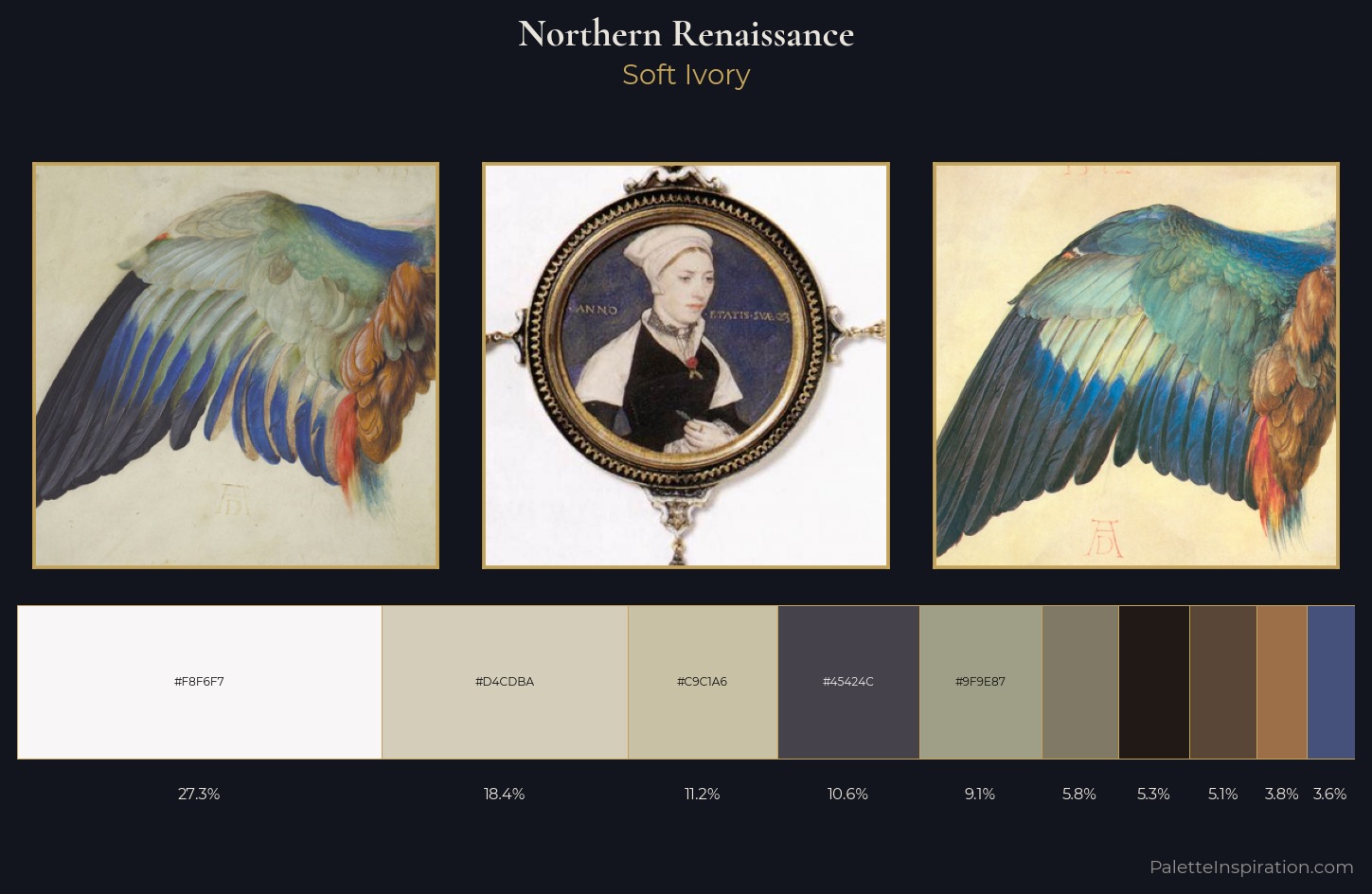
Northern Renaissance works in the upper reaches of the value scale, creating an atmosphere of brightness and expansiveness. Cool hues prevail: blues, greens, and greys anchor the palette's emotional temperature. Chroma hovers near zero; colour declares itself through subtle shifts in hue rather than outright saturation. The dominant colour, #F8F6F7, takes 27.3% of the total area, establishing the overall mood before any other hue is introduced. The saturated accent, #5A4636, registers at 5.1% - sparse enough to feel like a deliberate surprise. At 75 units of value range, the palette has the tonal breadth to sustain complex spatial readings. The palette has the character of outdoor light: cool, mid-bright, with colour rendered faithfully rather than expressively.
Example use cases
- florist branding
- event design
- real estate
- jewelry retail
- hospitality branding
I Love This!
Copy, export, or download for your project