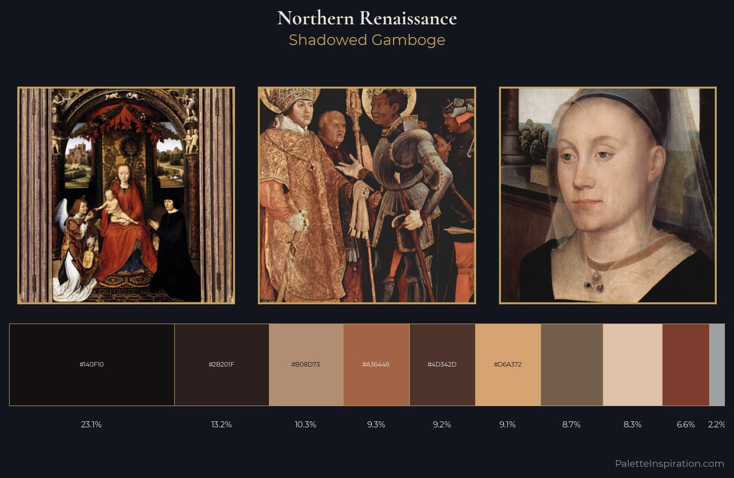
Northern Renaissance Palette 31
Shadowed Gamboge
Shadowed Low-key - values weighted toward shadow, the palette of dim interiors and overcast skies.
Gamboge Deep golden yellow - a traditional warm pigment, rich amber-gold.
Palette Analysis
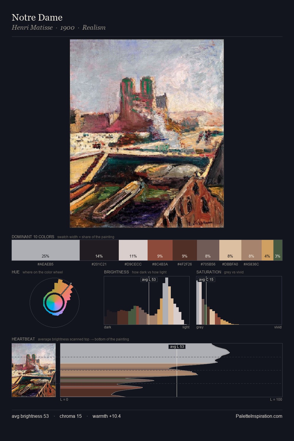
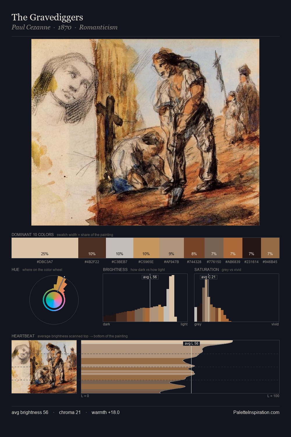
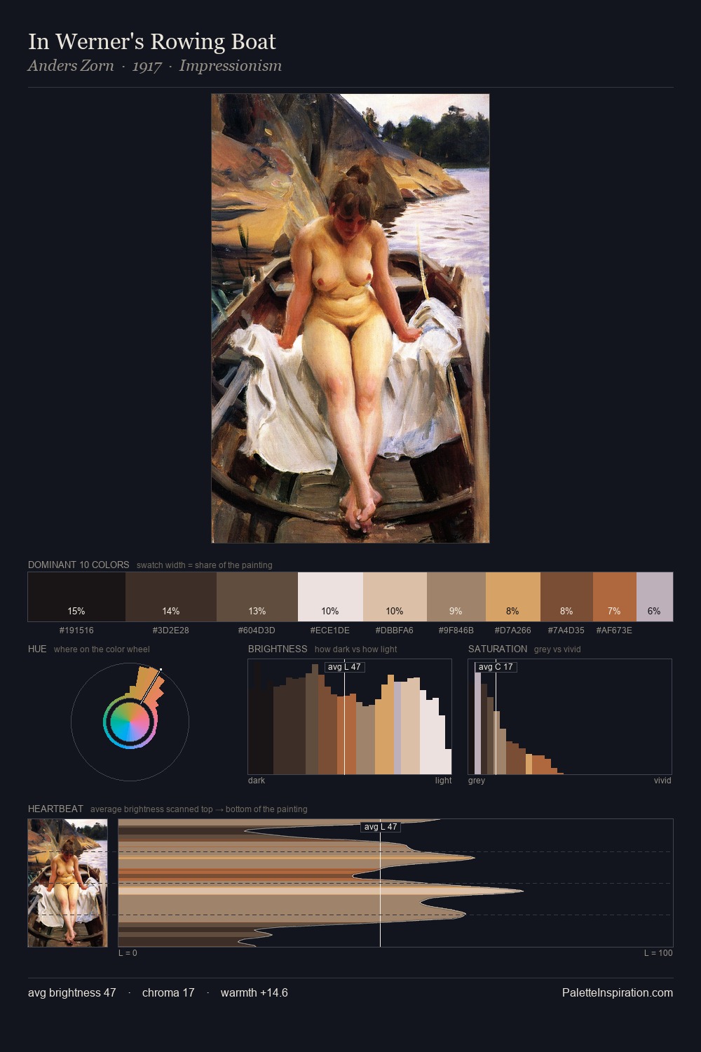
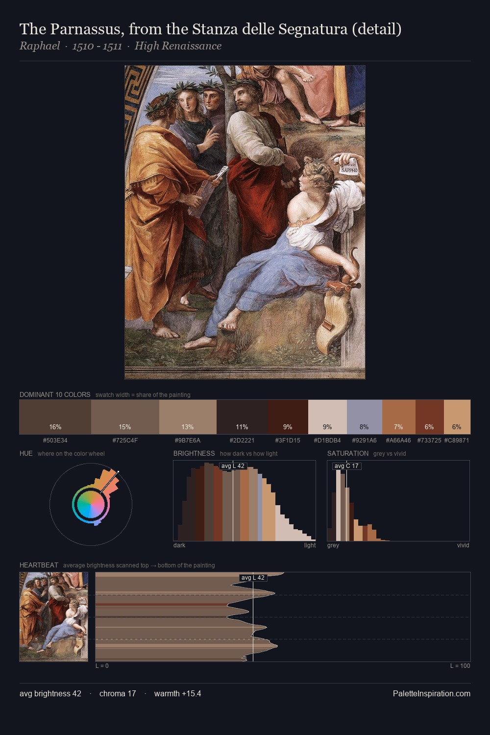
Northern Renaissance occupies the comfortable middle of the value scale, avoiding both extremes to hold the eye in a sustained middle grey. The palette orchestrates warmth above all else - reds, ambers, and siennas take the lead. All colours lean toward grey, building depth through value rather than colour punch. The saturated accent, #7C3D2E, registers at 6.6% - sparse enough to feel like a deliberate surprise. A value spread of 65 units gives the palette both depth and air - shadows are genuinely dark, lights genuinely light.
Example use cases
- theater design
- jewelry brands
- tobacco-adjacent retail
- event branding
- film & entertainment
I Love This!
Use This Palette
Copy, export, or download for your project
Copy, export, or download for your project
Copy:
Download:
Share: