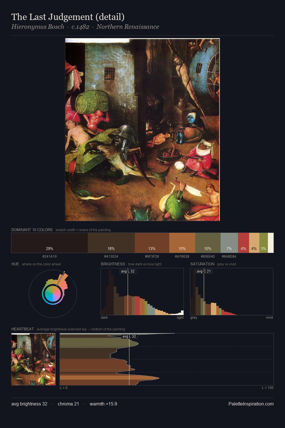
Northern Renaissance Palette 40
Nocturnal Umber
Nocturnal Night-register palette - very low values, the world after dark.
Umber Dark earthy brown - raw or burnt umber, a foundational old-master earth pigment.

Palette Analysis
Northern Renaissance sits in the centre of the value range, lending the palette a sense of even, sustained light. Warmth dominates - the palette leans heavily on the yellow-orange-red arc of the colour wheel. All colours lean toward grey, building depth through value rather than colour punch. A single dominant - #151111 at 29.3% - sets the character of the whole composition. #814028 delivers the chromatic peak at only 8.5% - a small shot of colour with outsized visual impact. A value spread of 68 units gives the palette both depth and air - shadows are genuinely dark, lights genuinely light.
Example use cases
- theater design
- jewelry brands
- tobacco-adjacent retail
- event branding
- film & entertainment
I Love This!
Use This Palette
Copy, export, or download for your project
Copy, export, or download for your project
Copy:
Download:
Share: