Northern Renaissance Palette 39
Shadowed Bister
Shadowed Low-key - values weighted toward shadow, the palette of dim interiors and overcast skies.
Bister Dark warm brown - a traditional ink and wash pigment made from wood soot.

Palette Analysis
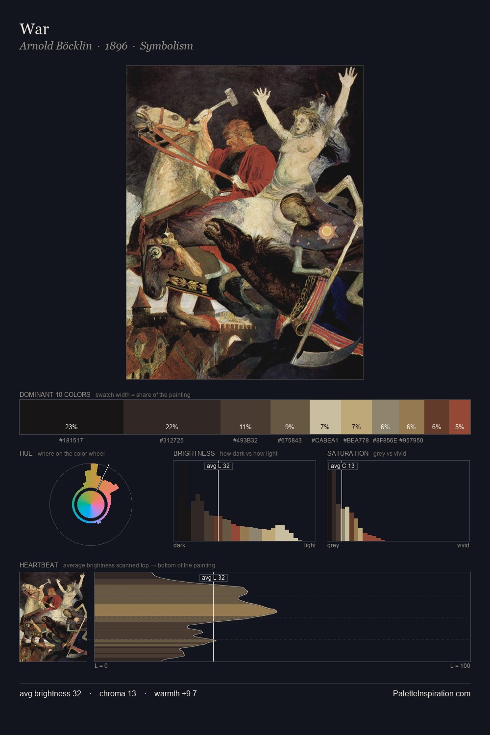
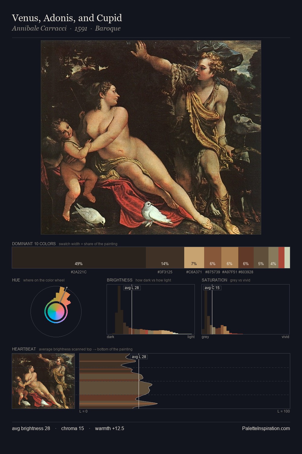
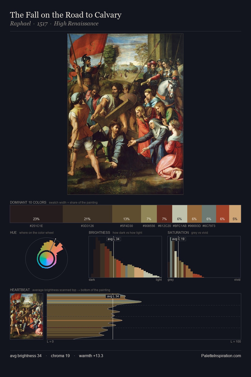
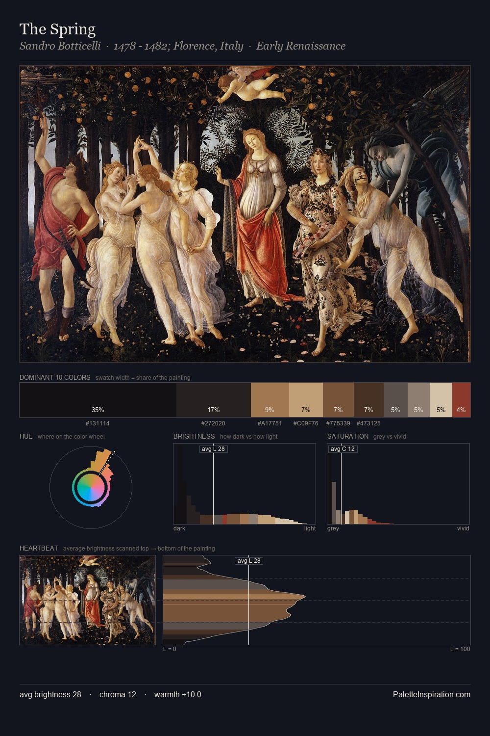
Northern Renaissance keeps values measured and balanced, a hallmark of tonal restraint. Temperature reads distinctly warm: the reds and earth tones carry the compositional weight. All colours lean toward grey, building depth through value rather than colour punch. 28.2% of the palette belongs to #1E1918, a concentration that makes it the unmistakable visual centre. #9E422E delivers the chromatic peak at only 2.8% - a small shot of colour with outsized visual impact. At 62 units of value range, the palette has the tonal breadth to sustain complex spatial readings.
Example use cases
- theater design
- jewelry brands
- tobacco-adjacent retail
- event branding
- film & entertainment
I Love This!
Use This Palette
Copy, export, or download for your project
Copy, export, or download for your project
Copy:
Download:
Share: