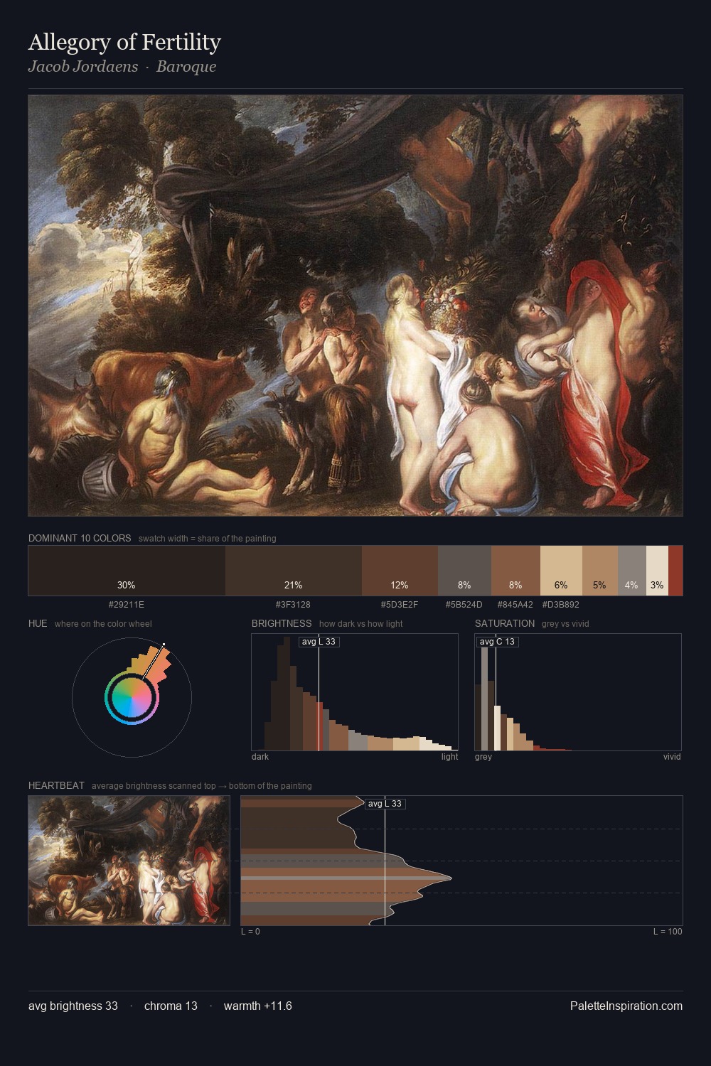
Northern Renaissance Palette 30
Shadowed Bister
Shadowed Low-key - values weighted toward shadow, the palette of dim interiors and overcast skies.
Bister Dark warm brown - a traditional ink and wash pigment made from wood soot.

Palette Analysis
The value structure of Northern Renaissance is mid-key: quiet, controlled, and cohesive. Warmth dominates - the palette leans heavily on the yellow-orange-red arc of the colour wheel. Chroma is kept low across all colours, producing the soft, enveloping quality that characterises tonal painting. A single dominant - #211A19 at 27.2% - sets the character of the whole composition. The most saturated colour, #A88251, is reserved to 7.9% of the surface, where it acts as a focal punctuation. A value spread of 67 units gives the palette both depth and air - shadows are genuinely dark, lights genuinely light.
Example use cases
- theater design
- jewelry brands
- tobacco-adjacent retail
- event branding
- film & entertainment
I Love This!
Use This Palette
Copy, export, or download for your project
Copy, export, or download for your project
Copy:
Download:
Share: