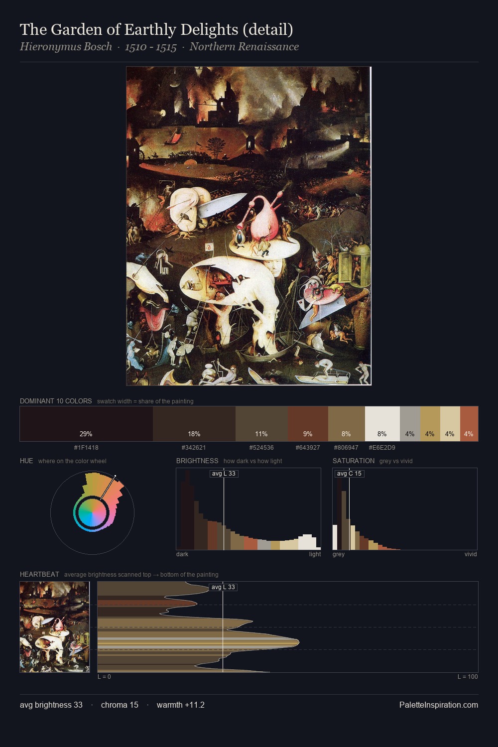
Northern Renaissance Palette 15
Muted Tawny
Muted Deliberately desaturated - chroma pulled toward gray, the restraint of tonal painting.
Tawny Warm orange-brown - a traditional term for the color of tanned leather or lion fur.

Palette Analysis
The value structure of Northern Renaissance is mid-key: quiet, controlled, and cohesive. Heat pervades this palette; warm chromatic identities outweigh cool ones at almost every weight. All colours lean toward grey, building depth through value rather than colour punch. #AB5C42 delivers the chromatic peak at only 3.9% - a small shot of colour with outsized visual impact. At 60 units of value range, the palette has the tonal breadth to sustain complex spatial readings.
Example use cases
- theater design
- jewelry brands
- tobacco-adjacent retail
- event branding
- film & entertainment
I Love This!
Use This Palette
Copy, export, or download for your project
Copy, export, or download for your project
Copy:
Download:
Share: