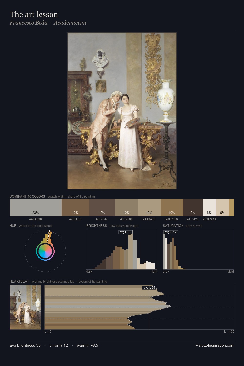
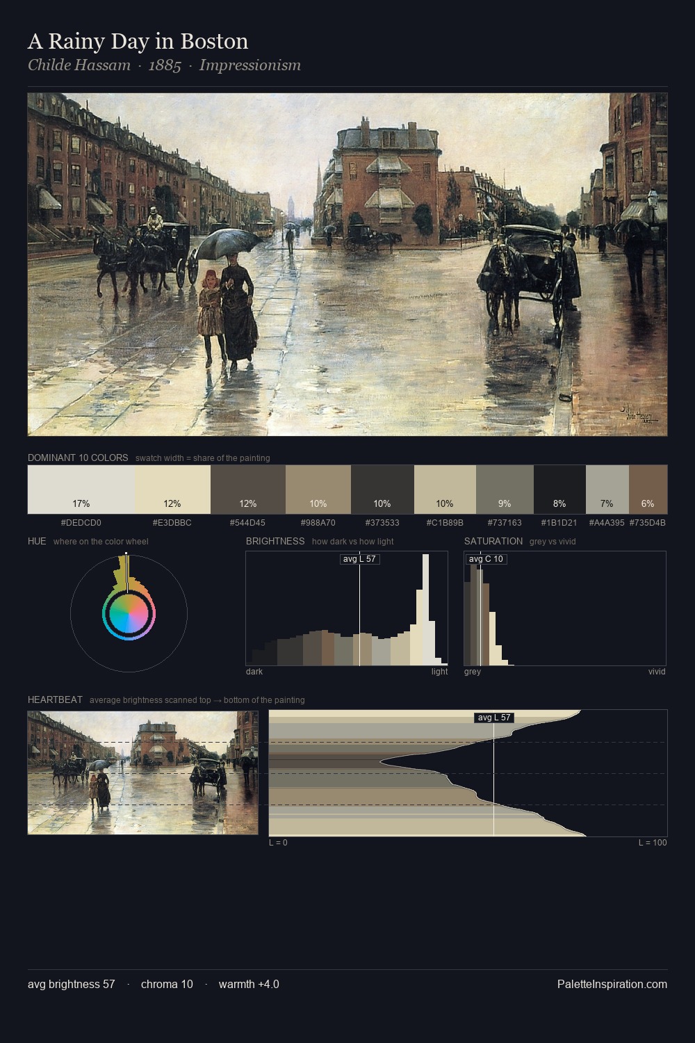
Northern Renaissance Palette 4
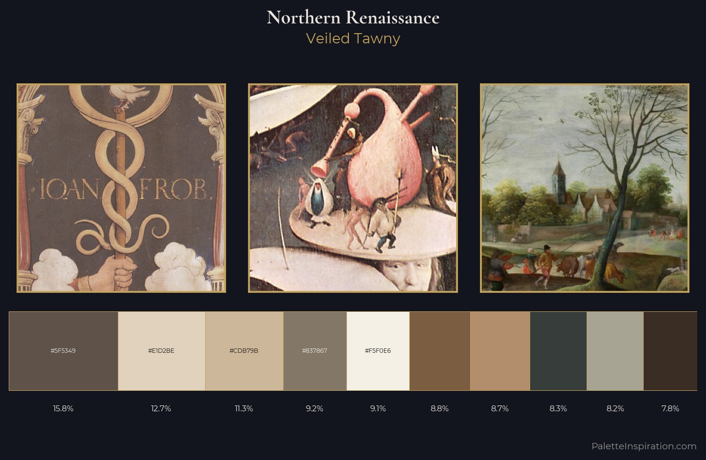
Veiled Tawny
Veiled Partially obscured light - mid-dark with a hazy, scrim-filtered quality.
Tawny Warm orange-brown - a traditional term for the color of tanned leather or lion fur.
Palette Analysis
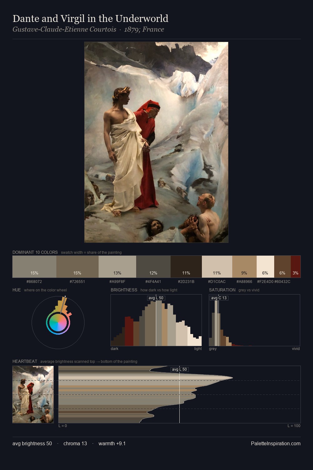
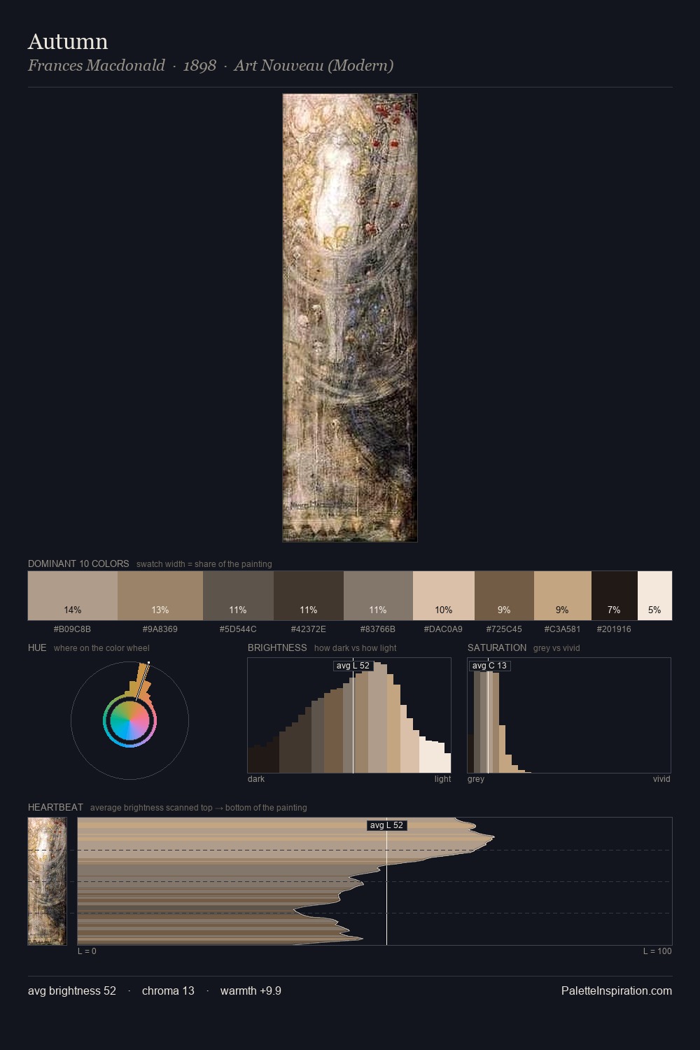
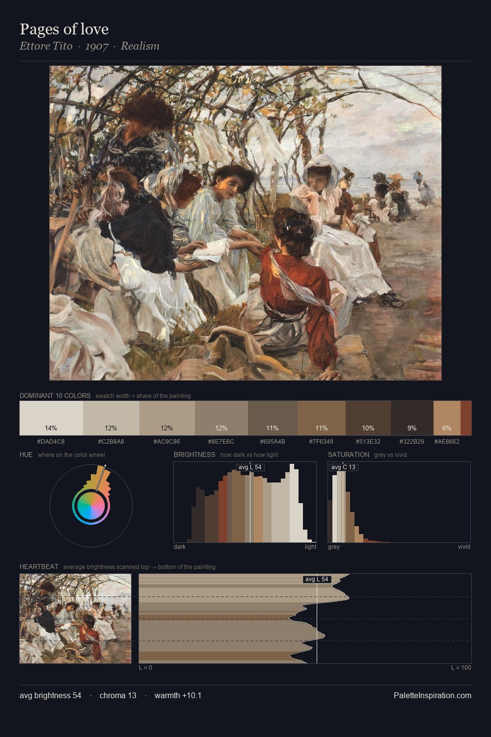
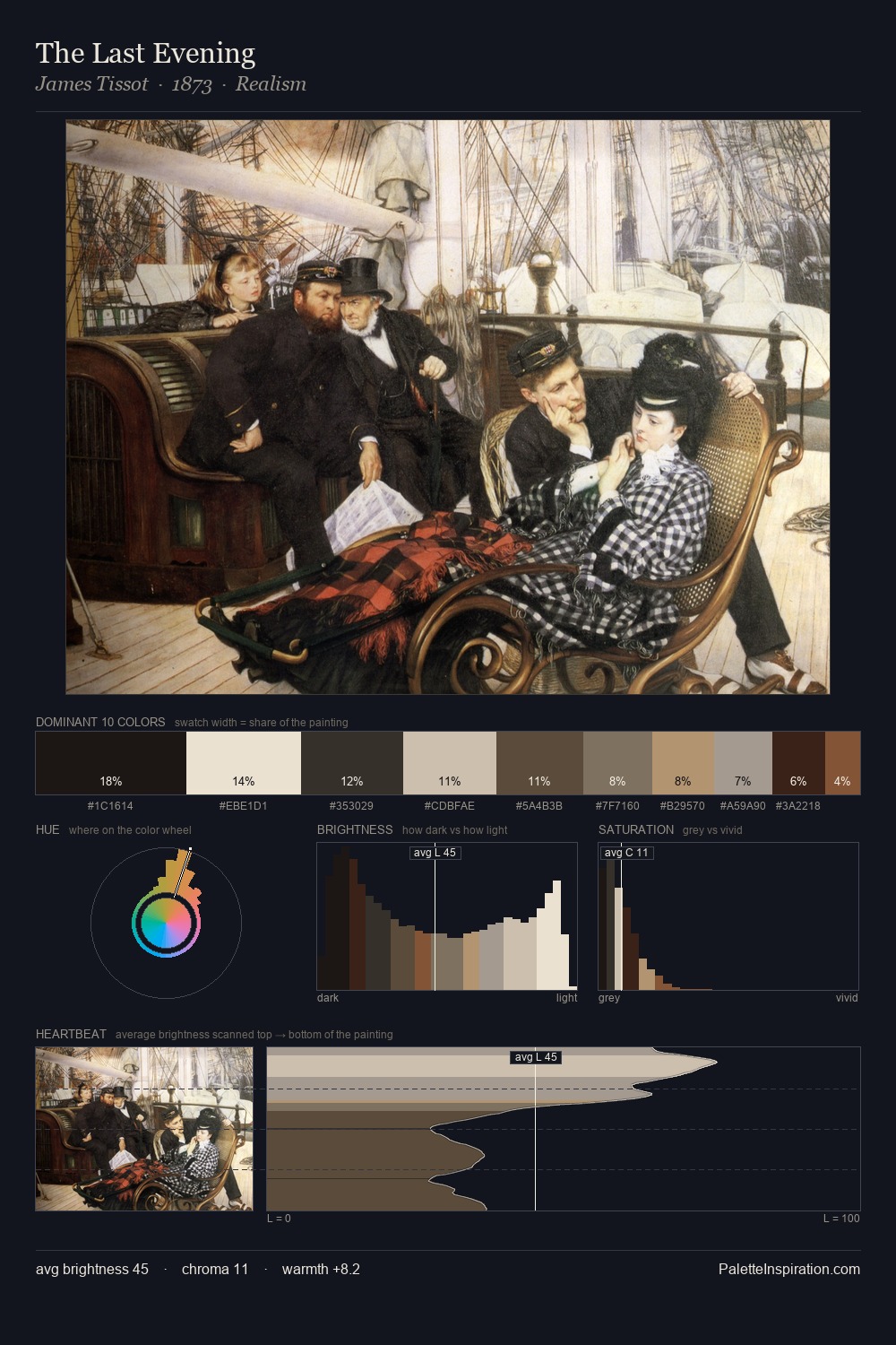
Values in Northern Renaissance rest in the mid-range - neither dramatically lit nor steeped in shadow. The palette balances warm and cool with remarkable evenness, giving the composition its characteristic vibrancy. Saturation is deliberately withheld - the beauty here lies in the near-monochromatic gradations rather than colour difference. #B28E6D delivers the chromatic peak at only 8.7% - a small shot of colour with outsized visual impact. The full value range is 65 units: broad enough to build convincing three-dimensional form.
Example use cases
- ceramics & pottery
- boutique hospitality
- menswear
- heritage food brands
- craft & artisan brands
I Love This!
Use This Palette
Copy, export, or download for your project
Copy, export, or download for your project
Copy:
Download:
Share: