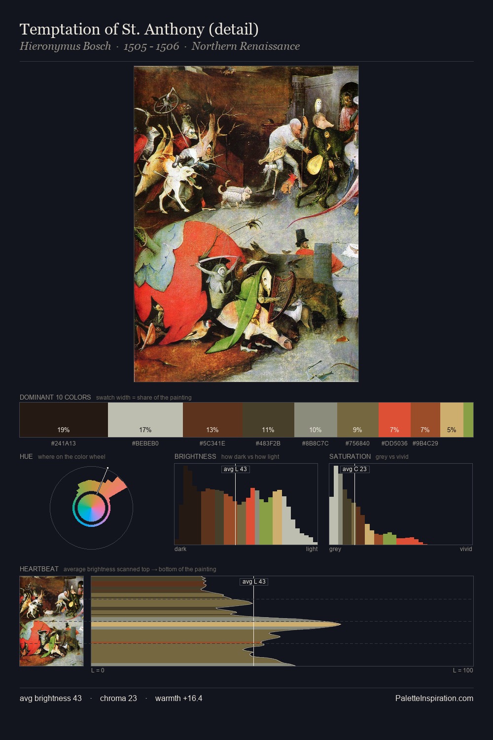
Northern Renaissance Palette 32
Shadowed Rust
Shadowed Low-key - values weighted toward shadow, the palette of dim interiors and overcast skies.
Rust Oxidized red-brown - the color of iron corrosion, warm and earthy-red.

Palette Analysis
Northern Renaissance distributes its values across the middle register, creating harmony without high contrast. The palette orchestrates warmth above all else - reds, ambers, and siennas take the lead. Chroma is moderate: colours carry enough saturation to be read as colour, but the palette stops well short of garish intensity. The most saturated colour, #C5AD65, is reserved to 4.1% of the surface, where it acts as a focal punctuation. At 51 units across the value scale, the palette keeps contrast readable without letting it dominate.
Example use cases
- theater design
- jewelry brands
- tobacco-adjacent retail
- event branding
- film & entertainment
I Love This!
Use This Palette
Copy, export, or download for your project
Copy, export, or download for your project
Copy:
Download:
Share: