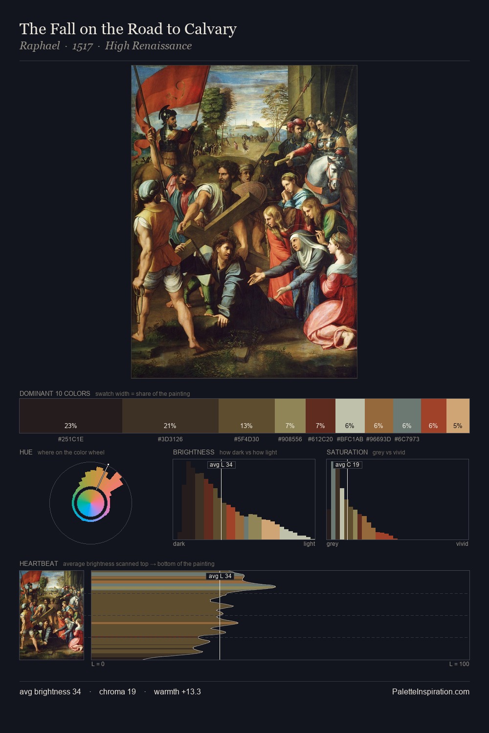
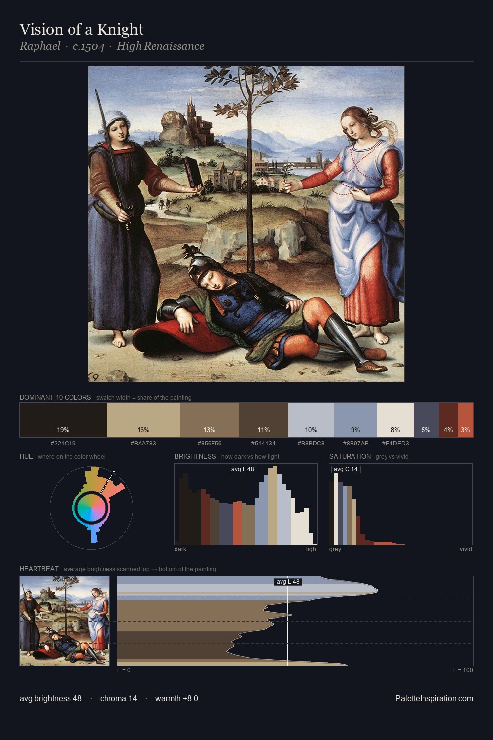
Northern Renaissance Palette 16
Shadowed Tawny
Shadowed Low-key - values weighted toward shadow, the palette of dim interiors and overcast skies.
Tawny Warm orange-brown - a traditional term for the color of tanned leather or lion fur.

Palette Analysis
Northern Renaissance distributes its values across the middle register, creating harmony without high contrast. Warm hues command this palette; it favours the reds, oranges, and yellows of firelight and earth. Every colour is desaturated; the palette proceeds through near-neutrals and gently-coloured greys. Only 4.8% is devoted to #AB5239, yet that small allocation delivers the palette's entire chromatic tension. The full value range is 68 units: broad enough to build convincing three-dimensional form.
Example use cases
- theater design
- jewelry brands
- tobacco-adjacent retail
- event branding
- film & entertainment
I Love This!
Use This Palette
Copy, export, or download for your project
Copy, export, or download for your project
Copy:
Download:
Share: