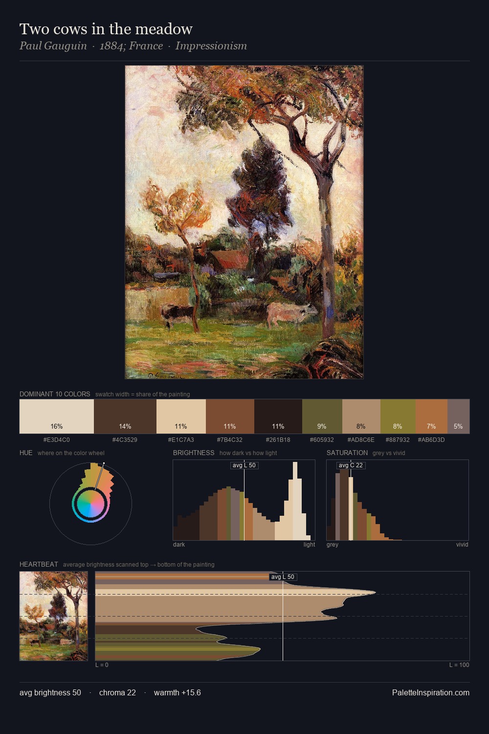
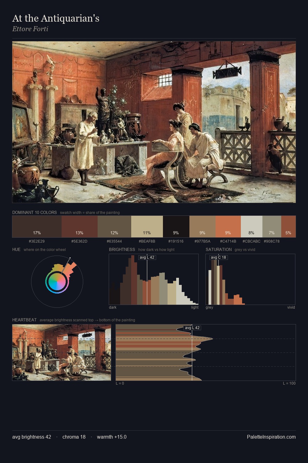
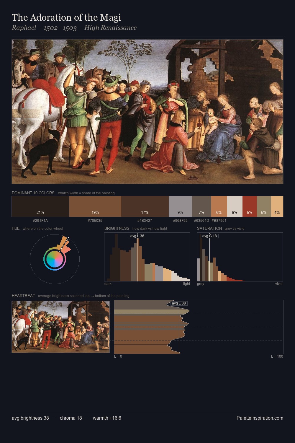
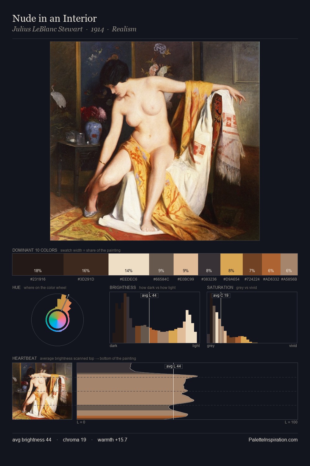
Northern Renaissance Palette 37
Shadowed Tawny
Shadowed Low-key - values weighted toward shadow, the palette of dim interiors and overcast skies.
Tawny Warm orange-brown - a traditional term for the color of tanned leather or lion fur.

Palette Analysis
Northern Renaissance keeps values measured and balanced, a hallmark of tonal restraint. The palette orchestrates warmth above all else - reds, ambers, and siennas take the lead. Chroma hovers near zero; colour declares itself through subtle shifts in hue rather than outright saturation. The most saturated colour, #B26843, is reserved to 4.6% of the surface, where it acts as a focal punctuation. From deepest dark to palest light, the palette traverses 63 units of the value scale - a span that creates natural depth.
Example use cases
- premium streaming
- cocktail bars
- fashion campaigns
- book covers
- music labels
I Love This!
Use This Palette
Copy, export, or download for your project
Copy, export, or download for your project
Copy:
Download:
Share: