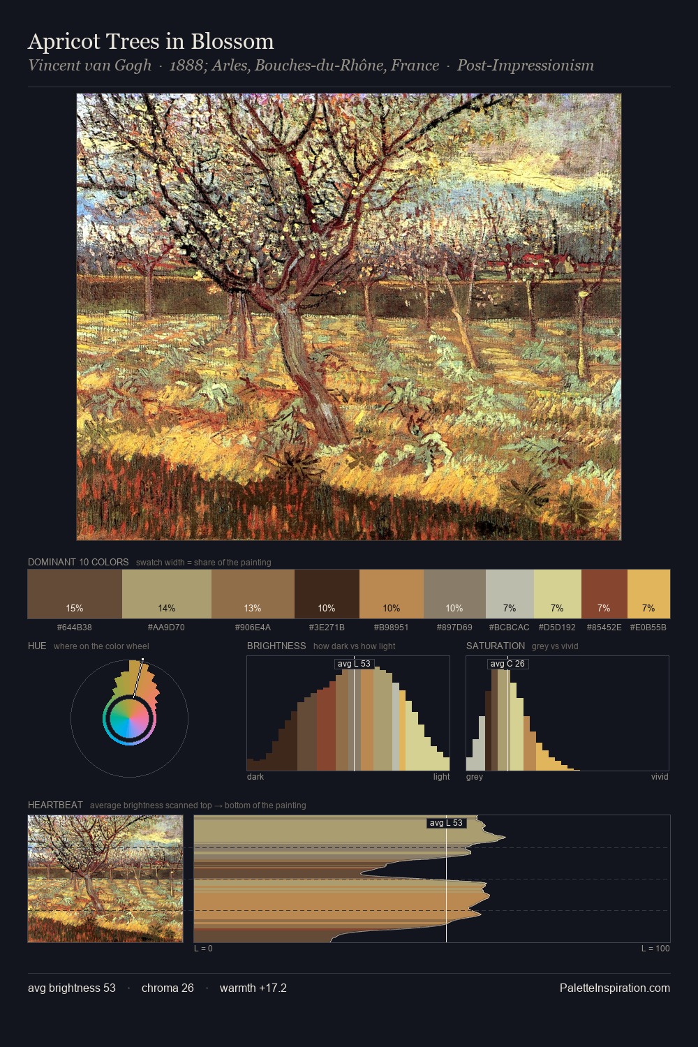
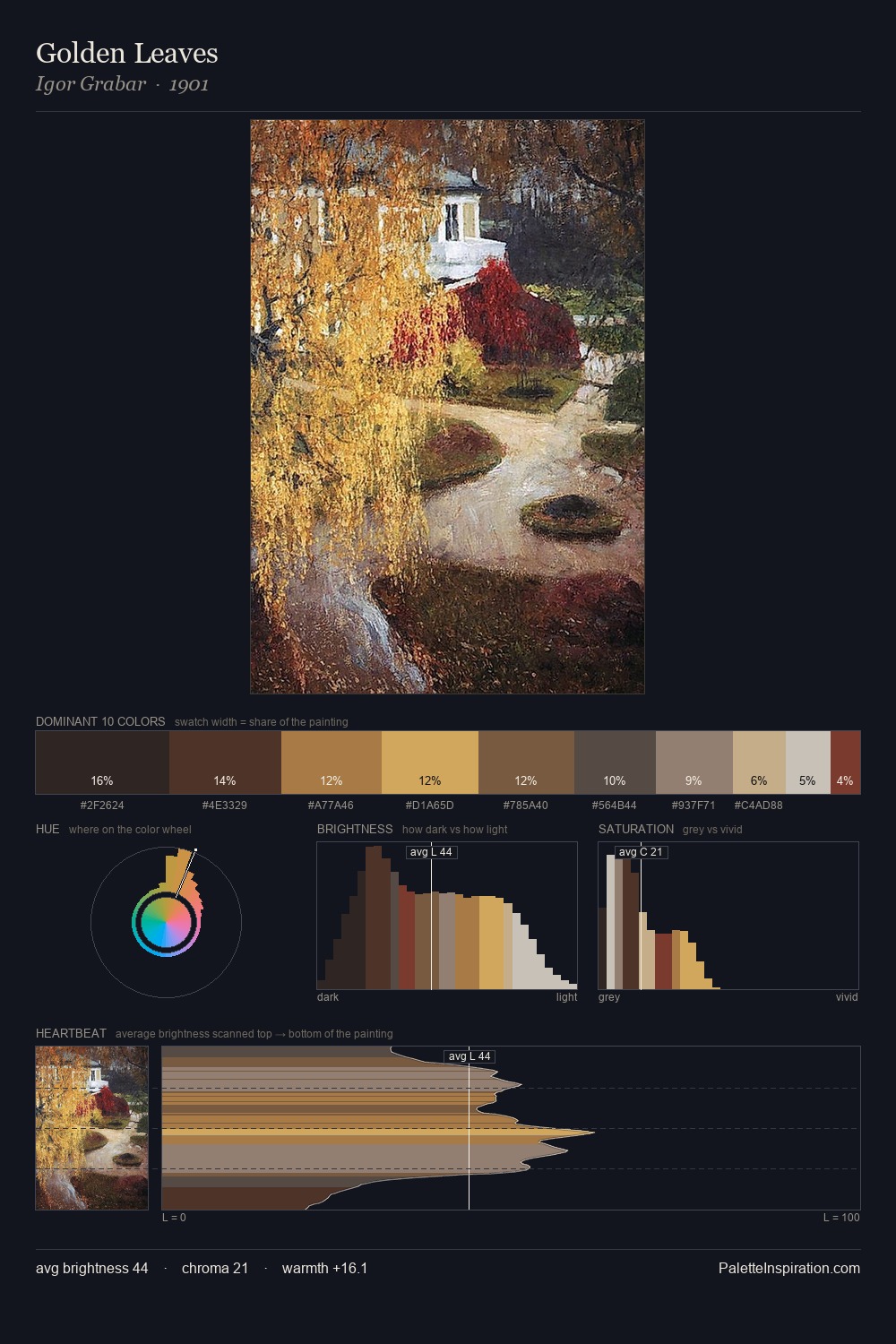
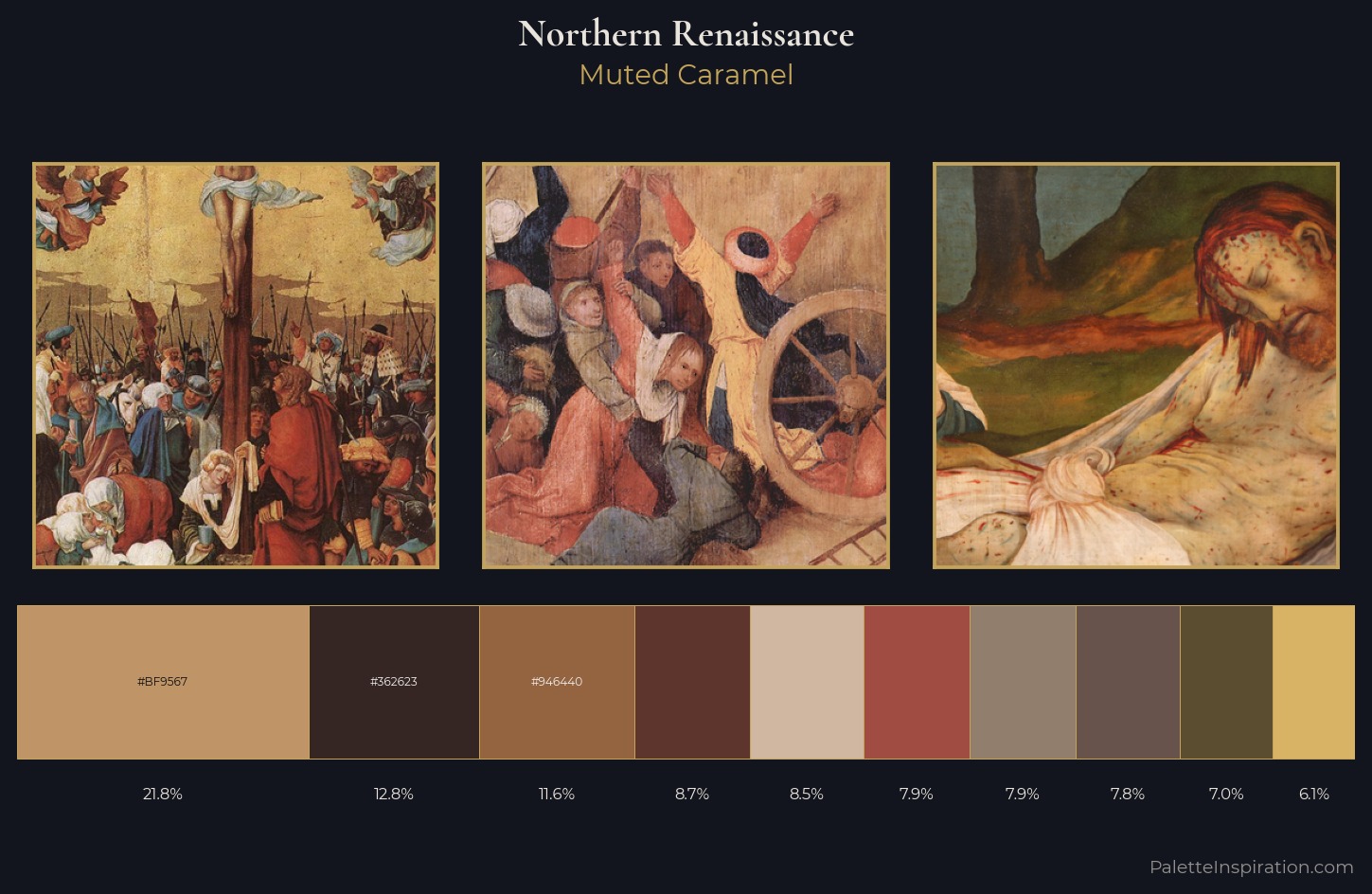
Northern Renaissance Palette 26
Muted Caramel
Muted Deliberately desaturated - chroma pulled toward gray, the restraint of tonal painting.
Caramel Warm mid-brown - the color of cooked sugar, smooth and amber-toned.
Palette Analysis
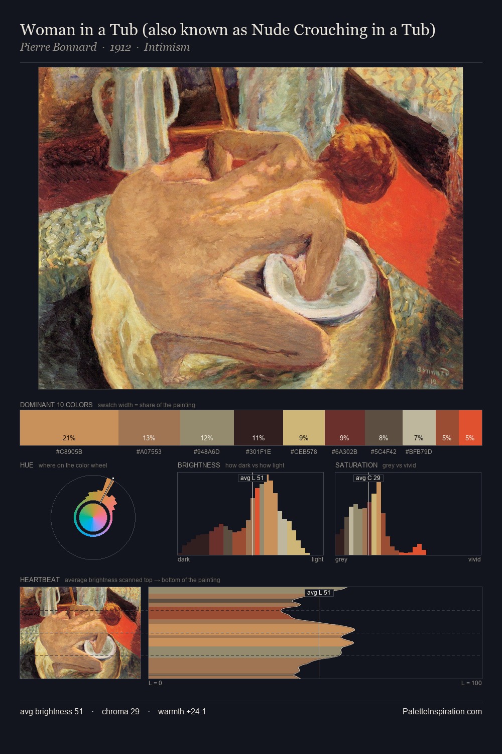
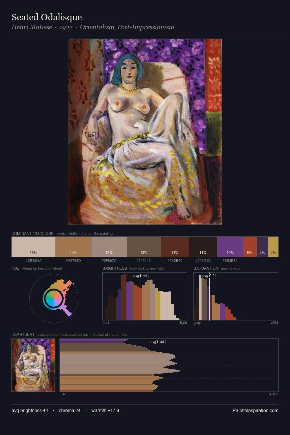
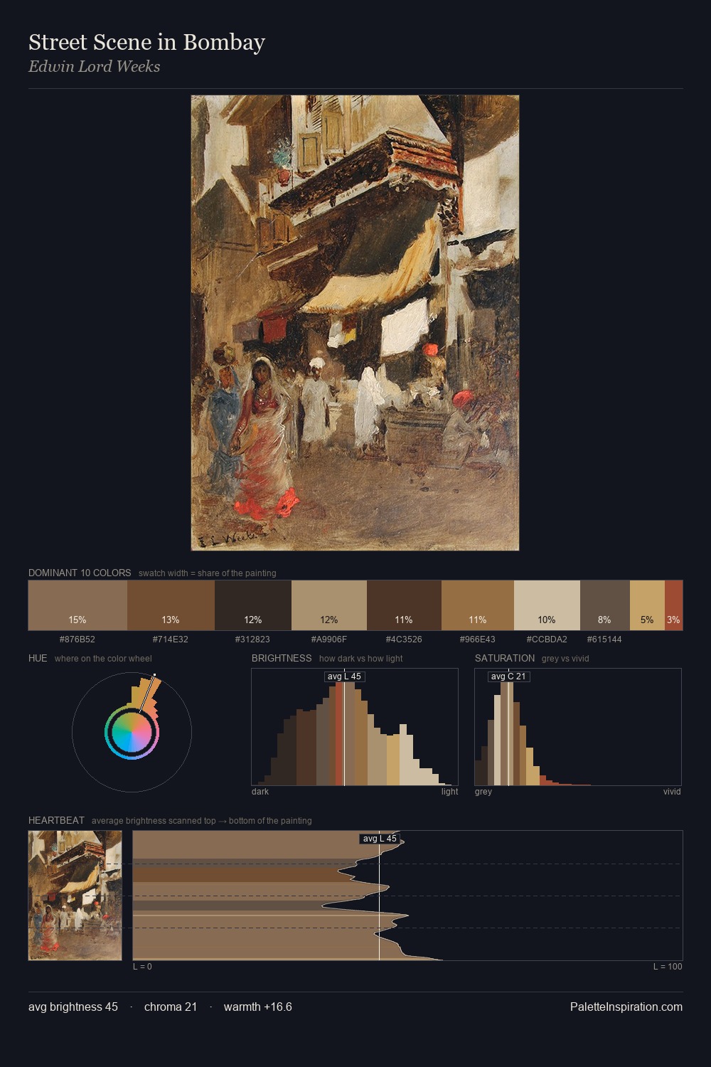
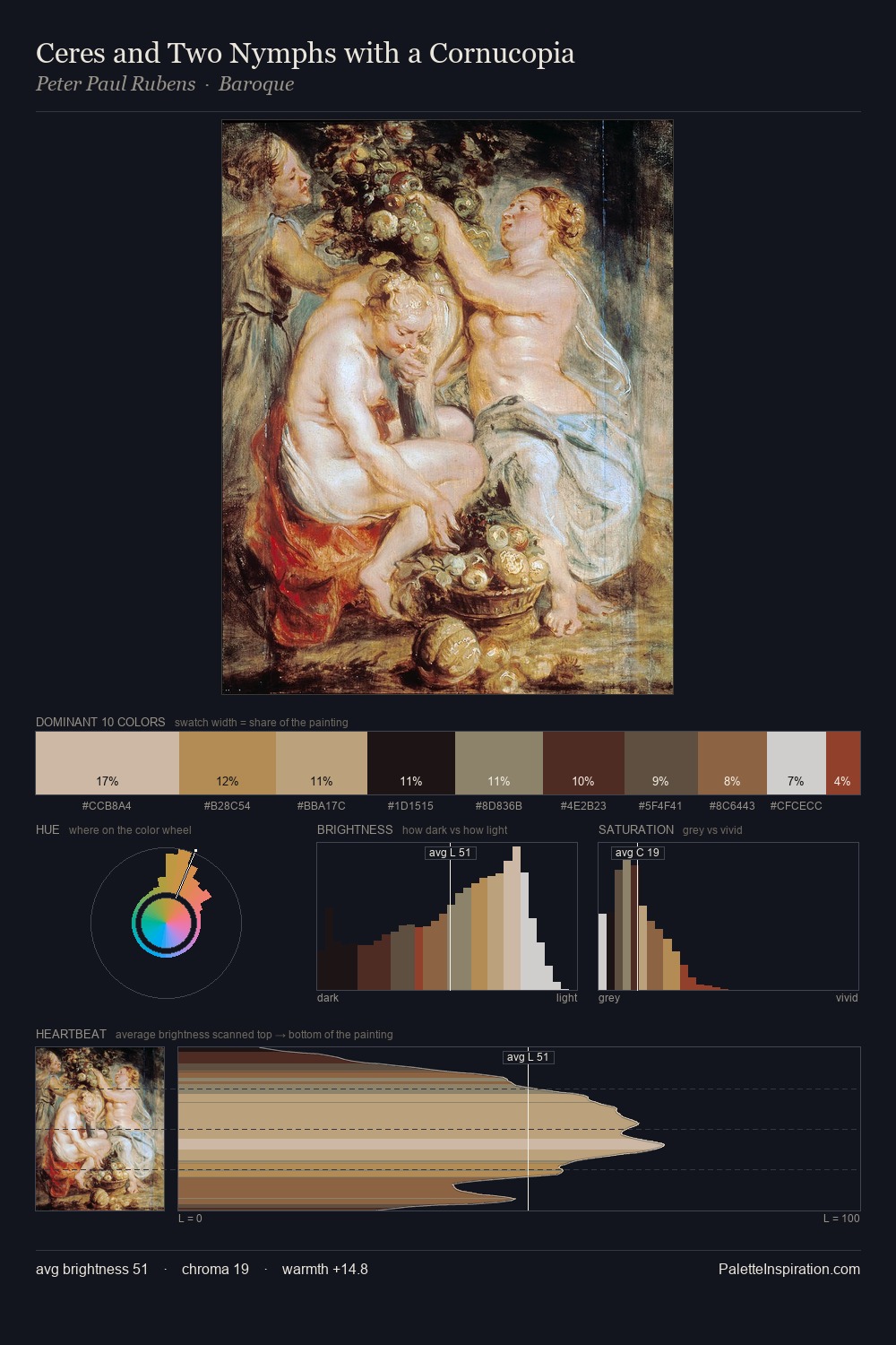
Northern Renaissance occupies the comfortable middle of the value scale, avoiding both extremes to hold the eye in a sustained middle grey. Heat pervades this palette; warm chromatic identities outweigh cool ones at almost every weight. Mid-saturation across the board: the palette has colour character without chromatic excess. Only 7.9% is devoted to #A04C42, yet that small allocation delivers the palette's entire chromatic tension. At 51 units across the value scale, the palette keeps contrast readable without letting it dominate.
Example use cases
- ceramics & pottery
- boutique hospitality
- menswear
- heritage food brands
- craft & artisan brands
I Love This!
Use This Palette
Copy, export, or download for your project
Copy, export, or download for your project
Copy:
Download:
Share: