Northern Renaissance Palette 11
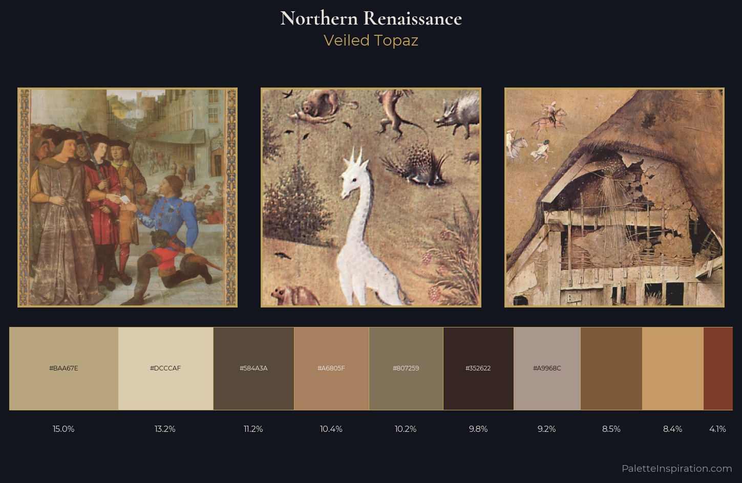
Veiled Topaz
Veiled Partially obscured light - mid-dark with a hazy, scrim-filtered quality.
Topaz Golden yellow - the color of topaz gemstone, warm and slightly saturated.
Palette Analysis
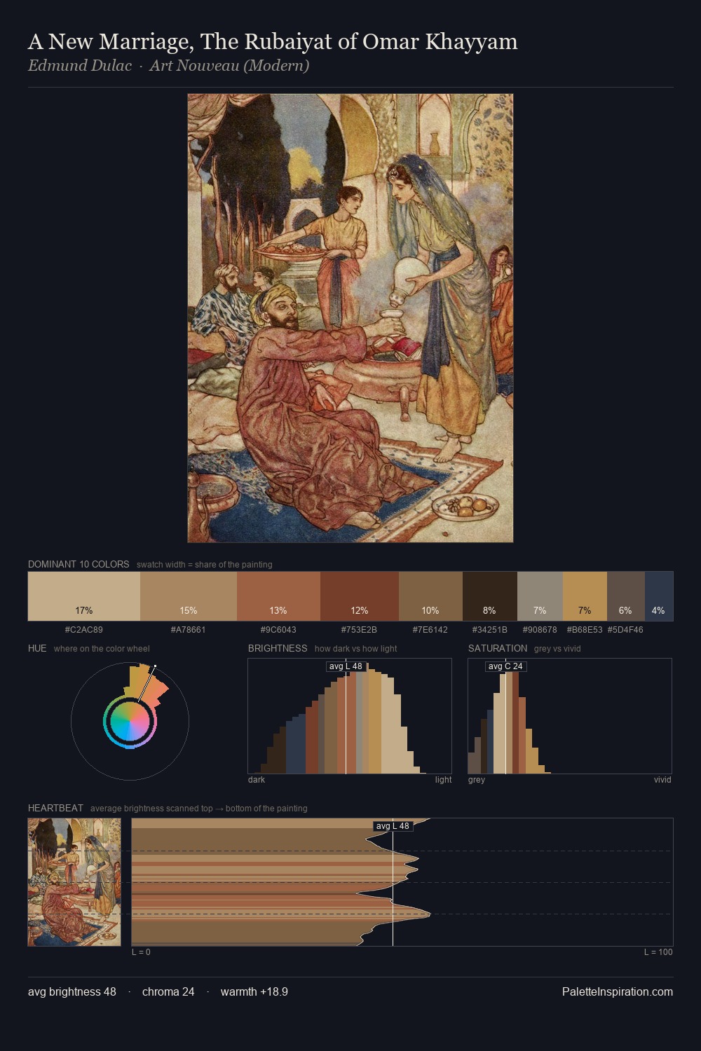
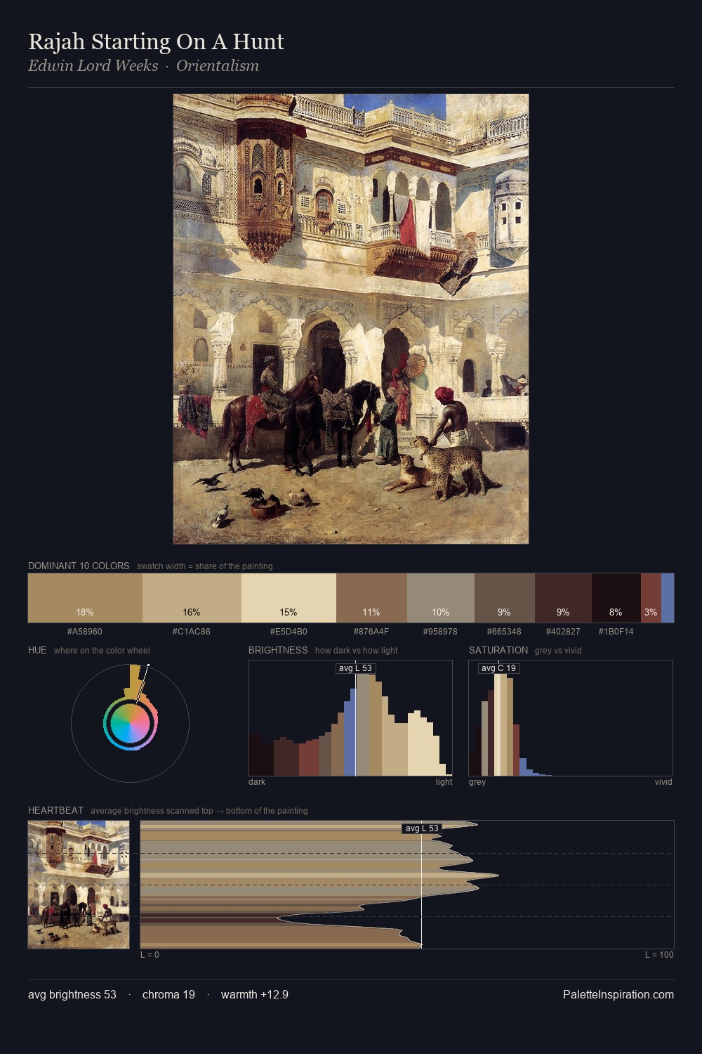
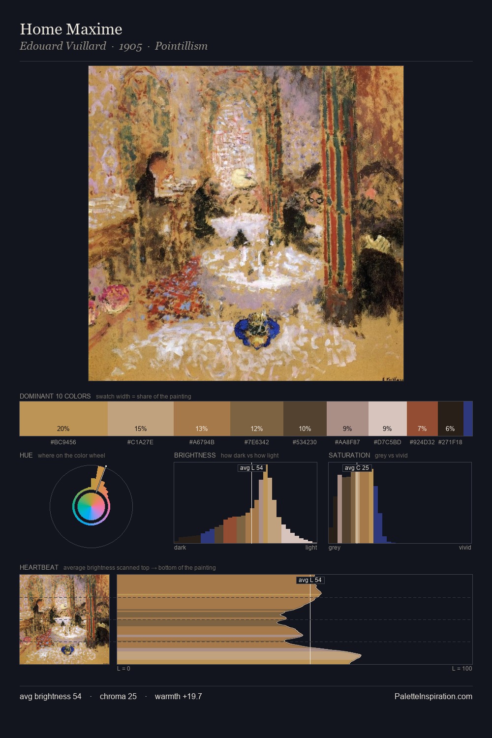
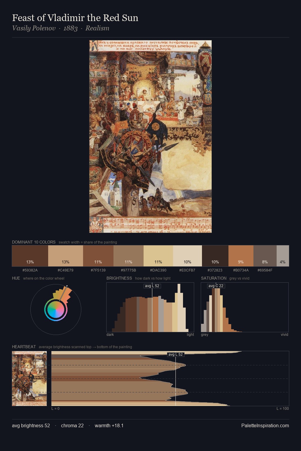
Northern Renaissance keeps values measured and balanced, a hallmark of tonal restraint. Warm hues command this palette; it favours the reds, oranges, and yellows of firelight and earth. Saturation is deliberately withheld - the beauty here lies in the near-monochromatic gradations rather than colour difference. Only 8.4% is devoted to #C69A67, yet that small allocation delivers the palette's entire chromatic tension. A value spread of 56 units gives the palette both depth and air - shadows are genuinely dark, lights genuinely light.
Example use cases
- ceramics & pottery
- boutique hospitality
- menswear
- heritage food brands
- craft & artisan brands
I Love This!
Use This Palette
Copy, export, or download for your project
Copy, export, or download for your project
Copy:
Download:
Share: