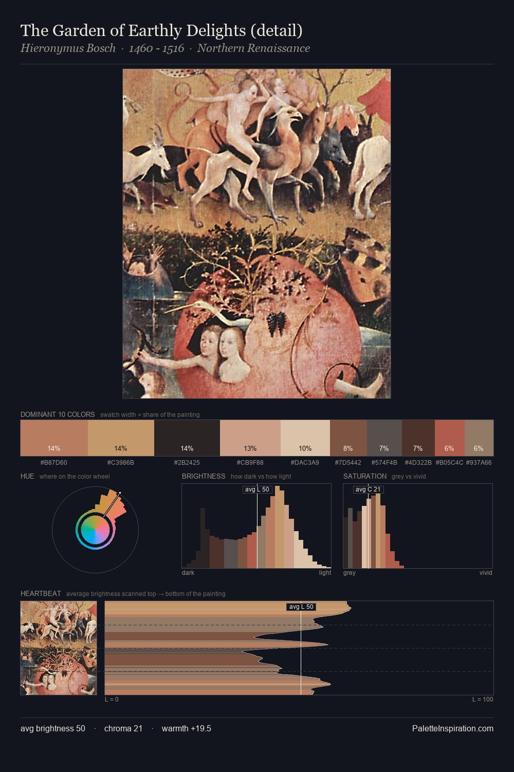
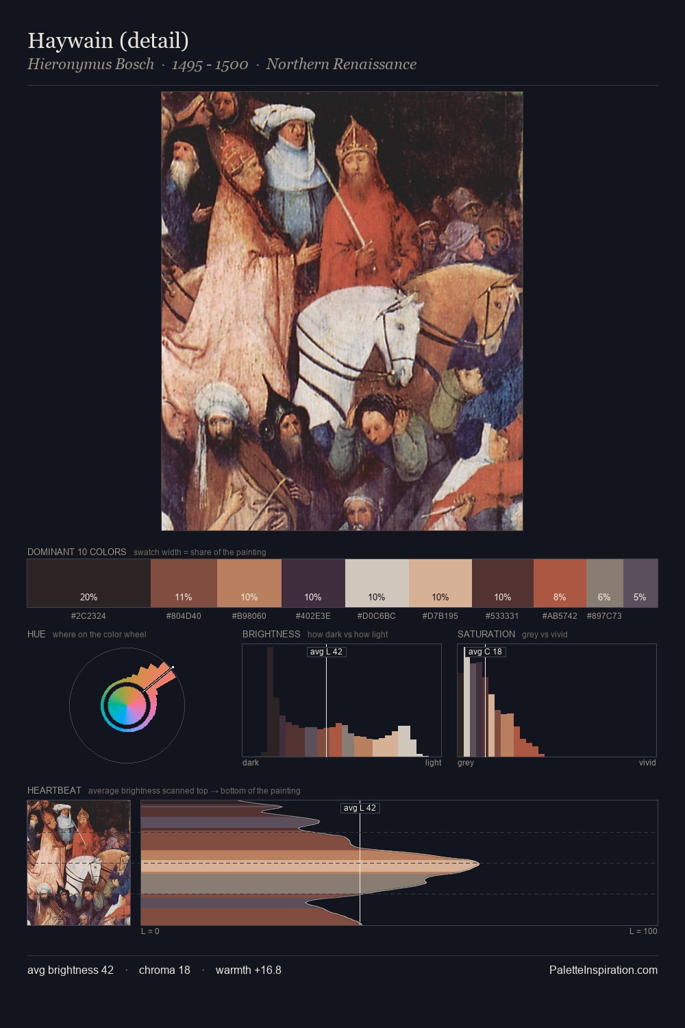
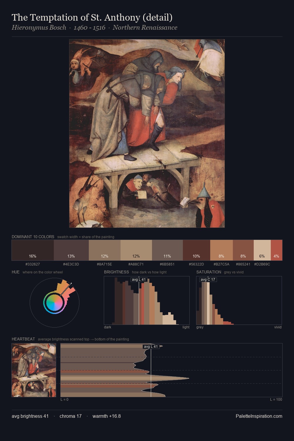
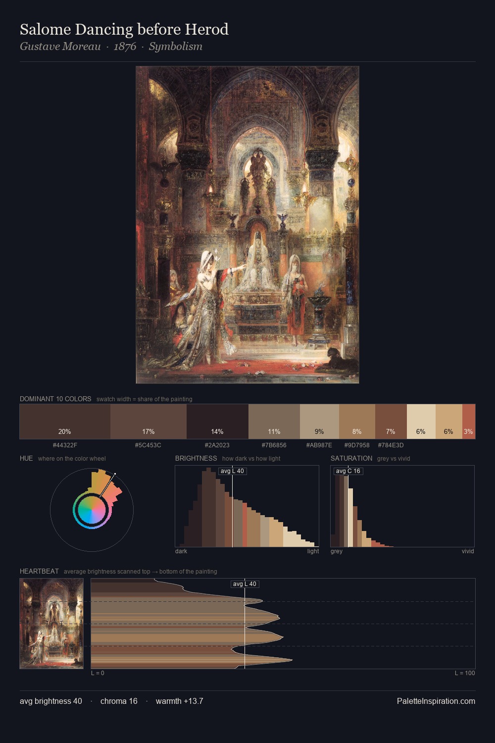
Northern Renaissance Palette 34
Shadowed Bister
Shadowed Low-key - values weighted toward shadow, the palette of dim interiors and overcast skies.
Bister Dark warm brown - a traditional ink and wash pigment made from wood soot.
Palette Analysis
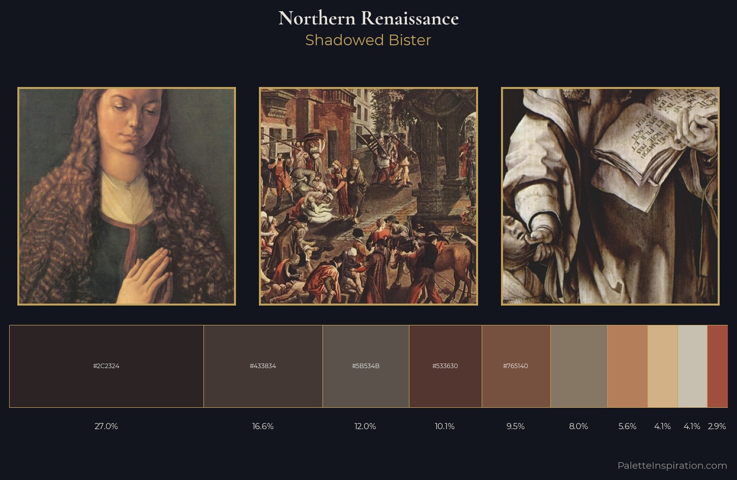
Northern Renaissance keeps values measured and balanced, a hallmark of tonal restraint. The palette orchestrates warmth above all else - reds, ambers, and siennas take the lead. Chroma hovers near zero; colour declares itself through subtle shifts in hue rather than outright saturation. The dominant colour, #2C2324, takes 27.0% of the total area, establishing the overall mood before any other hue is introduced. The saturated accent, #B37E59, registers at 5.6% - sparse enough to feel like a deliberate surprise. Spanning 54 units on the value axis, the palette achieves the balance between tonal flatness and fragmentation.
Example use cases
- premium streaming
- cocktail bars
- fashion campaigns
- book covers
- music labels
I Love This!
Use This Palette
Copy, export, or download for your project
Copy, export, or download for your project
Copy:
Download:
Share: