Northern Renaissance Palette 7
Pale Ecru
Pale High-key and low-chroma - delicate, bleached, washed with light.
Ecru Unbleached linen - warm mid-neutral, slightly grayed, raw and natural.

Palette Analysis
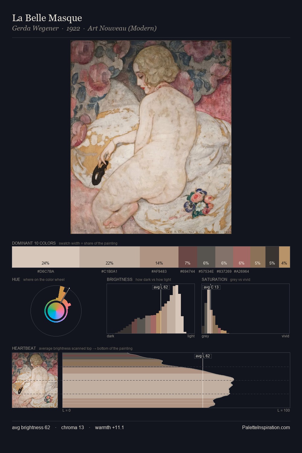
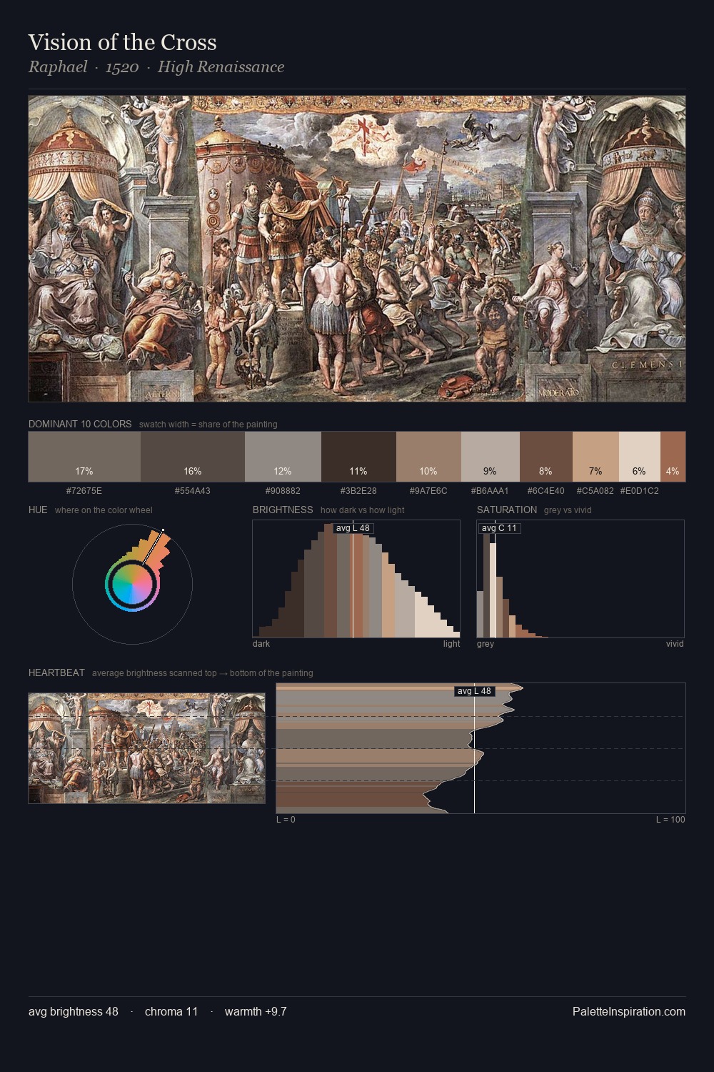
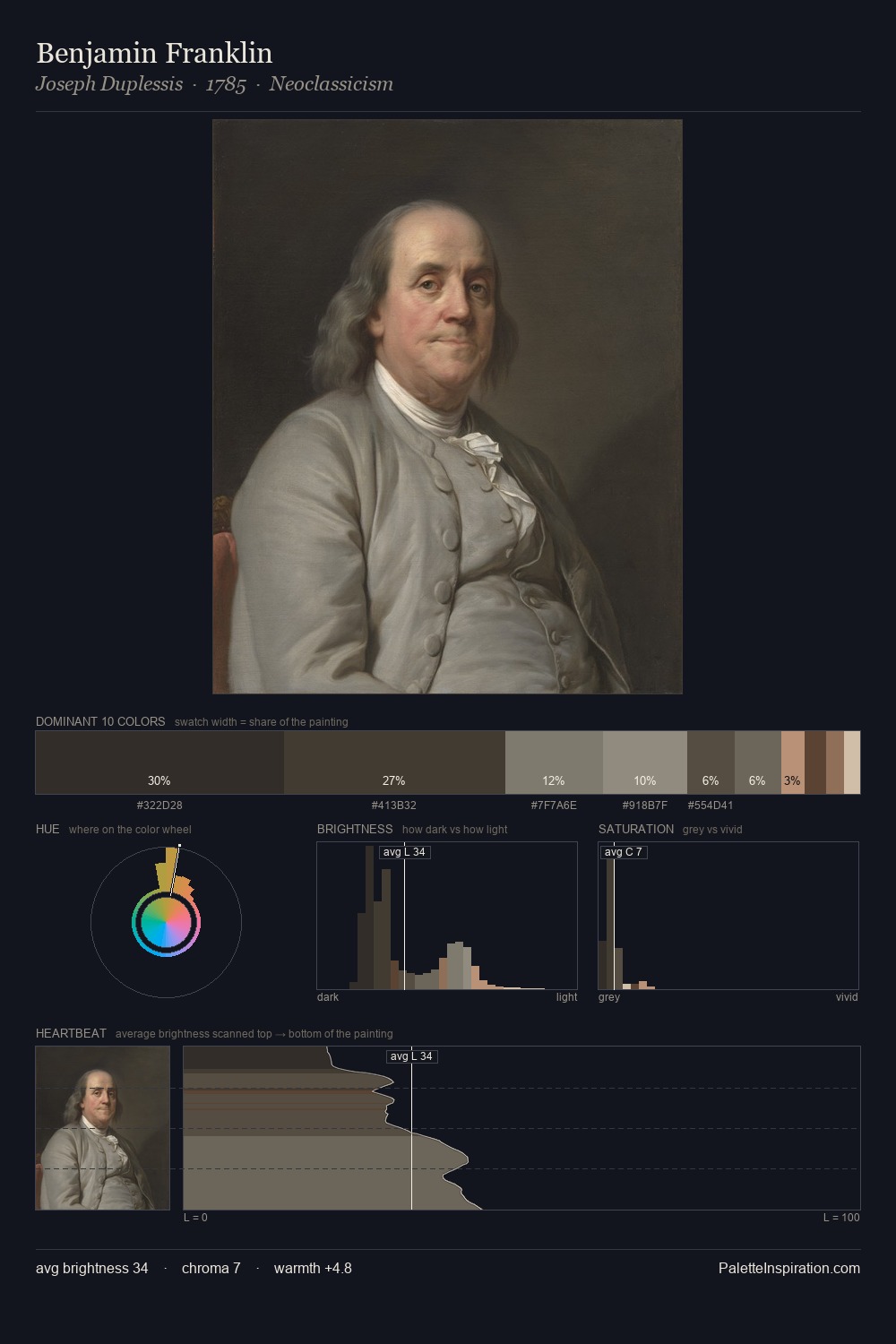
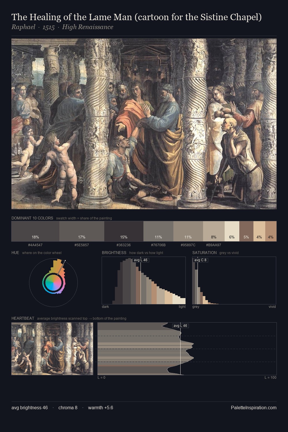
Values in Northern Renaissance rest in the mid-range - neither dramatically lit nor steeped in shadow. Temperature reads distinctly warm: the reds and earth tones carry the compositional weight. Chroma hovers near zero; colour declares itself through subtle shifts in hue rather than outright saturation. The most saturated colour, #B18C69, is reserved to 10.4% of the surface, where it acts as a focal punctuation. The value range spans 57 units across the palette, providing the full gamut from deep shadow to near-white and ensuring clear tonal hierarchy.
Example use cases
- exhibition design
- foundation branding
- estate management
- art education
- museums & galleries
I Love This!
Use This Palette
Copy, export, or download for your project
Copy, export, or download for your project
Copy:
Download:
Share: