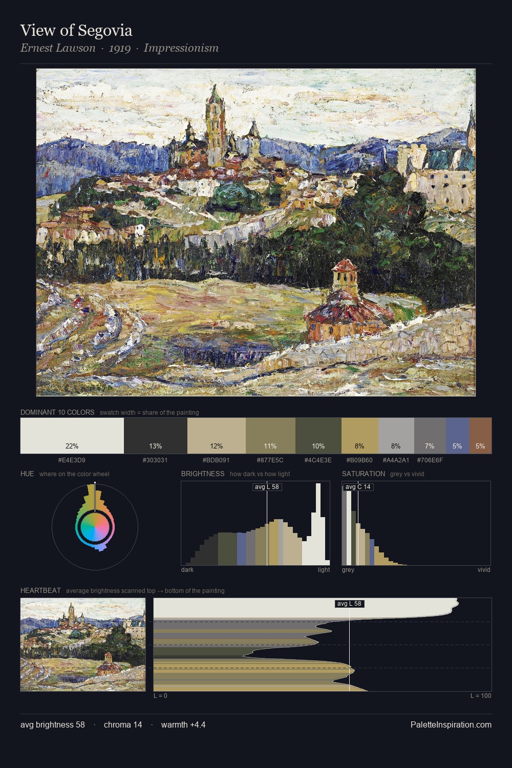
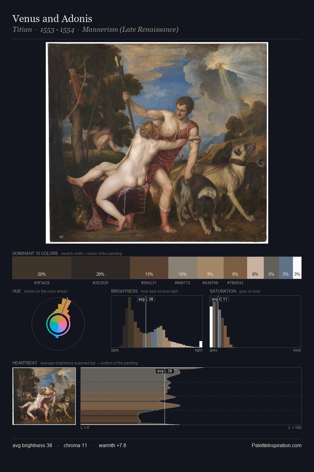
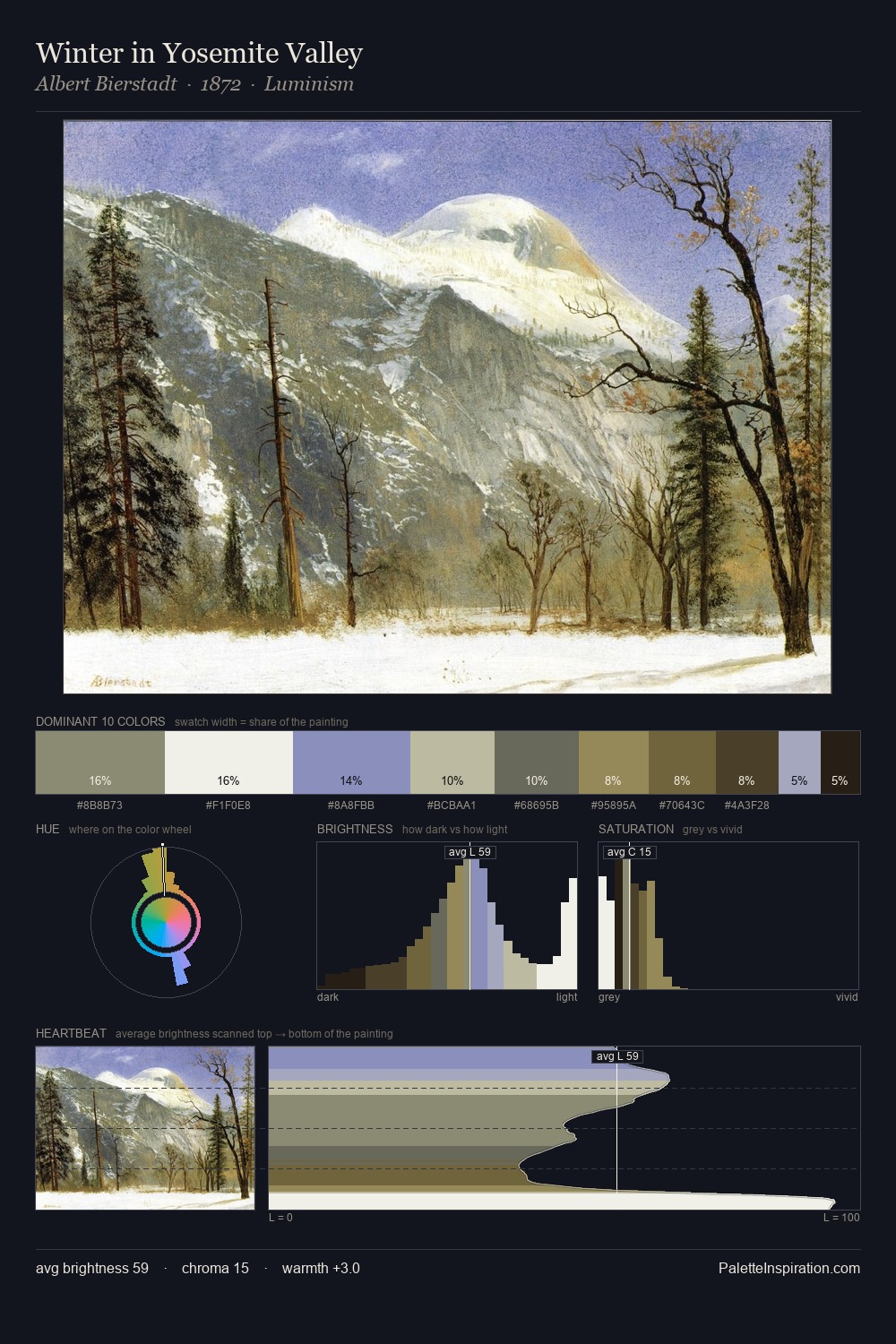
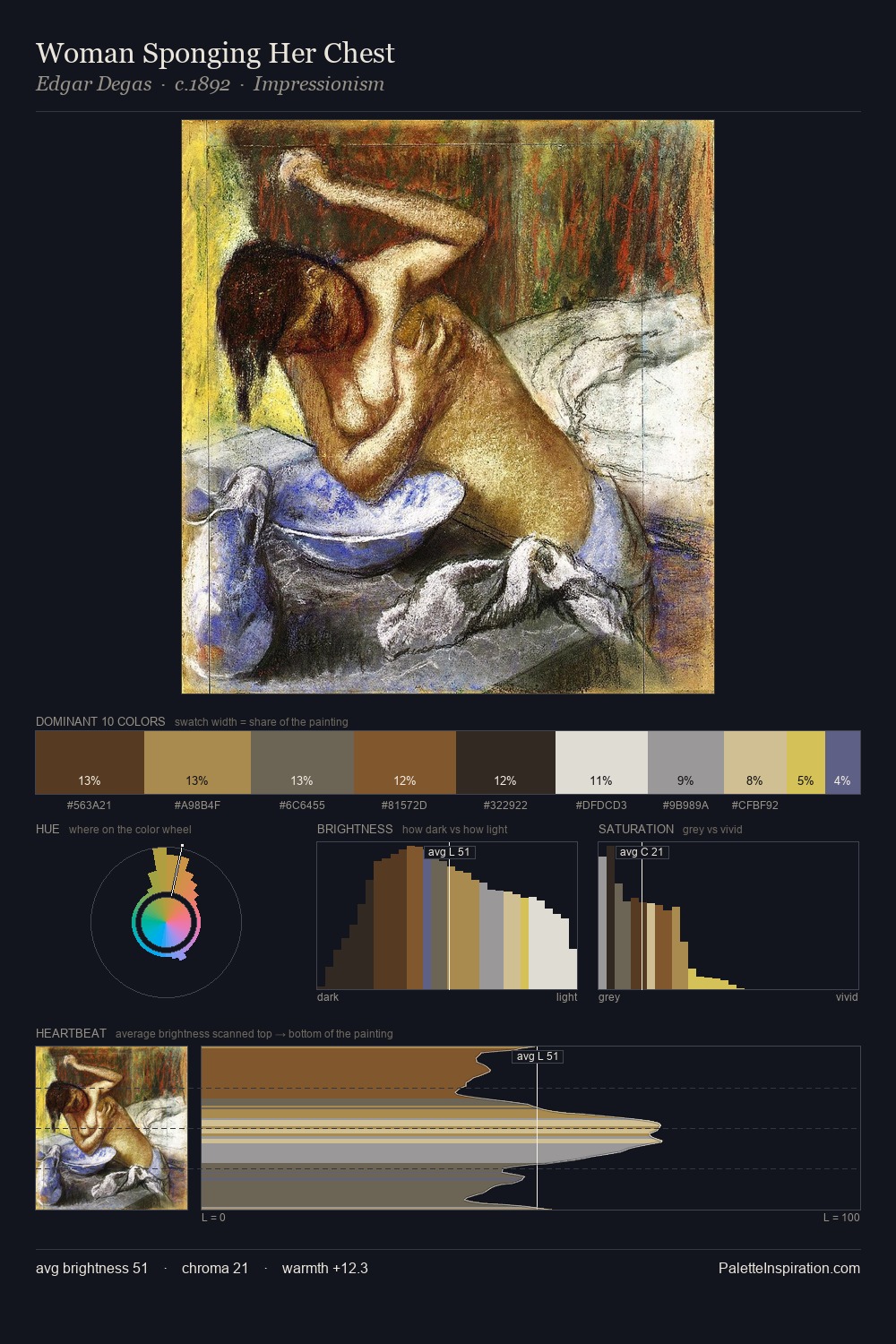
Northern Renaissance Palette 6
Soft Ecru
Soft Low-contrast, gentle chroma - mid-key values and low saturation, approachable and calm.
Ecru Unbleached linen - warm mid-neutral, slightly grayed, raw and natural.

Palette Analysis
Northern Renaissance is high-key - luminous, open, and weighted toward light. Built on cool foundations: the palette favours the blue-cyan-green arc. Saturation is deliberately withheld - the beauty here lies in the near-monochromatic gradations rather than colour difference. #FCFBF9 delivers the chromatic peak at only 10.0% - a small shot of colour with outsized visual impact. From deepest dark to palest light, the palette traverses 70 units of the value scale - a span that creates natural depth. The palette has the character of outdoor light: cool, mid-bright, with colour rendered faithfully rather than expressively.
Example use cases
- ceramics & pottery
- boutique hospitality
- menswear
- heritage food brands
- craft & artisan brands
I Love This!
Use This Palette
Copy, export, or download for your project
Copy, export, or download for your project
Copy:
Download:
Share: