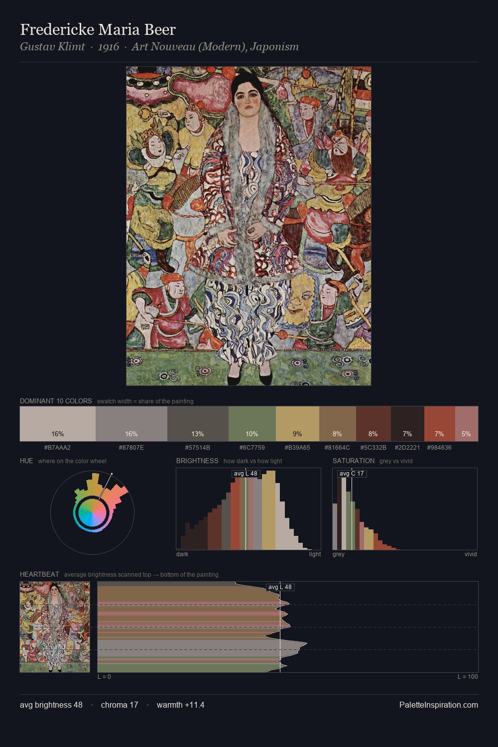
Northern Renaissance Palette 35
Penumbral Sienna
Penumbral Partial shadow - the transitional zone between light and full dark, soft-edged.
Sienna Warm red-brown earth - named after the Sienese pigment, a fundamental artist earth color.

Palette Analysis
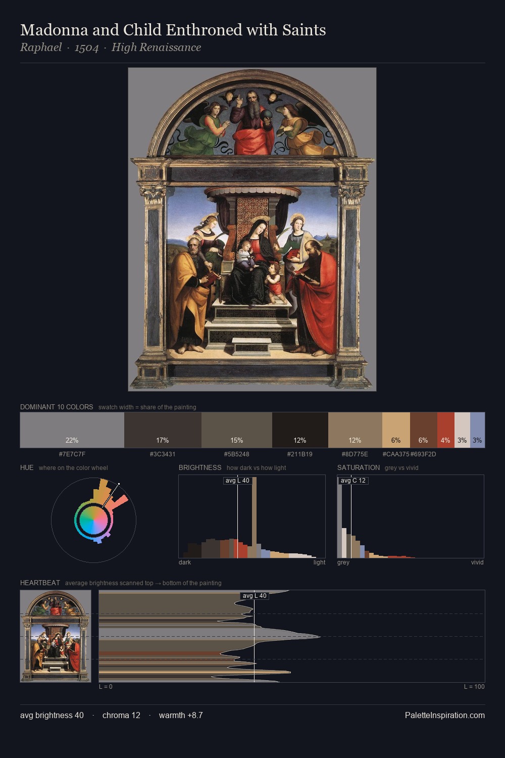
Northern Renaissance distributes its values across the middle register, creating harmony without high contrast. Neither warm nor cool has the upper hand here; the equilibrium between the two generates the palette's visual energy. All colours lean toward grey, building depth through value rather than colour punch. #222020 claims 30.4% of the surface, functioning as the work's tonal foundation. The saturated accent, #C6A67D, registers at 5.7% - sparse enough to feel like a deliberate surprise. A value spread of 56 units gives the palette both depth and air - shadows are genuinely dark, lights genuinely light.
Example use cases
- theater design
- jewelry brands
- tobacco-adjacent retail
- event branding
- film & entertainment
I Love This!
Use This Palette
Copy, export, or download for your project
Copy, export, or download for your project
Copy:
Download:
Share: