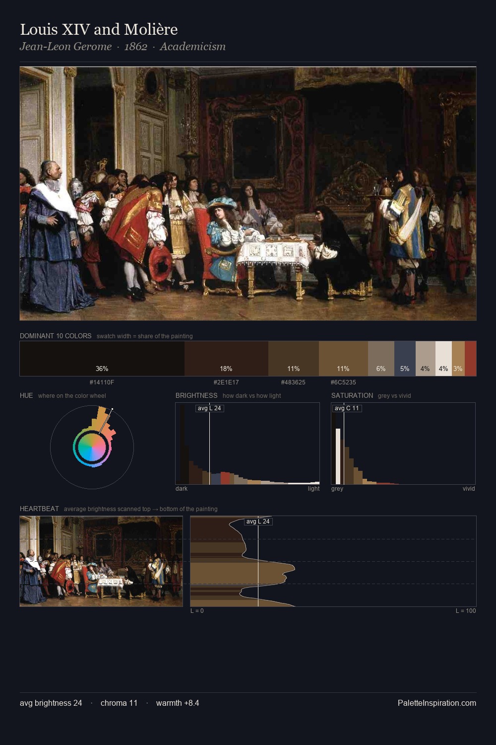
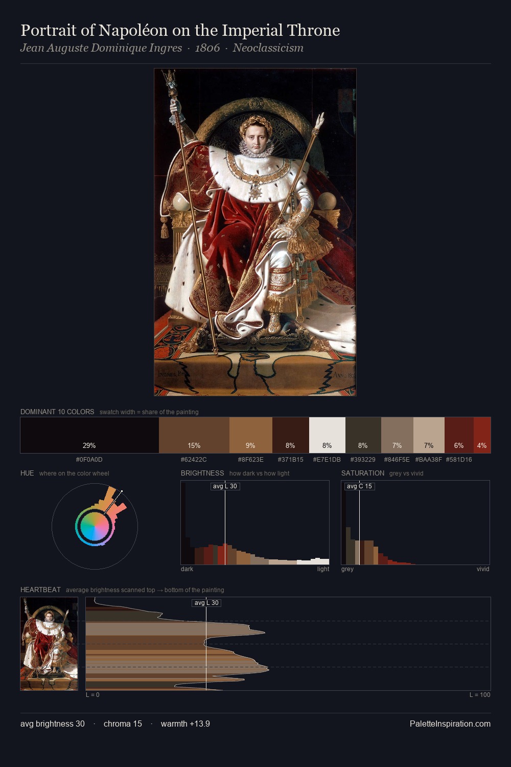
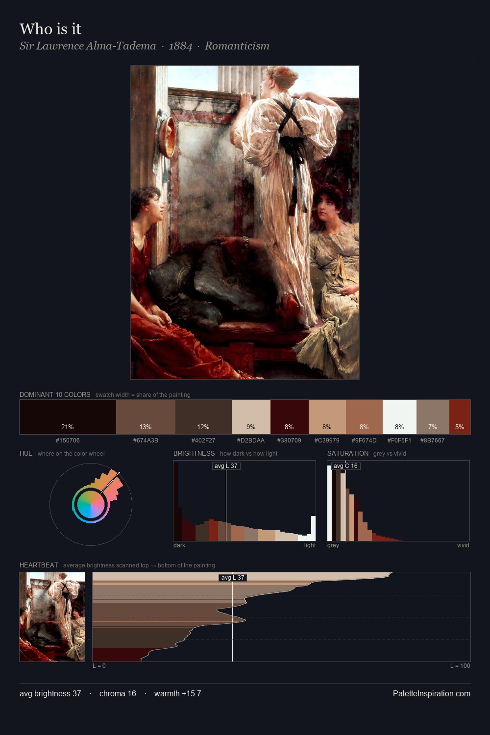
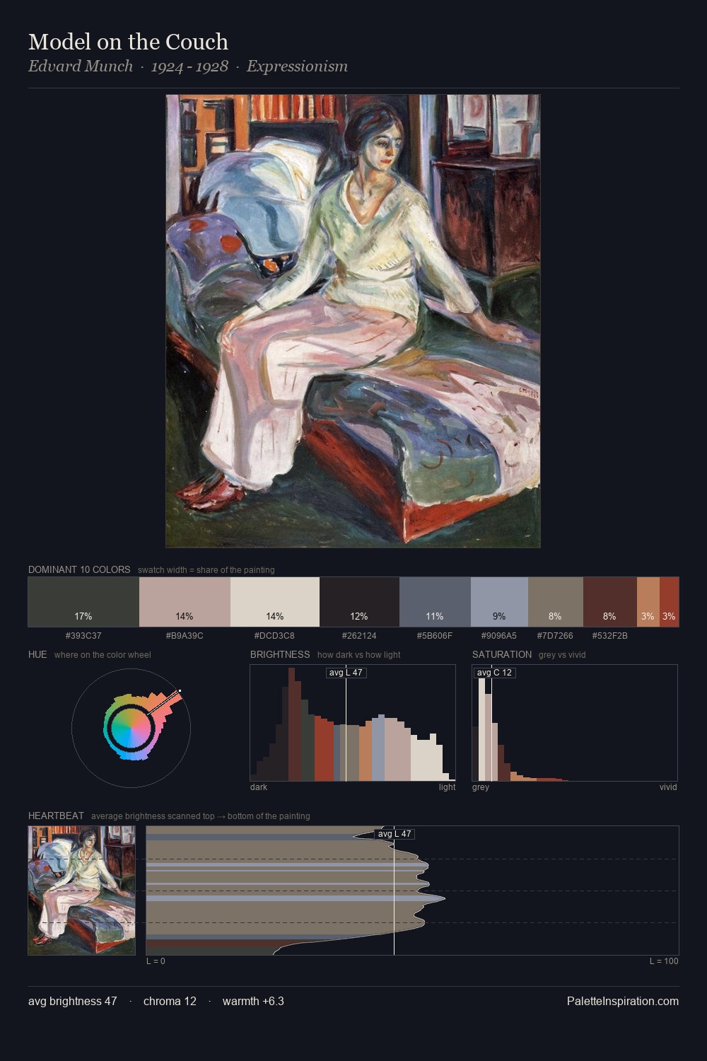
Northern Renaissance Palette 23
Muted Tawny
Muted Deliberately desaturated - chroma pulled toward gray, the restraint of tonal painting.
Tawny Warm orange-brown - a traditional term for the color of tanned leather or lion fur.

Palette Analysis
The value structure of Northern Renaissance is mid-key: quiet, controlled, and cohesive. The palette orchestrates warmth above all else - reds, ambers, and siennas take the lead. Saturation is deliberately withheld - the beauty here lies in the near-monochromatic gradations rather than colour difference. #A67855 functions as the palette's exclamation mark: highest chroma, lowest percentage (8.2%). 75 units of value range underpin the palette's structural clarity: the eye always knows where light falls.
Example use cases
- ceramics & pottery
- boutique hospitality
- menswear
- heritage food brands
- craft & artisan brands
I Love This!
Use This Palette
Copy, export, or download for your project
Copy, export, or download for your project
Copy:
Download:
Share: