Northern Renaissance Palette 17
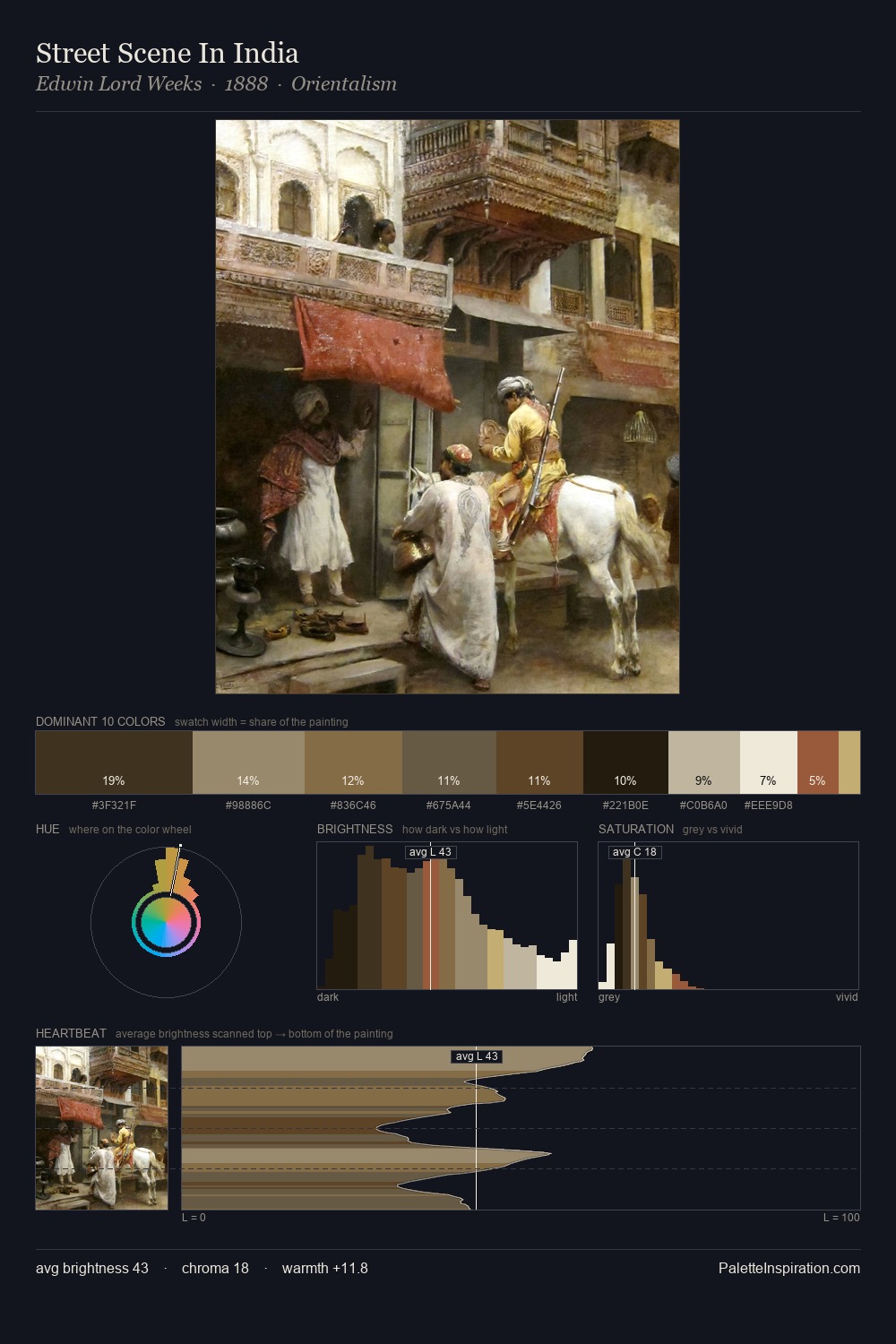
Shadowed Gamboge
Shadowed Low-key - values weighted toward shadow, the palette of dim interiors and overcast skies.
Gamboge Deep golden yellow - a traditional warm pigment, rich amber-gold.

Palette Analysis
Northern Renaissance distributes its values across the middle register, creating harmony without high contrast. Temperature reads distinctly warm: the reds and earth tones carry the compositional weight. Chroma is kept low across all colours, producing the soft, enveloping quality that characterises tonal painting. The most saturated colour, #D2B17A, is reserved to 9.5% of the surface, where it acts as a focal punctuation. 69 units of value range underpin the palette's structural clarity: the eye always knows where light falls.
Example use cases
- theater design
- jewelry brands
- tobacco-adjacent retail
- event branding
- film & entertainment
I Love This!
Use This Palette
Copy, export, or download for your project
Copy, export, or download for your project
Copy:
Download:
Share: