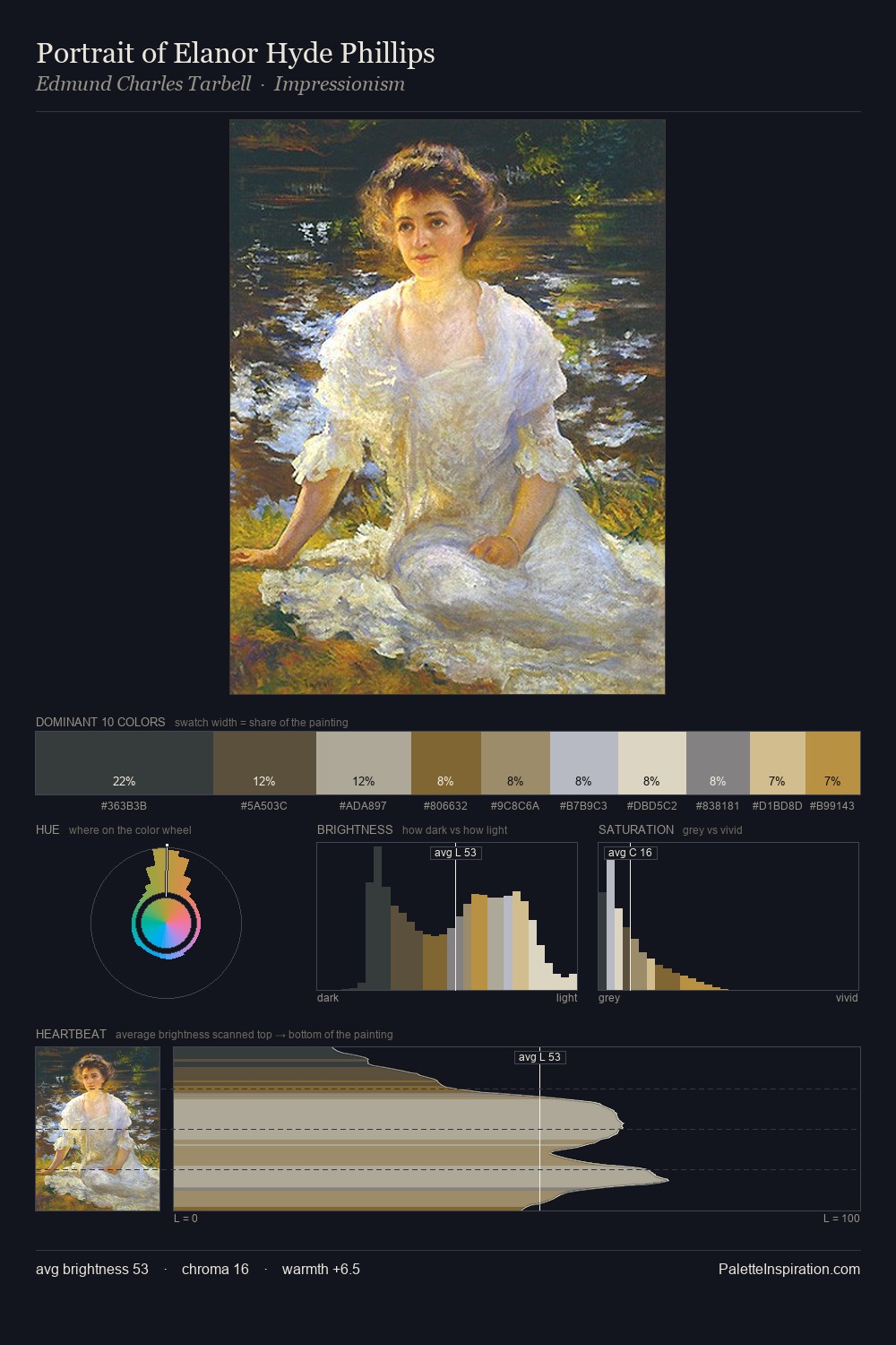
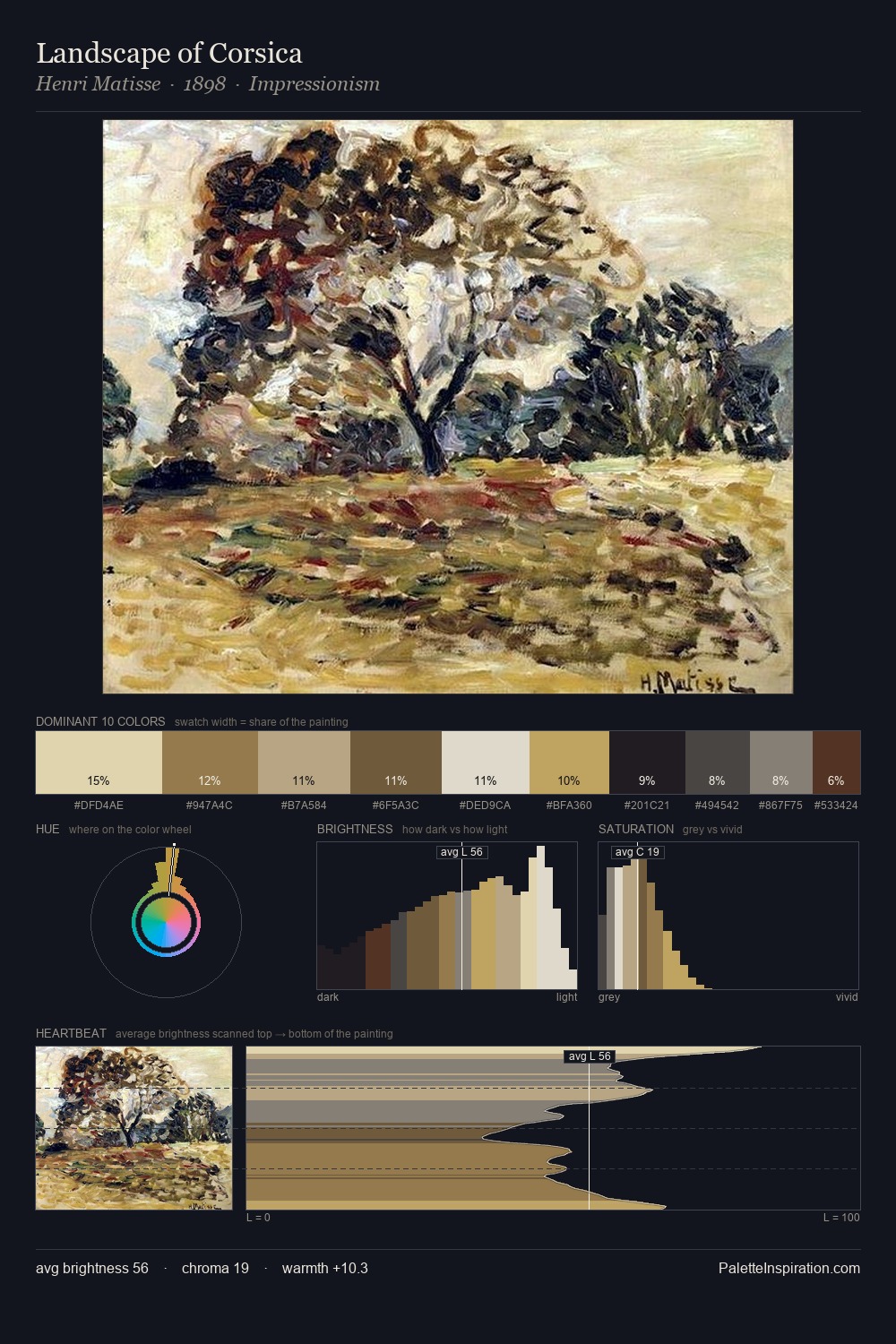
Northern Renaissance Palette 1
Gleaming Ecru
Gleaming Bright and polished - high-key, often warm, suggesting reflective or luminous surfaces.
Ecru Unbleached linen - warm mid-neutral, slightly grayed, raw and natural.

Palette Analysis
Northern Renaissance is high-key - luminous, open, and weighted toward light. The palette tilts toward cool - blues and silver-greys carry the structural weight. Every colour is desaturated; the palette proceeds through near-neutrals and gently-coloured greys. #D2BF89 delivers the chromatic peak at only 10.8% - a small shot of colour with outsized visual impact. 62 units of value range underpin the palette's structural clarity: the eye always knows where light falls. High luminosity and cool temperature suggest the plein-air condition: unfiltered daylight and open sky.
Example use cases
- ceramics & pottery
- boutique hospitality
- menswear
- heritage food brands
- craft & artisan brands
I Love This!
Use This Palette
Copy, export, or download for your project
Copy, export, or download for your project
Copy:
Download:
Share: