Peter Paul Rubens Palette 22

Palette Analysis
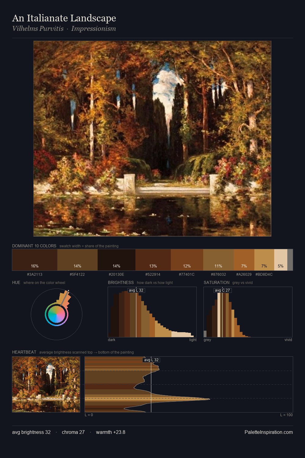
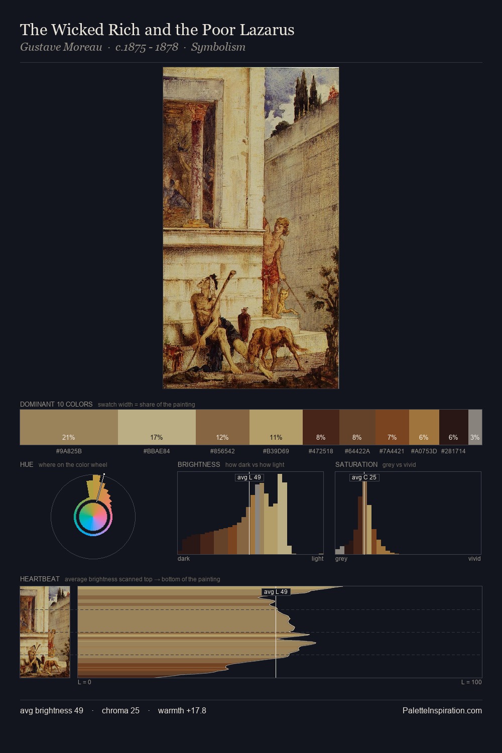
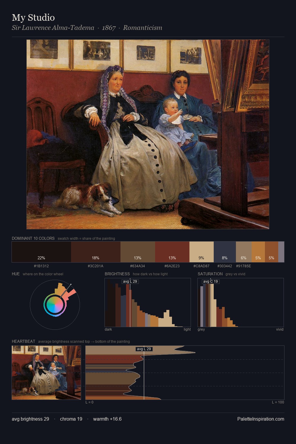
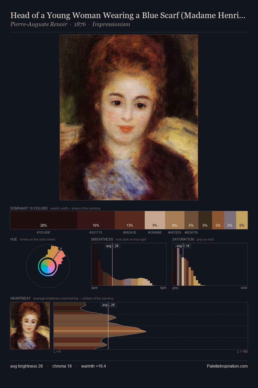
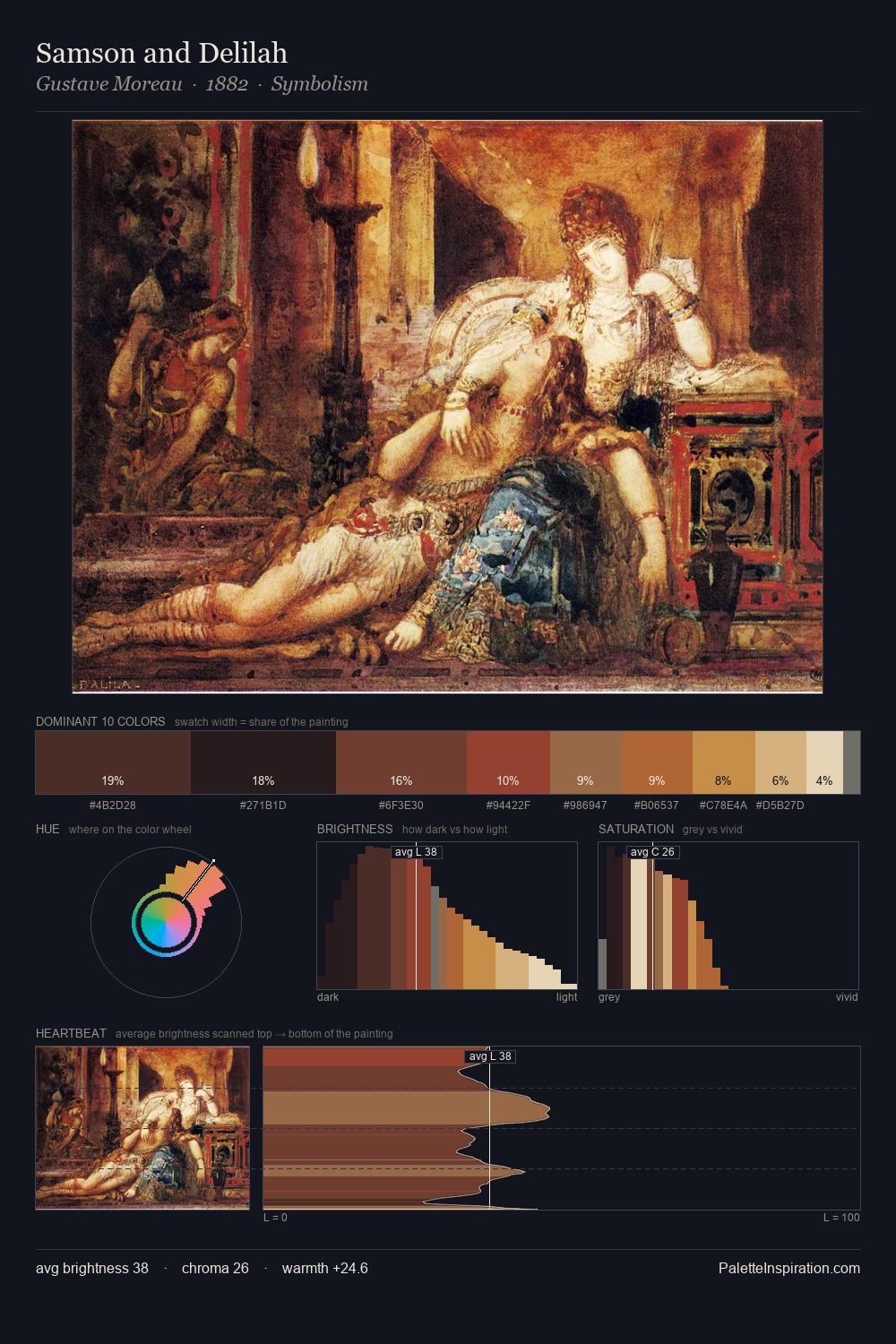
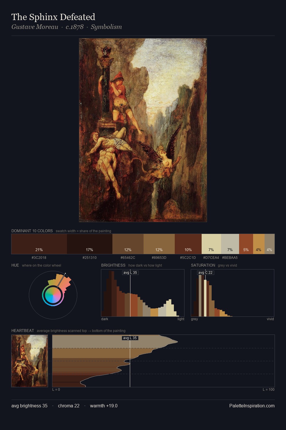
Peter Paul Rubens occupies the comfortable middle of the value scale, avoiding both extremes to hold the eye in a sustained middle grey. Peter Paul Rubens orchestrates warmth above all else - reds, ambers, and siennas take the lead. Muted throughout, the palette achieves its effects through value and temperature rather than chromatic force. At 25.1%, #170F0F functions less as a colour accent and more as a complete atmospheric environment. Only 8.1% is devoted to #57261E, yet that small allocation delivers the palette's entire chromatic tension. 64 units of value range underpin the palette's structural clarity: the eye always knows where light falls. Peter Paul Rubens's palette 22 carries its own internal logic while remaining in conversation with the artist's broader colour intelligence.
Example use cases
- theater design
- jewelry brands
- tobacco-adjacent retail
- event branding
- film & entertainment
I Love This!
Copy, export, or download for your project