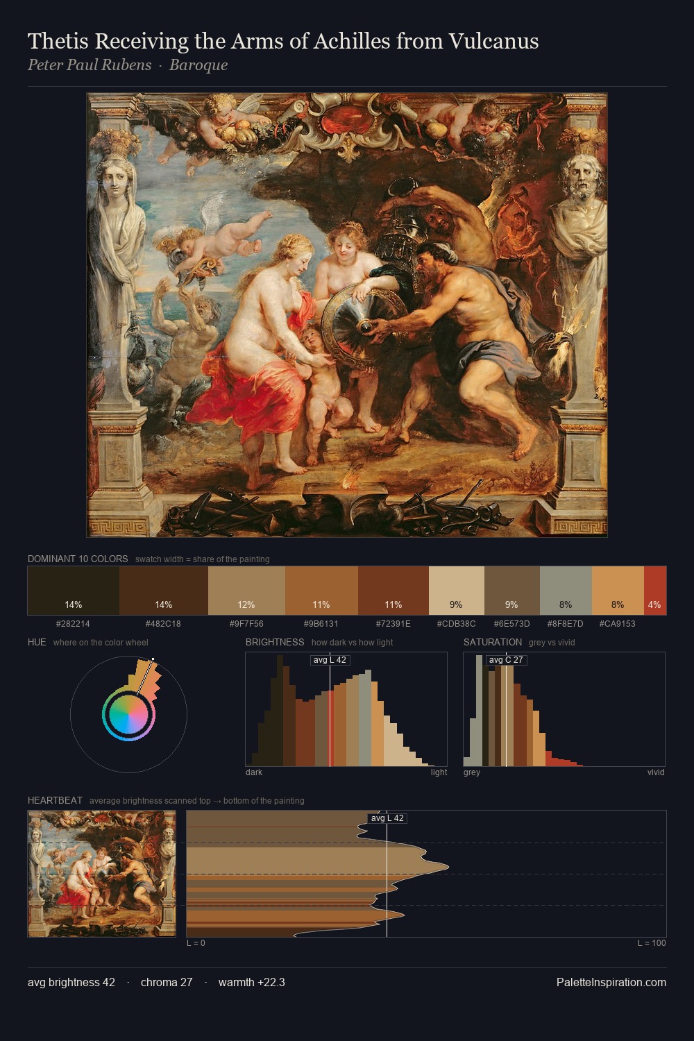
Peter Paul Rubens Palette 21
Shadowed Terracotta
Shadowed Low-key - values weighted toward shadow, the palette of dim interiors and overcast skies.
Terracotta Fired clay red-orange - the color of unglazed earthenware pottery.

Palette Analysis
Peter Paul Rubens keeps values measured and balanced, a hallmark of tonal restraint. The dominant temperature is warm, with earth tones and fire-hues setting the emotional key. Chroma is moderate: colours carry enough saturation to be read as colour, but the palette stops well short of garish intensity. The most saturated colour, #E0BE8B, is reserved to 5.4% of the surface, where it acts as a focal punctuation. From deepest dark to palest light, the palette traverses 62 units of the value scale - a span that creates natural depth. In the context of Peter Paul Rubens's full range of palettes, group 21 represents one movement in an ongoing chromatic dialogue.
Example use cases
- theater design
- jewelry brands
- tobacco-adjacent retail
- event branding
- film & entertainment
I Love This!
Use This Palette
Copy, export, or download for your project
Copy, export, or download for your project
Copy:
Download:
Share: