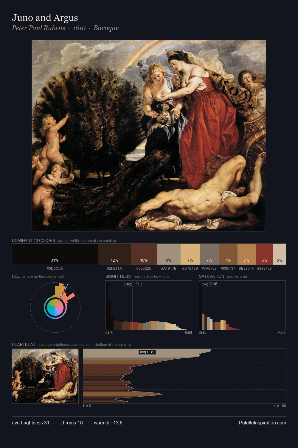
Peter Paul Rubens Palette 9
Shadowed Bister
Shadowed Low-key - values weighted toward shadow, the palette of dim interiors and overcast skies.
Bister Dark warm brown - a traditional ink and wash pigment made from wood soot.

Palette Analysis
Peter Paul Rubens occupies the comfortable middle of the value scale, avoiding both extremes to hold the eye in a sustained middle grey. Yellow, ochre, sienna: warm hues that Peter Paul Rubens deploys as the palette's primary energy. All colours lean toward grey, building depth through value rather than colour punch. #7C3429 delivers the chromatic peak at only 2.9% - a small shot of colour with outsized visual impact. At 65 units of value range, the palette has the tonal breadth to sustain complex spatial readings. Peter Paul Rubens's palette 9 carries its own internal logic while remaining in conversation with the artist's broader colour intelligence.
Example use cases
- theater design
- jewelry brands
- tobacco-adjacent retail
- event branding
- film & entertainment
I Love This!
Use This Palette
Copy, export, or download for your project
Copy, export, or download for your project
Copy:
Download:
Share:
, \"Cecchino\" Palette 3 - Shadowed Bister")


