Peter Paul Rubens Palette 15

Palette Analysis
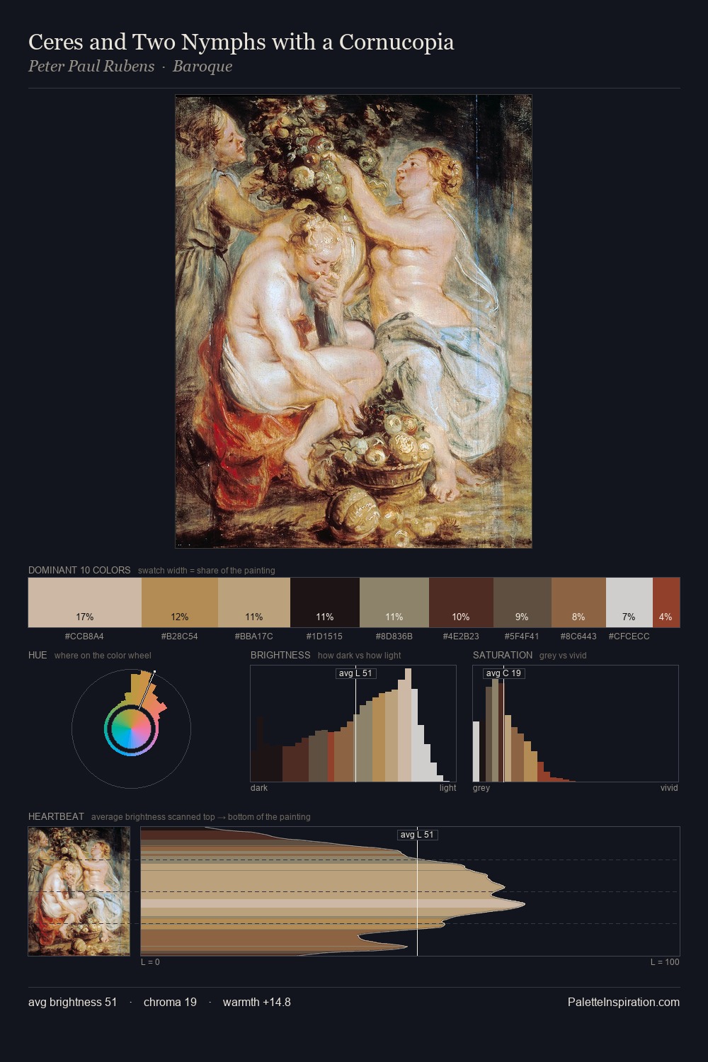
Mid-key values give Peter Paul Rubens its characteristic quietness - nothing blazes, nothing disappears. Temperature is cool-dominant, with blue and green families claiming the largest areas. Saturation is deliberately withheld - the beauty here lies in the near-monochromatic gradations rather than colour difference. Only 3.9% is devoted to #883A28, yet that small allocation delivers the palette's entire chromatic tension. The full value range is 65 units: broad enough to build convincing three-dimensional form. The palette has the character of outdoor light: cool, mid-bright, with colour rendered faithfully rather than expressively. Peter Paul Rubens's palette 15 carries its own internal logic while remaining in conversation with the artist's broader colour intelligence.
Example use cases
- theater design
- jewelry brands
- tobacco-adjacent retail
- event branding
- film & entertainment
I Love This!
Copy, export, or download for your project