Peter Paul Rubens Master Palette

Palette Analysis
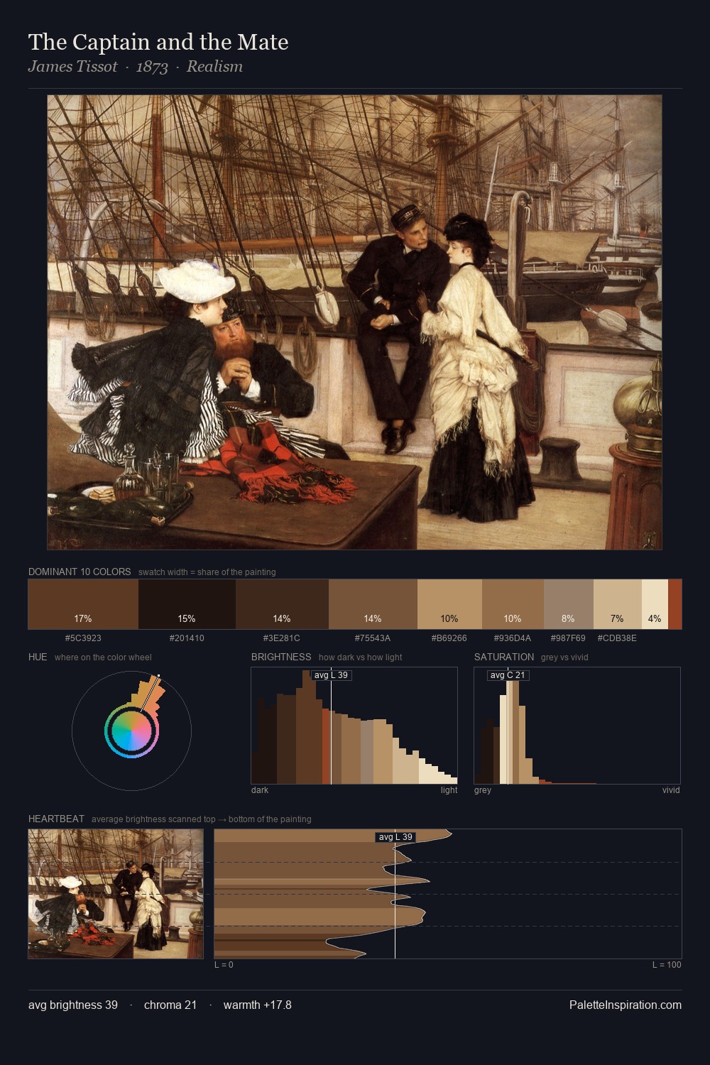
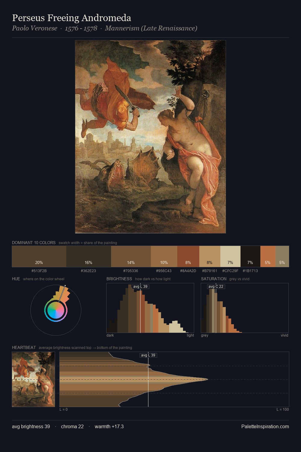
Peter Paul Rubens sits in the centre of the value range, lending the palette a sense of even, sustained light. The dominant temperature is warm, with earth tones and fire-hues setting the emotional key. All colours lean toward grey, building depth through value rather than colour punch. At 25.5%, #1C1715 functions less as a colour accent and more as a complete atmospheric environment. Only 4.4% is devoted to #994E2A, yet that small allocation delivers the palette's entire chromatic tension. The value range spans 63 units across the palette, providing the full gamut from deep shadow to near-white and ensuring clear tonal hierarchy. The palette is a signature: Peter Paul Rubens's particular sense of value, warmth, and colour weight made legible.
Example use cases
- theater design
- jewelry brands
- tobacco-adjacent retail
- event branding
- film & entertainment
I Love This!
Copy, export, or download for your project