Peter Paul Rubens Palette 5
Shadowed Bister
Shadowed Low-key - values weighted toward shadow, the palette of dim interiors and overcast skies.
Bister Dark warm brown - a traditional ink and wash pigment made from wood soot.

Palette Analysis
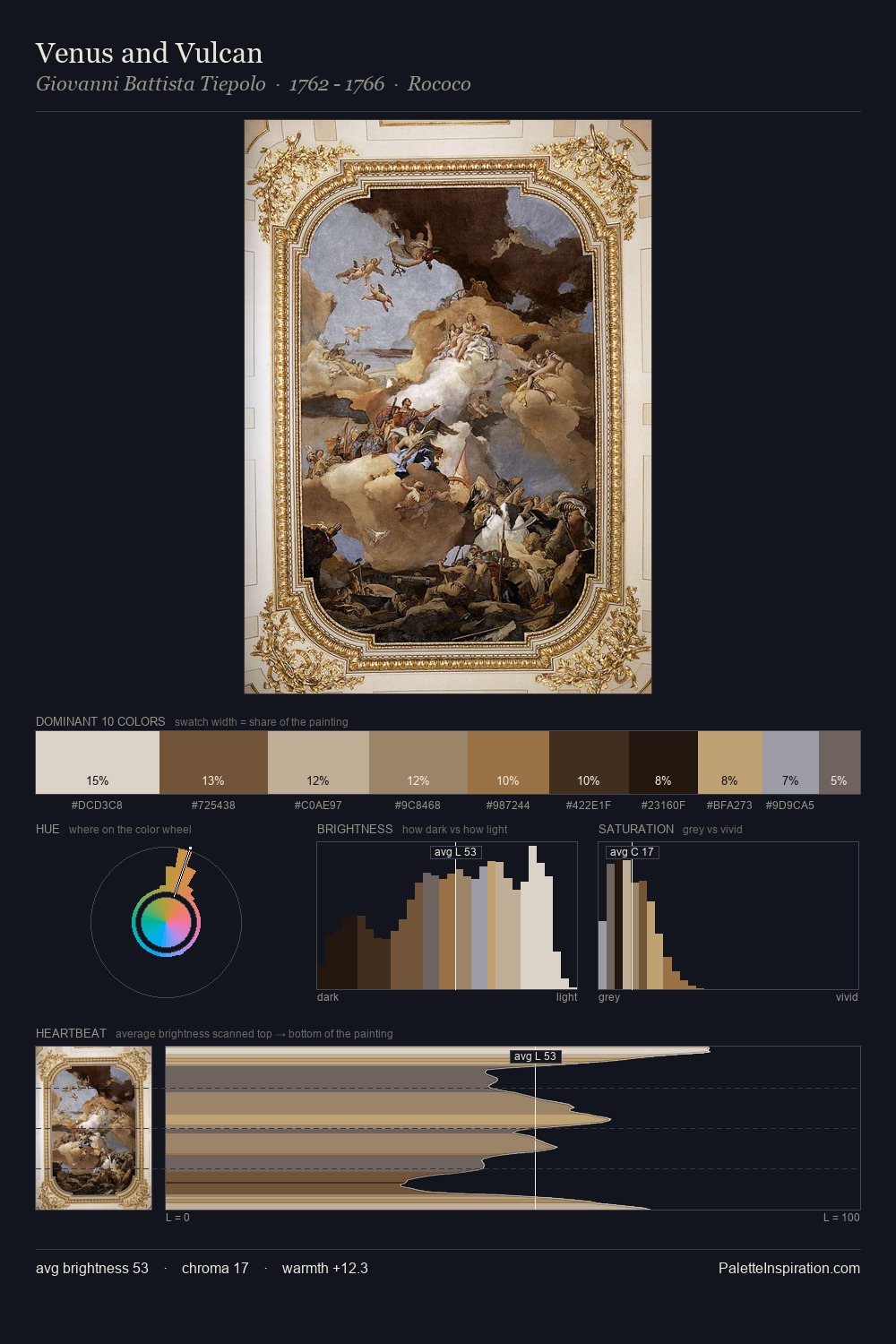
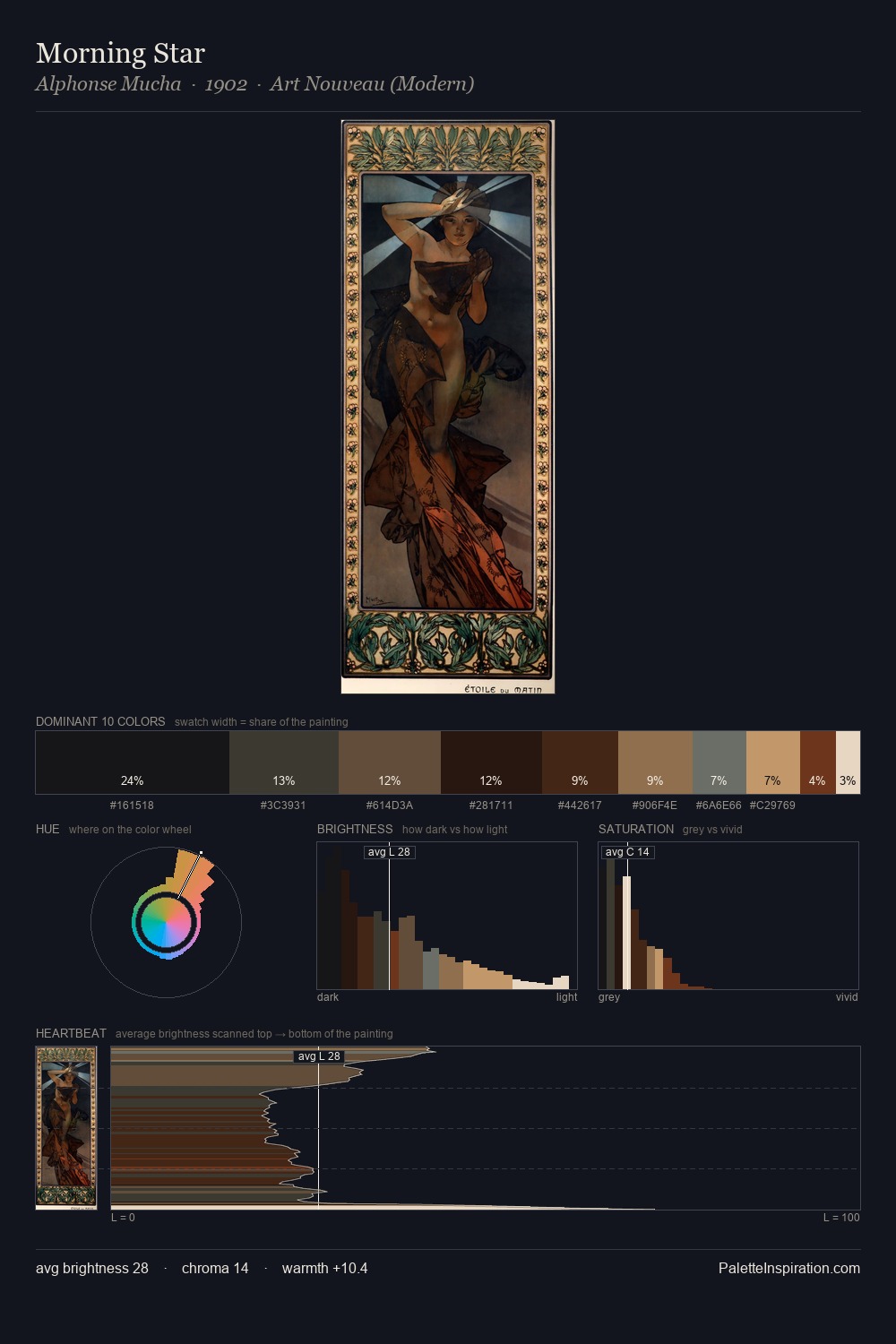
The value structure of Peter Paul Rubens is mid-key: quiet, controlled, and cohesive. Warmth dominates - the palette of Peter Paul Rubens leans heavily on the yellow-orange-red arc of the colour wheel. Every colour is desaturated; the palette proceeds through near-neutrals and gently-coloured greys. At 29.6%, #181513 functions less as a colour accent and more as a complete atmospheric environment. #C2A475 functions as the palette's exclamation mark: highest chroma, lowest percentage (5.8%). At 71 units of value range, the palette has the tonal breadth to sustain complex spatial readings. In the context of Peter Paul Rubens's full range of palettes, group 5 represents one movement in an ongoing chromatic dialogue.
Example use cases
- theater design
- jewelry brands
- tobacco-adjacent retail
- event branding
- film & entertainment
I Love This!
Use This Palette
Copy, export, or download for your project
Copy, export, or download for your project
Copy:
Download:
Share: