Peter Paul Rubens Palette 4
Muted Fawn
Muted Deliberately desaturated - chroma pulled toward gray, the restraint of tonal painting.
Fawn Light warm tan - the color of a young deer, soft and golden-brown.

Palette Analysis
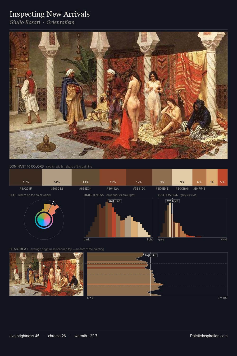
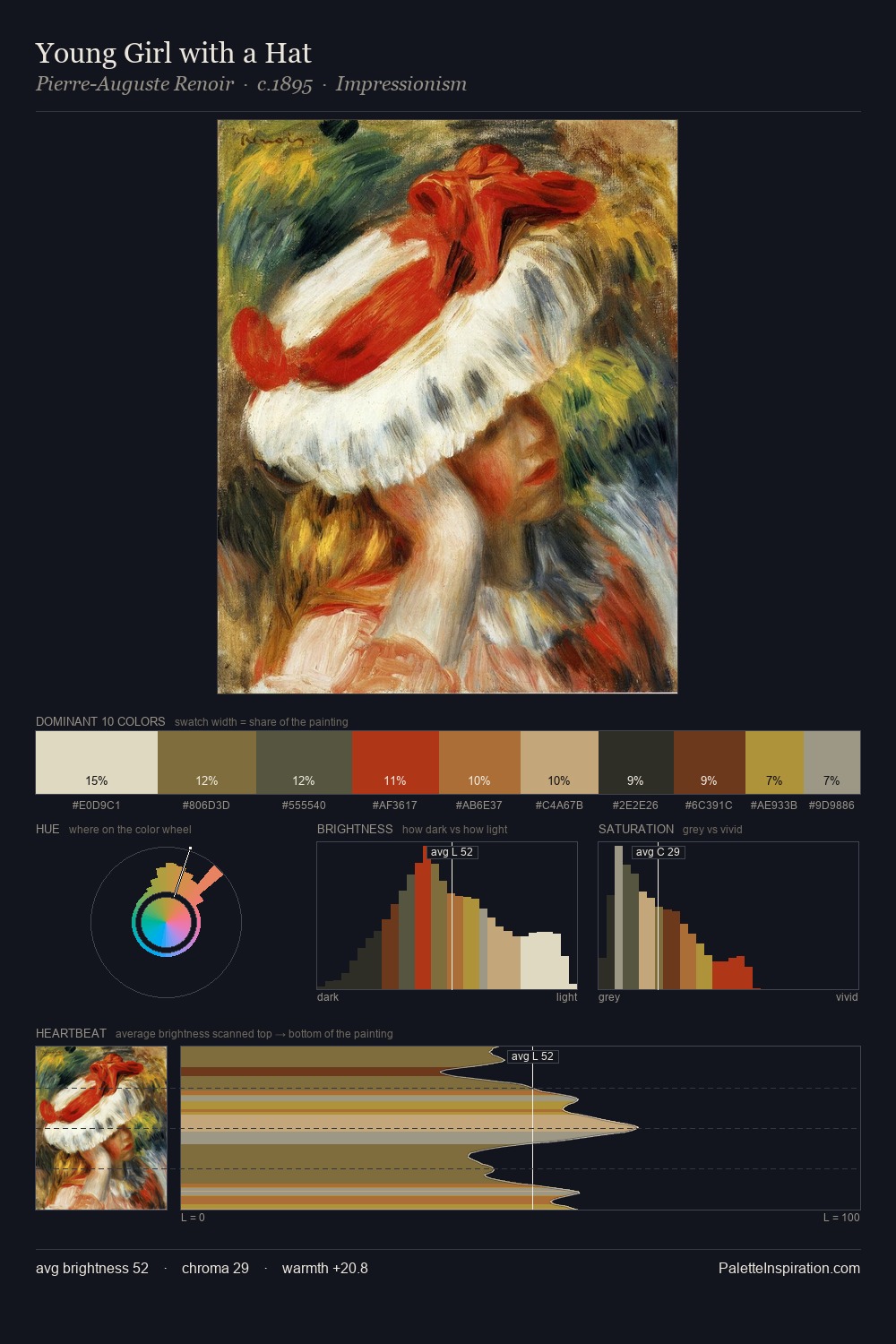
Peter Paul Rubens occupies the comfortable middle of the value scale, avoiding both extremes to hold the eye in a sustained middle grey. Warm hues command this palette; Peter Paul Rubens favours the reds, oranges, and yellows of firelight and earth. Colours are neither washed out nor blazing; they occupy the productive middle ground of the chroma scale. The highest-chroma note - #9C5F2A - appears at just 7.0%, deployed as a precision accent against the quieter ground. Spanning 52 units on the value axis, the palette achieves the balance between tonal flatness and fragmentation. In the context of Peter Paul Rubens's full range of palettes, group 4 represents one movement in an ongoing chromatic dialogue.
Example use cases
- publishing
- corporate identity
- consumer apps
- hospitality
- design agencies
I Love This!
Use This Palette
Copy, export, or download for your project
Copy, export, or download for your project
Copy:
Download:
Share: