Peter Paul Rubens Palette 14
Shadowed Bister
Shadowed Low-key - values weighted toward shadow, the palette of dim interiors and overcast skies.
Bister Dark warm brown - a traditional ink and wash pigment made from wood soot.

Palette Analysis
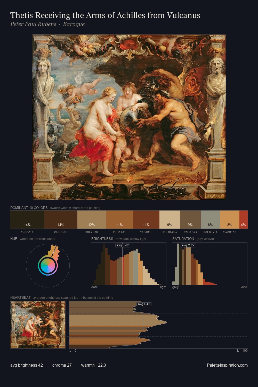
Peter Paul Rubens sits in the centre of the value range, lending the palette a sense of even, sustained light. Heat pervades this palette; warm chromatic identities outweigh cool ones at almost every weight. Chroma hovers near zero; colour declares itself through subtle shifts in hue rather than outright saturation. The most saturated colour, #624E2A, is reserved to 10.3% of the surface, where it acts as a focal punctuation. The palette spans 49 value units: a measured range that delivers coherence over drama. Palette 14 sits within the larger chromatic argument that Peter Paul Rubens's complete body of work advances.
Example use cases
- theater design
- jewelry brands
- tobacco-adjacent retail
- event branding
- film & entertainment
I Love This!
Use This Palette
Copy, export, or download for your project
Copy, export, or download for your project
Copy:
Download:
Share: