Peter Paul Rubens Palette 10
Shadowed Bister
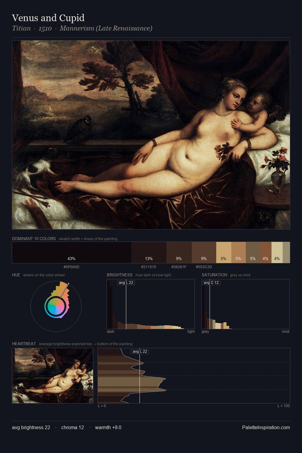
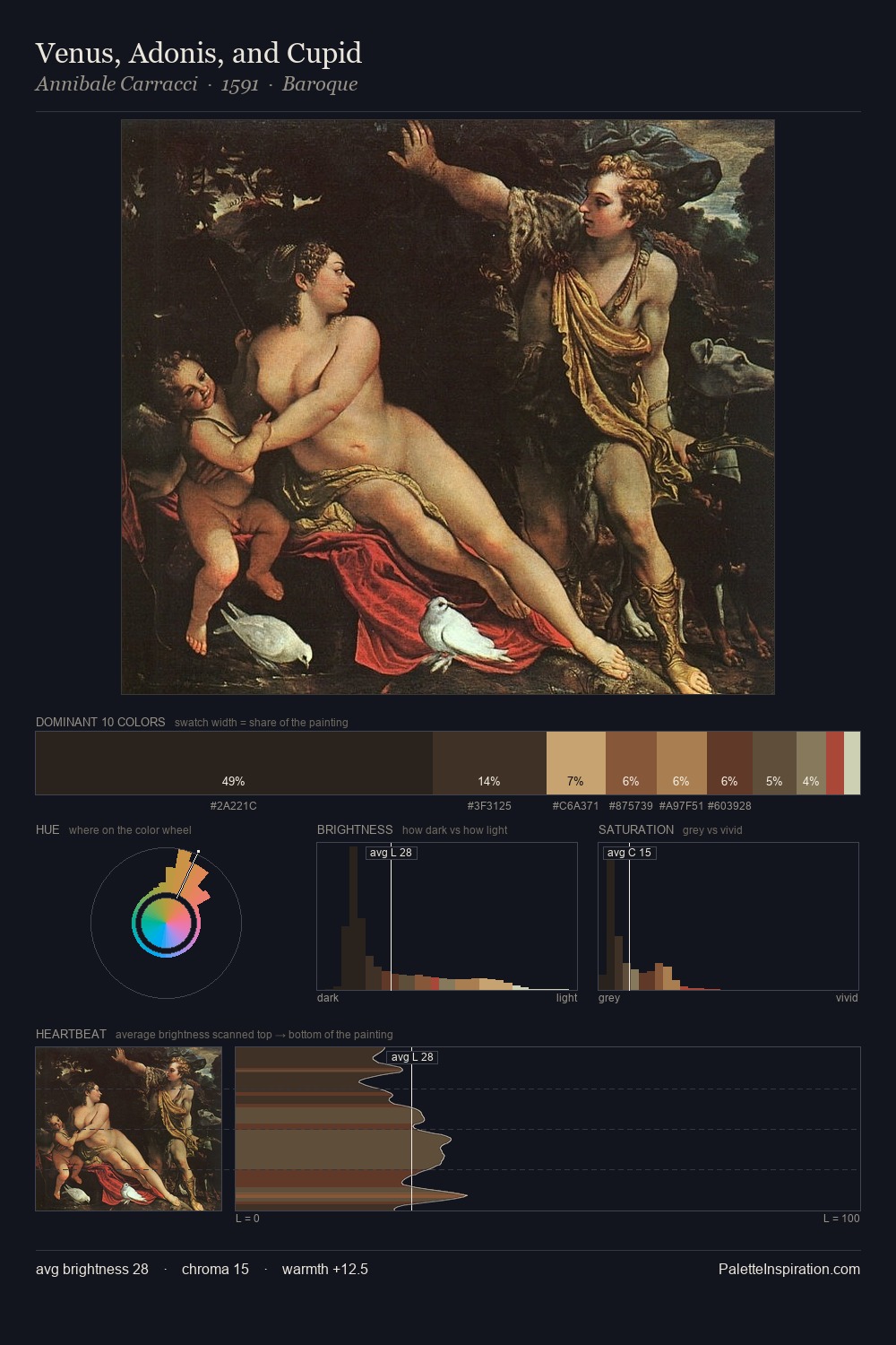
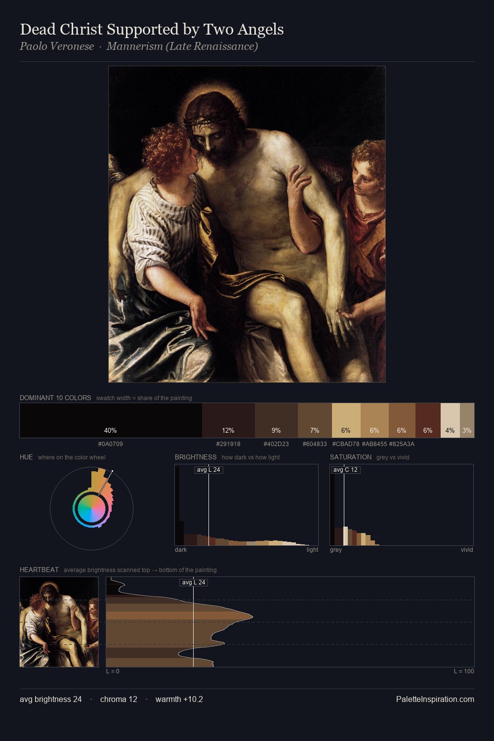
Shadowed Low-key - values weighted toward shadow, the palette of dim interiors and overcast skies.
Bister Dark warm brown - a traditional ink and wash pigment made from wood soot.

Palette Analysis
Peter Paul Rubens occupies the comfortable middle of the value scale, avoiding both extremes to hold the eye in a sustained middle grey. Temperature reads distinctly warm: the reds and earth tones from Peter Paul Rubens carry the compositional weight. Every colour is desaturated; the palette proceeds through near-neutrals and gently-coloured greys. The highest-chroma note - #6F4231 - appears at just 7.0%, deployed as a precision accent against the quieter ground. From deepest dark to palest light, the palette traverses 64 units of the value scale - a span that creates natural depth. Peter Paul Rubens's palette 10 carries its own internal logic while remaining in conversation with the artist's broader colour intelligence.
Example use cases
- theater design
- jewelry brands
- tobacco-adjacent retail
- event branding
- film & entertainment
I Love This!
Use This Palette
Copy, export, or download for your project
Copy, export, or download for your project
Copy:
Download:
Share: