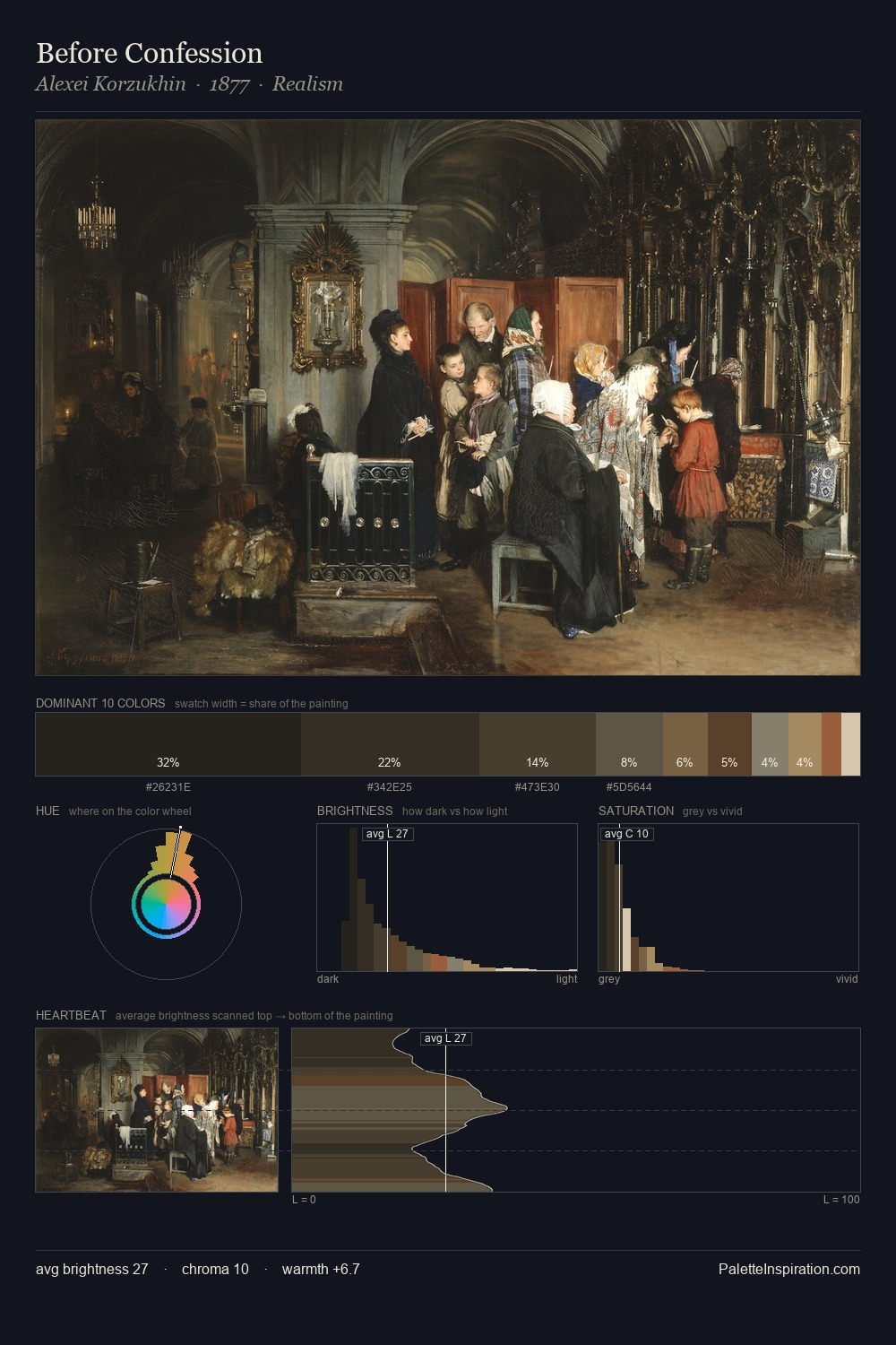
Peter Paul Rubens Palette 12

Palette Analysis
Peter Paul Rubens keeps values measured and balanced, a hallmark of tonal restraint. Cool hues prevail: blues, greens, and greys anchor the palette's emotional temperature. Muted throughout, the palette achieves its effects through value and temperature rather than chromatic force. The highest-chroma note - #D7C6A7 - appears at just 7.6%, deployed as a precision accent against the quieter ground. 61 units of value range underpin the palette's structural clarity: the eye always knows where light falls. The mid-to-high key, cool bias, and moderate chroma point to outdoor observation - sky and diffused daylight as the dominant light source. Peter Paul Rubens's palette 12 carries its own internal logic while remaining in conversation with the artist's broader colour intelligence.
Example use cases
- theater design
- jewelry brands
- tobacco-adjacent retail
- event branding
- film & entertainment
I Love This!
Copy, export, or download for your project