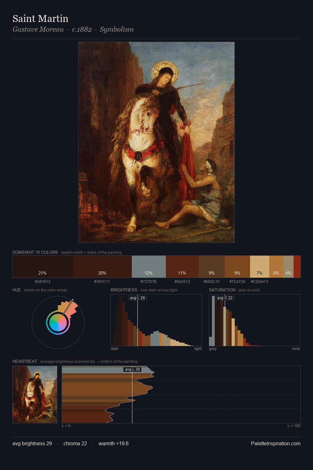
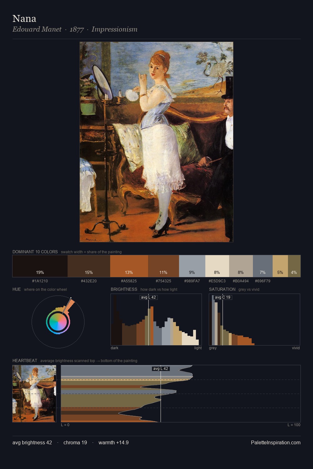
Matthias Stom Palette 7

Palette Analysis
Matthias Stom works almost entirely in the lower half of the value scale, privileging depth over brilliance. Yellow, ochre, sienna: warm hues that Matthias Stom deploys as the palette's primary energy. All colours lean toward grey, building depth through value rather than colour punch. #171314 at 34.3% of the palette: an overwhelming presence that pulls all other colours into its gravitational field. The most saturated colour, #B8773A, is reserved to 4.4% of the surface, where it acts as a focal punctuation. At 53 units across the value scale, the palette keeps contrast readable without letting it dominate. Together these qualities place Matthias Stom firmly in the tonal tradition - concerned with mood and atmosphere rather than chromatic display. This is palette 7 of Matthias Stom's sequence - a single chapter in a chromatic story told across many works.
Example use cases
- theater design
- jewelry brands
- tobacco-adjacent retail
- event branding
- film & entertainment
I Love This!
Copy, export, or download for your project