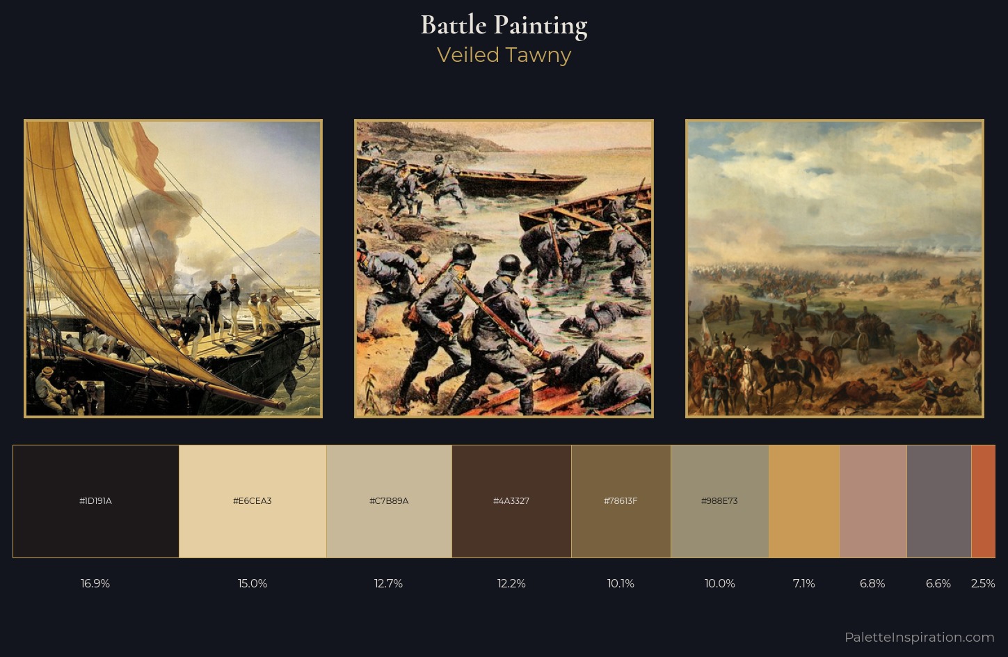
Battle Painting Palette 9
Veiled Tawny
Veiled Partially obscured light - mid-dark with a hazy, scrim-filtered quality.
Tawny Warm orange-brown - a traditional term for the color of tanned leather or lion fur.
Palette Analysis
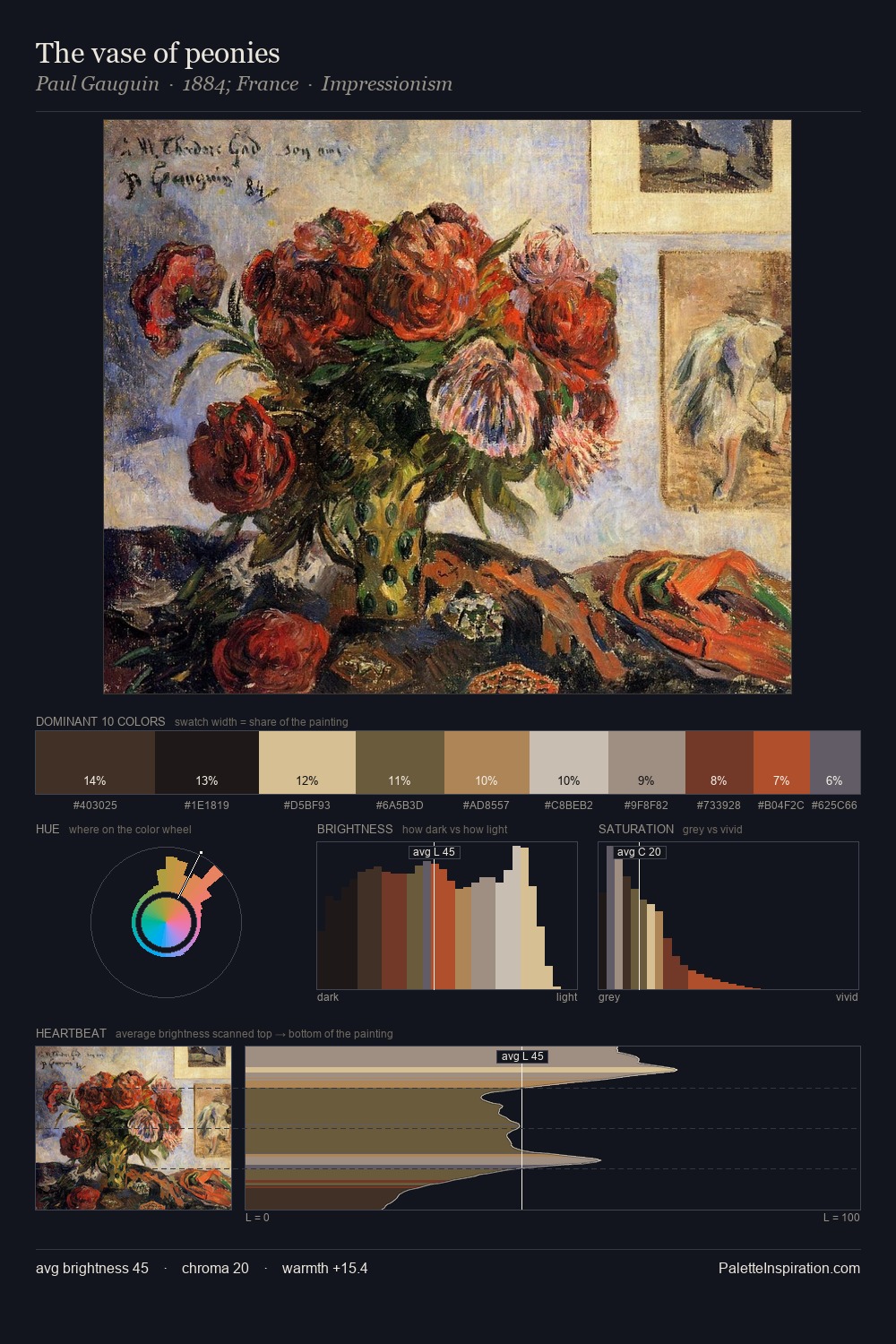
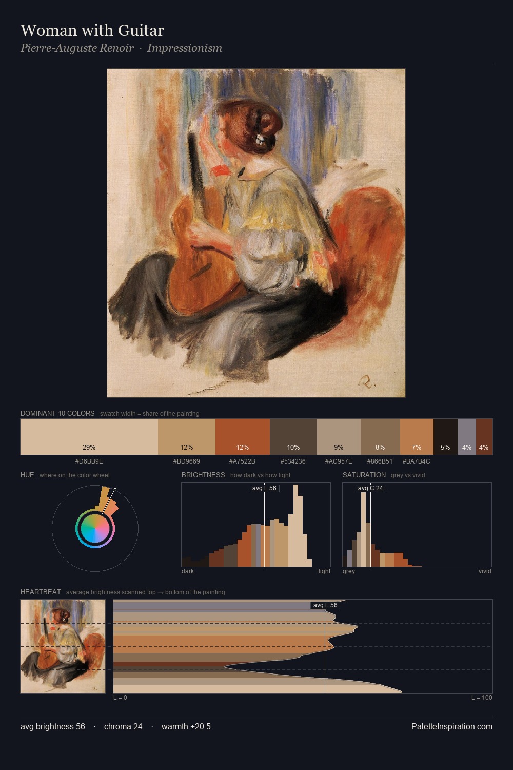
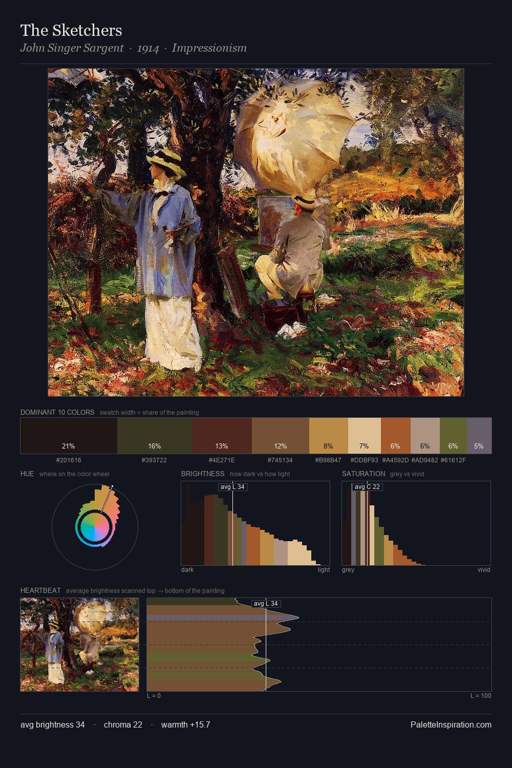
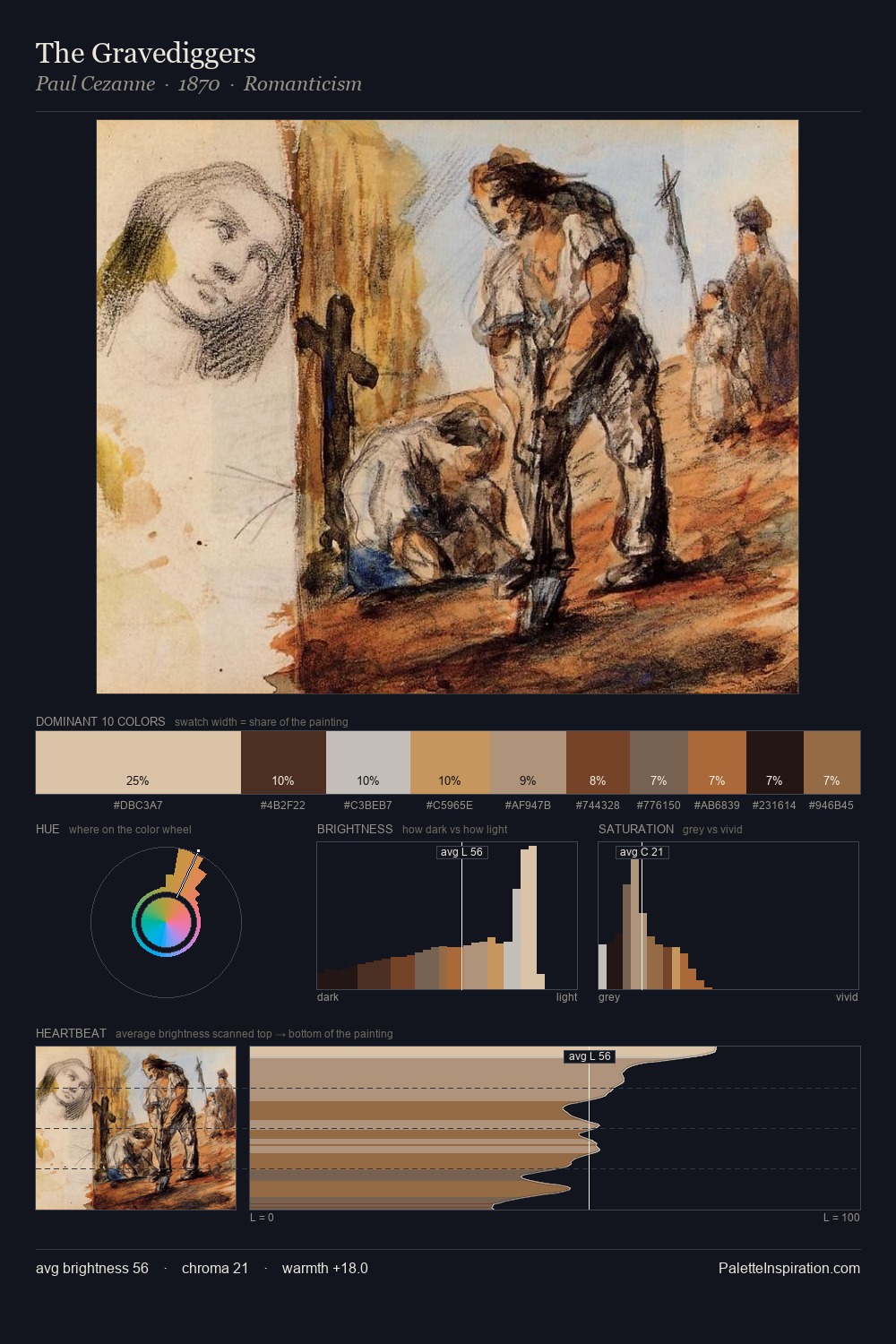
battle painting sits in the centre of the value range, lending the palette a sense of even, sustained light. The palette balances warm and cool with remarkable evenness, giving the composition its characteristic vibrancy. All colours lean toward grey, building depth through value rather than colour punch. The saturated accent, #78613F, registers at 10.1% - sparse enough to feel like a deliberate surprise. At 64 units of value range, the palette has the tonal breadth to sustain complex spatial readings.
Example use cases
- ceramics & pottery
- boutique hospitality
- menswear
- heritage food brands
- craft & artisan brands
I Love This!
Use This Palette
Copy, export, or download for your project
Copy, export, or download for your project
Copy:
Download:
Share: