Battle Painting Palette 25
Nocturnal Bister
Nocturnal Night-register palette - very low values, the world after dark.
Bister Dark warm brown - a traditional ink and wash pigment made from wood soot.

Palette Analysis
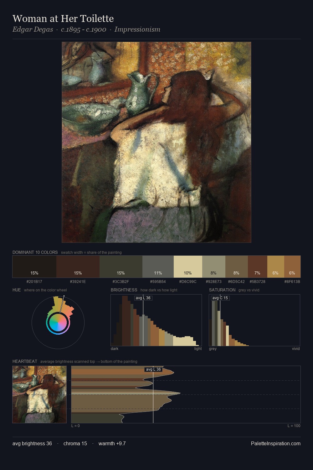
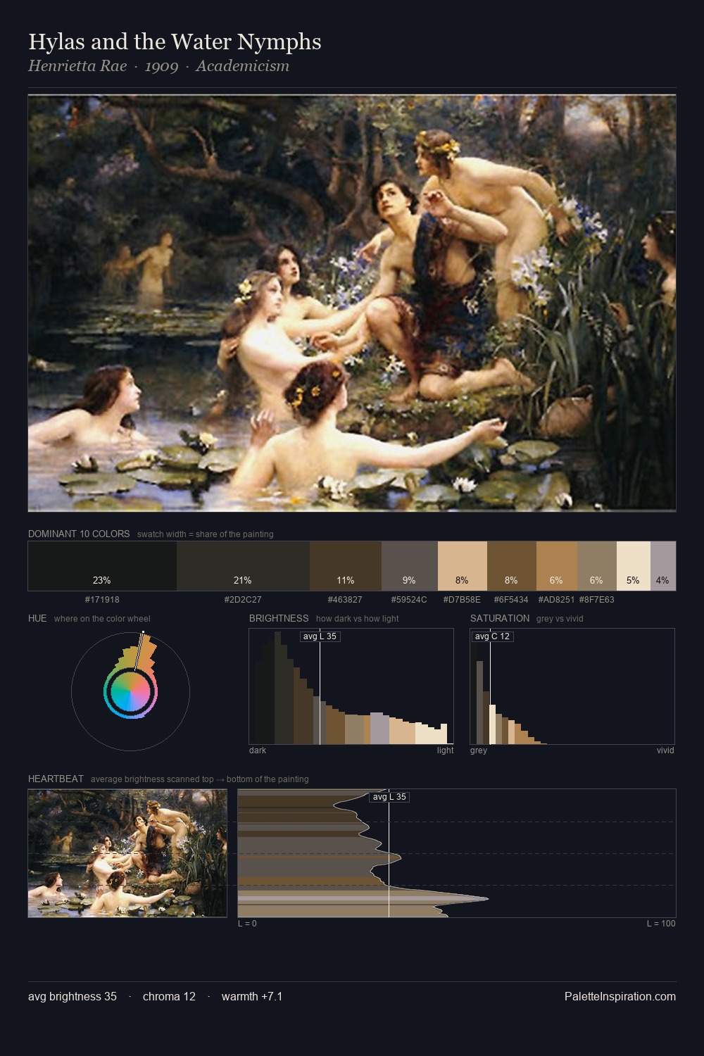
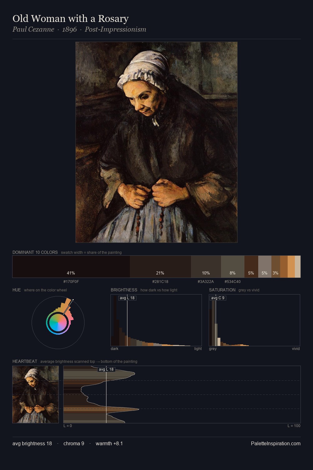
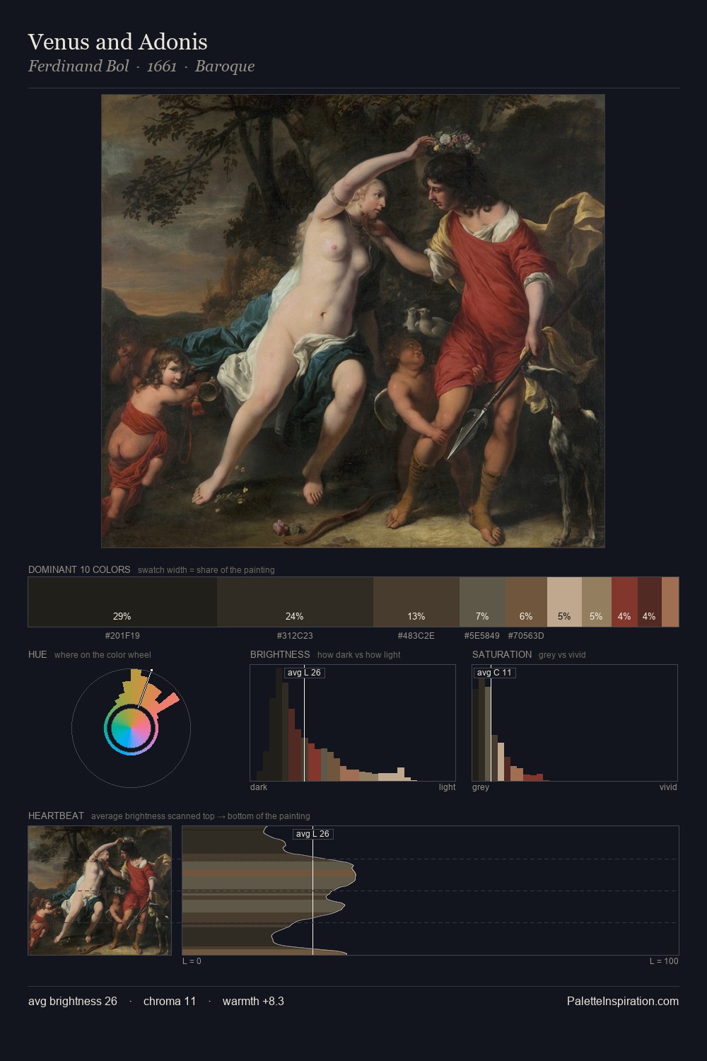
Values in battle painting rest in the mid-range - neither dramatically lit nor steeped in shadow. Cool tones set the register here - the blues and greens easily outweigh any warm accents. Chroma is kept low across all colours, producing the soft, enveloping quality that characterises tonal painting. The highest-chroma note - #CDB488 - appears at just 4.3%, deployed as a precision accent against the quieter ground. At 57 units of value range, the palette has the tonal breadth to sustain complex spatial readings. High luminosity and cool temperature suggest the plein-air condition: unfiltered daylight and open sky.
Example use cases
- theater design
- jewelry brands
- tobacco-adjacent retail
- event branding
- film & entertainment
I Love This!
Use This Palette
Copy, export, or download for your project
Copy, export, or download for your project
Copy:
Download:
Share: