Battle Painting Palette 22
Dimmed Heather
Dimmed Moderate shadow - values pulled toward mid-dark, as if a light source has been reduced.
Heather Muted mauve - the color of Scottish heather, gray-purple and soft.

Palette Analysis
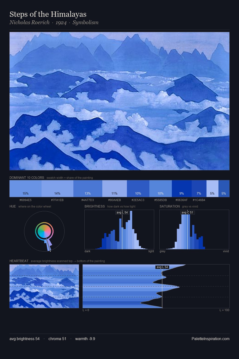
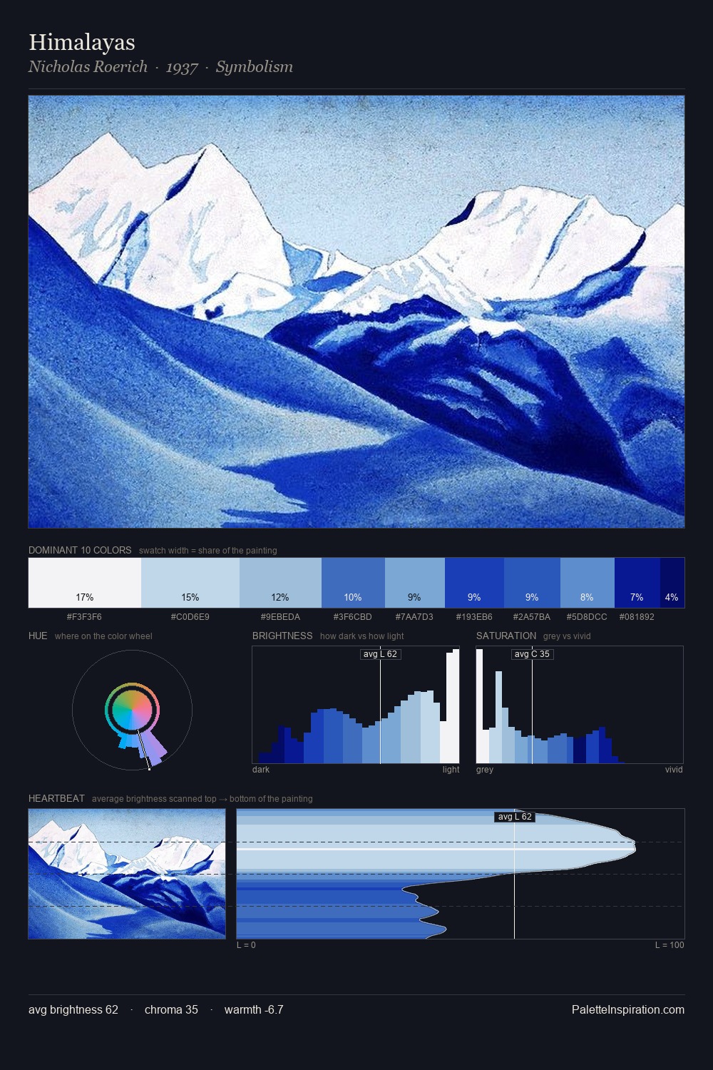
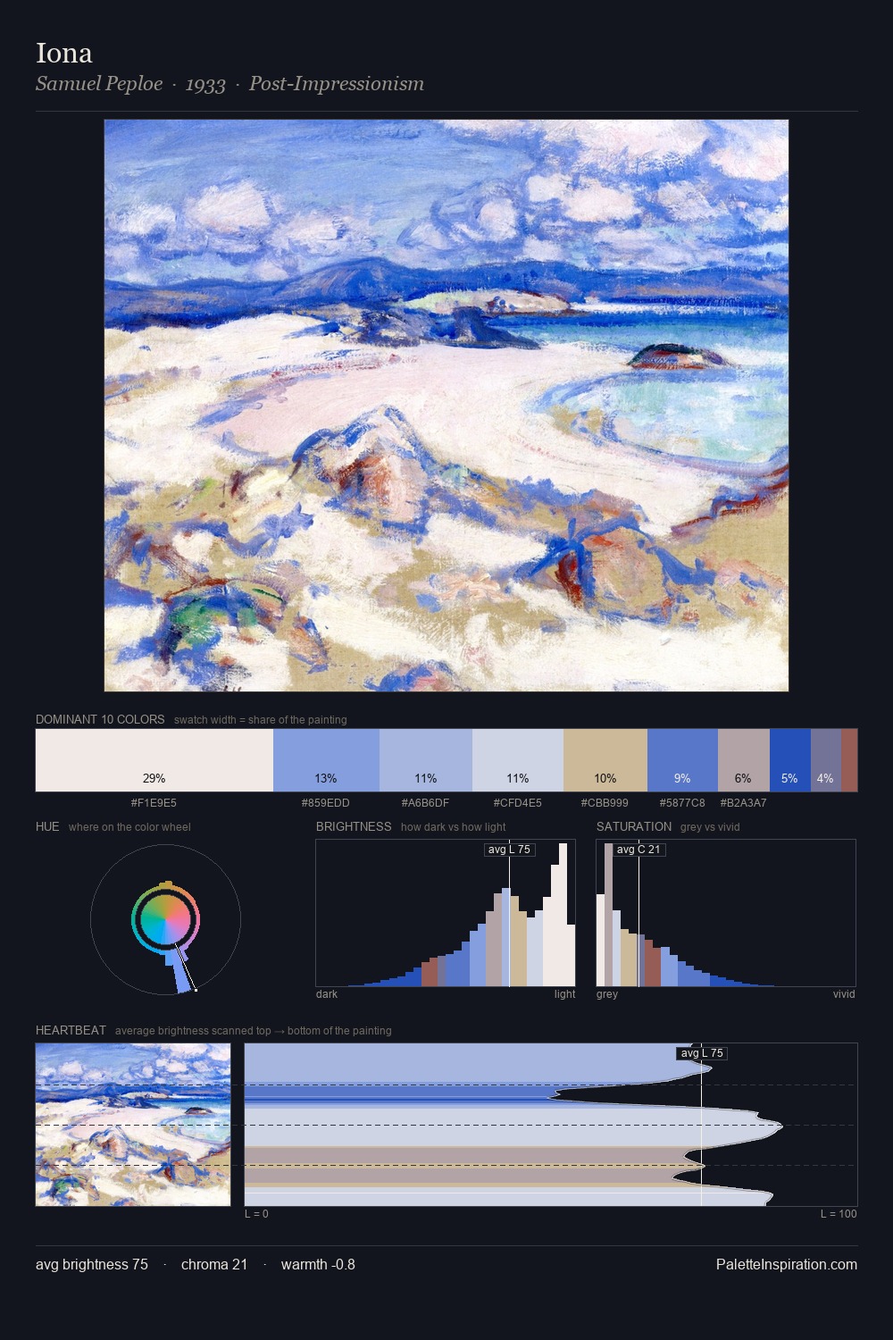
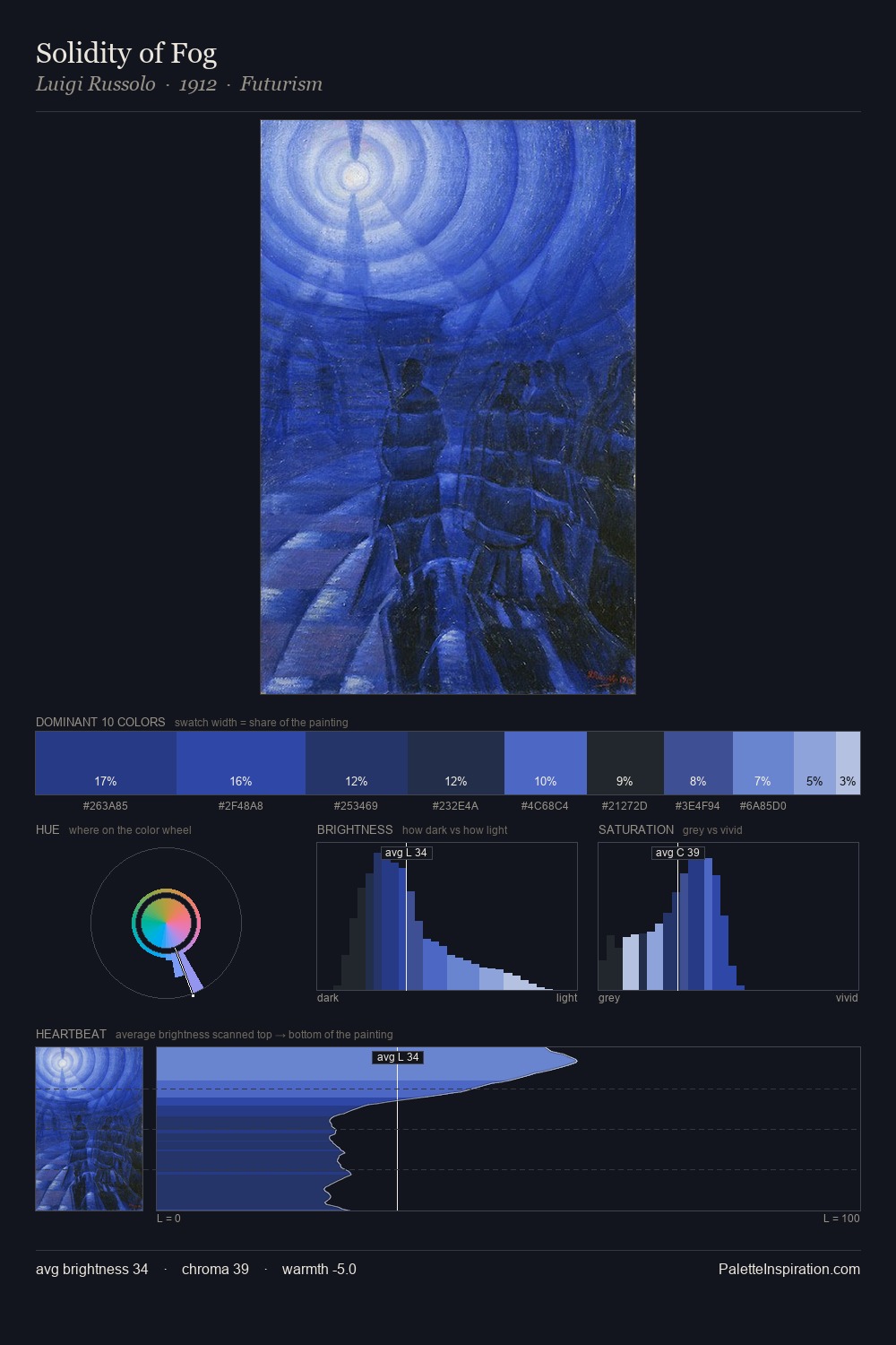
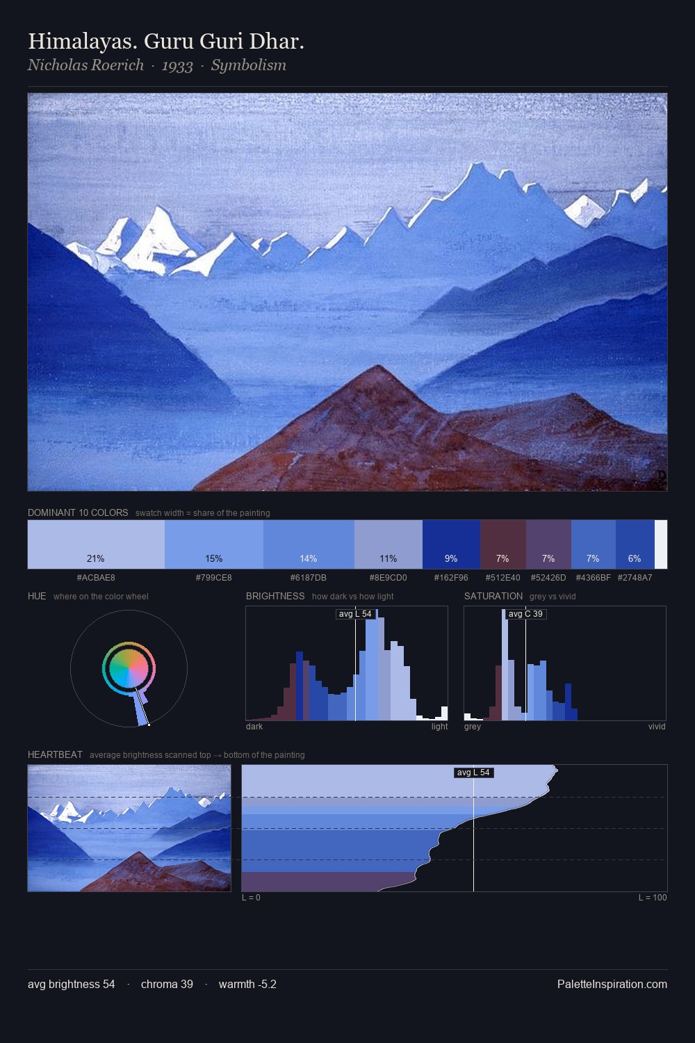
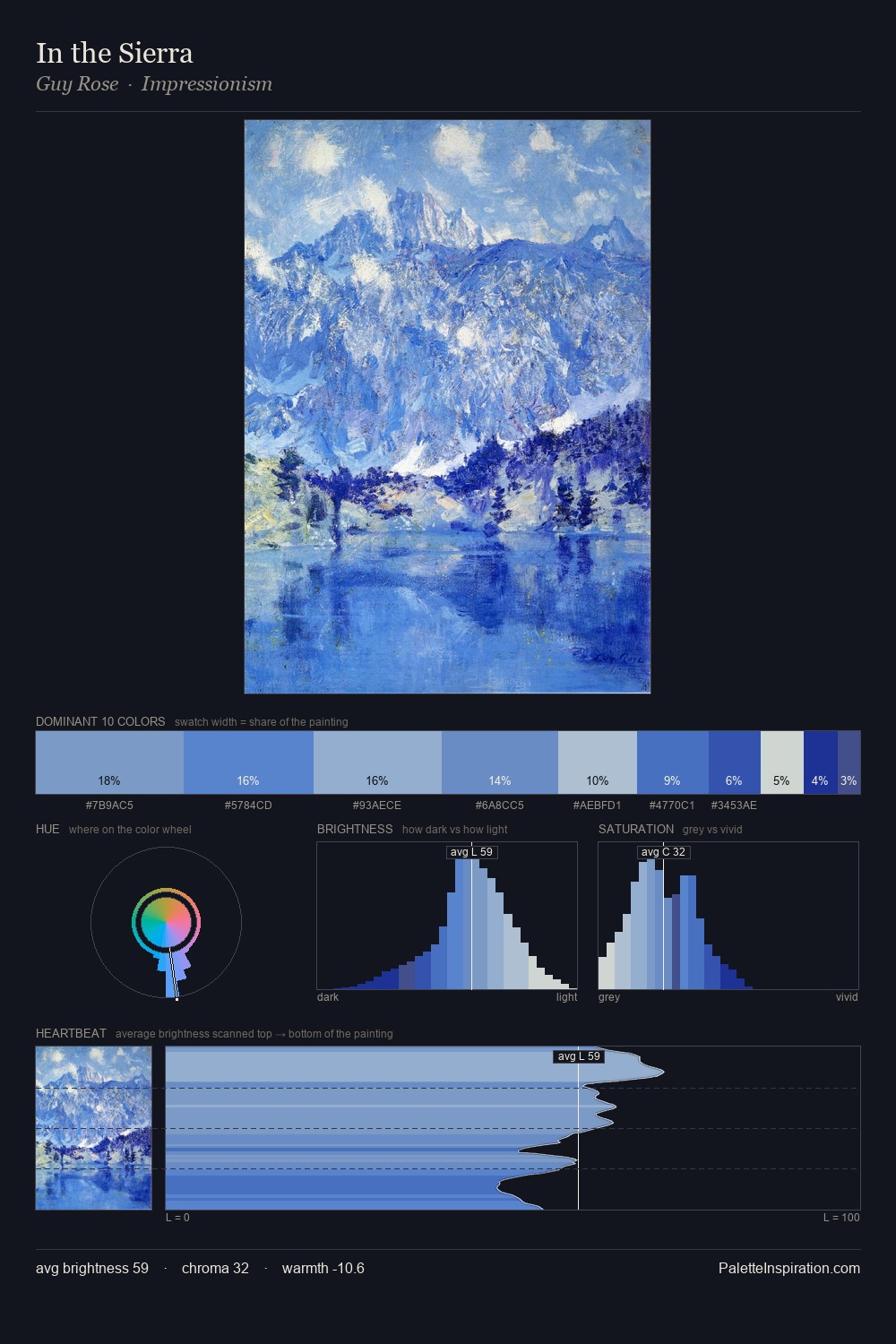
Values in battle painting rest in the mid-range - neither dramatically lit nor steeped in shadow. Cool tones set the register here - the blues and greens easily outweigh any warm accents. Mid-saturation across the board: the palette has colour character without chromatic excess. The saturated accent, #2F52BB, registers at 11.5% - sparse enough to feel like a deliberate surprise. 35 units of value spread create a palette that is varied but unified - contrast in the service of harmony. High luminosity and cool temperature suggest the plein-air condition: unfiltered daylight and open sky.
Example use cases
- publishing
- corporate identity
- consumer apps
- hospitality
- design agencies
I Love This!
Use This Palette
Copy, export, or download for your project
Copy, export, or download for your project
Copy:
Download:
Share: