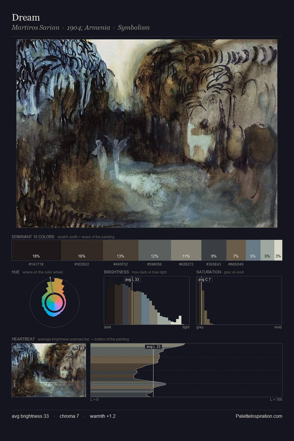
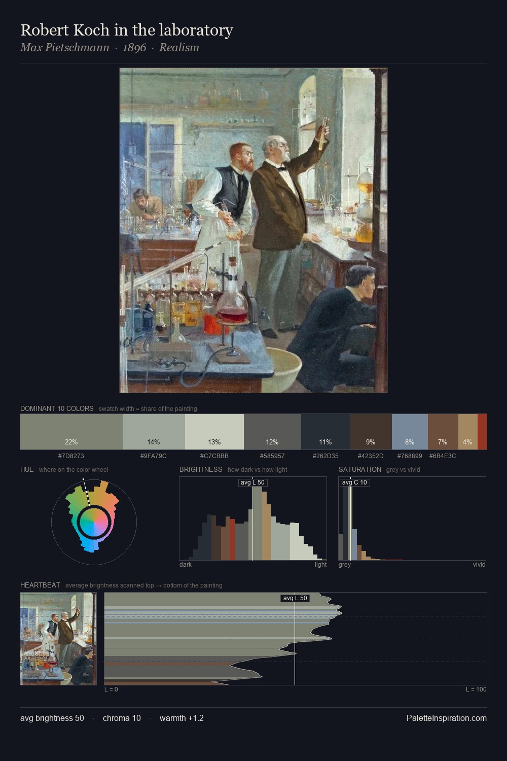
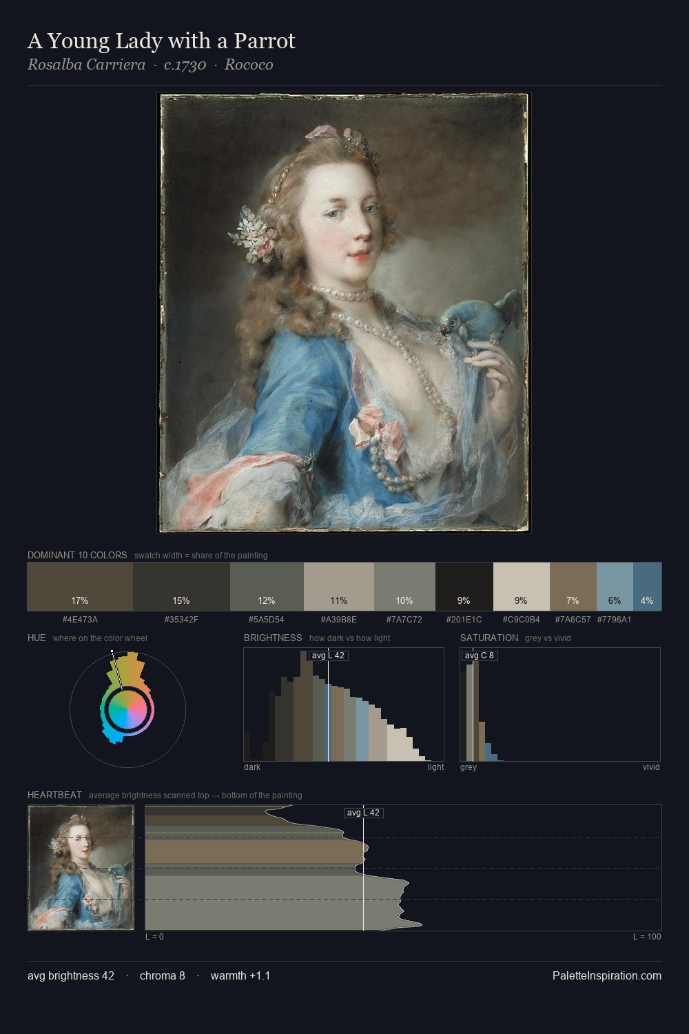
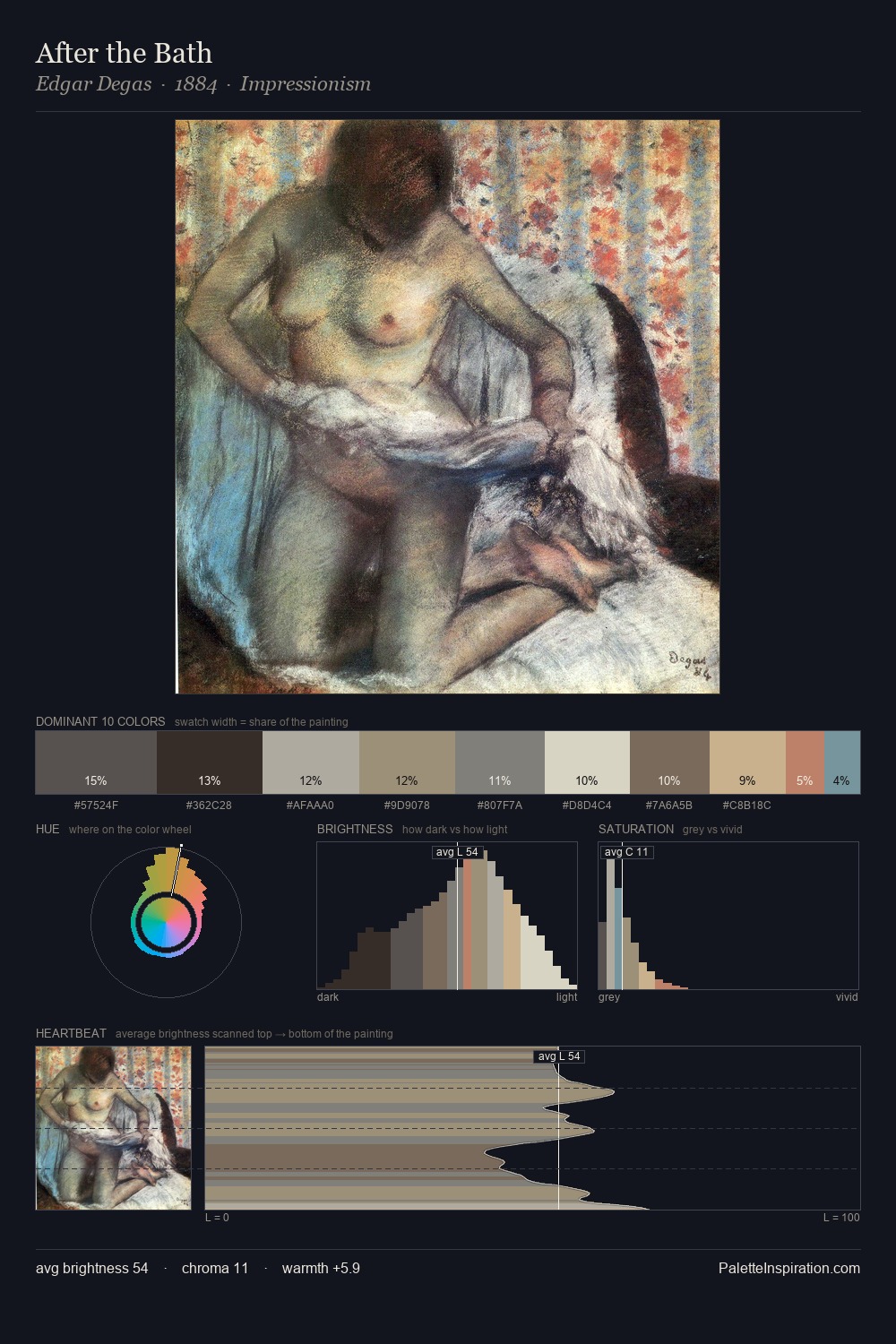
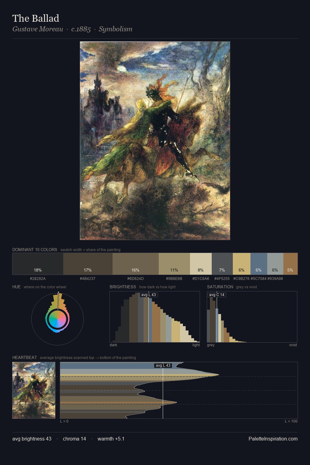
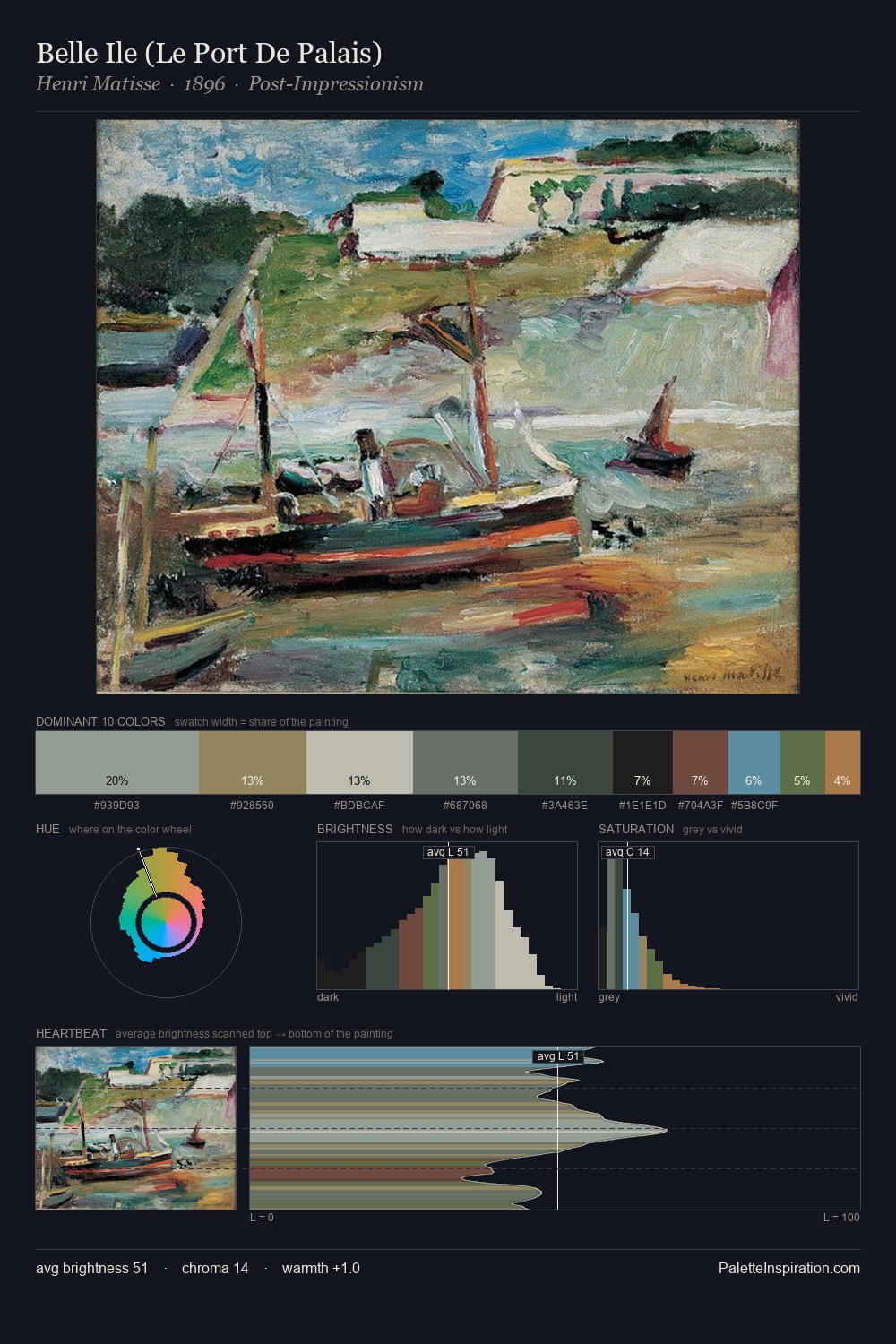
Battle Painting Palette 19
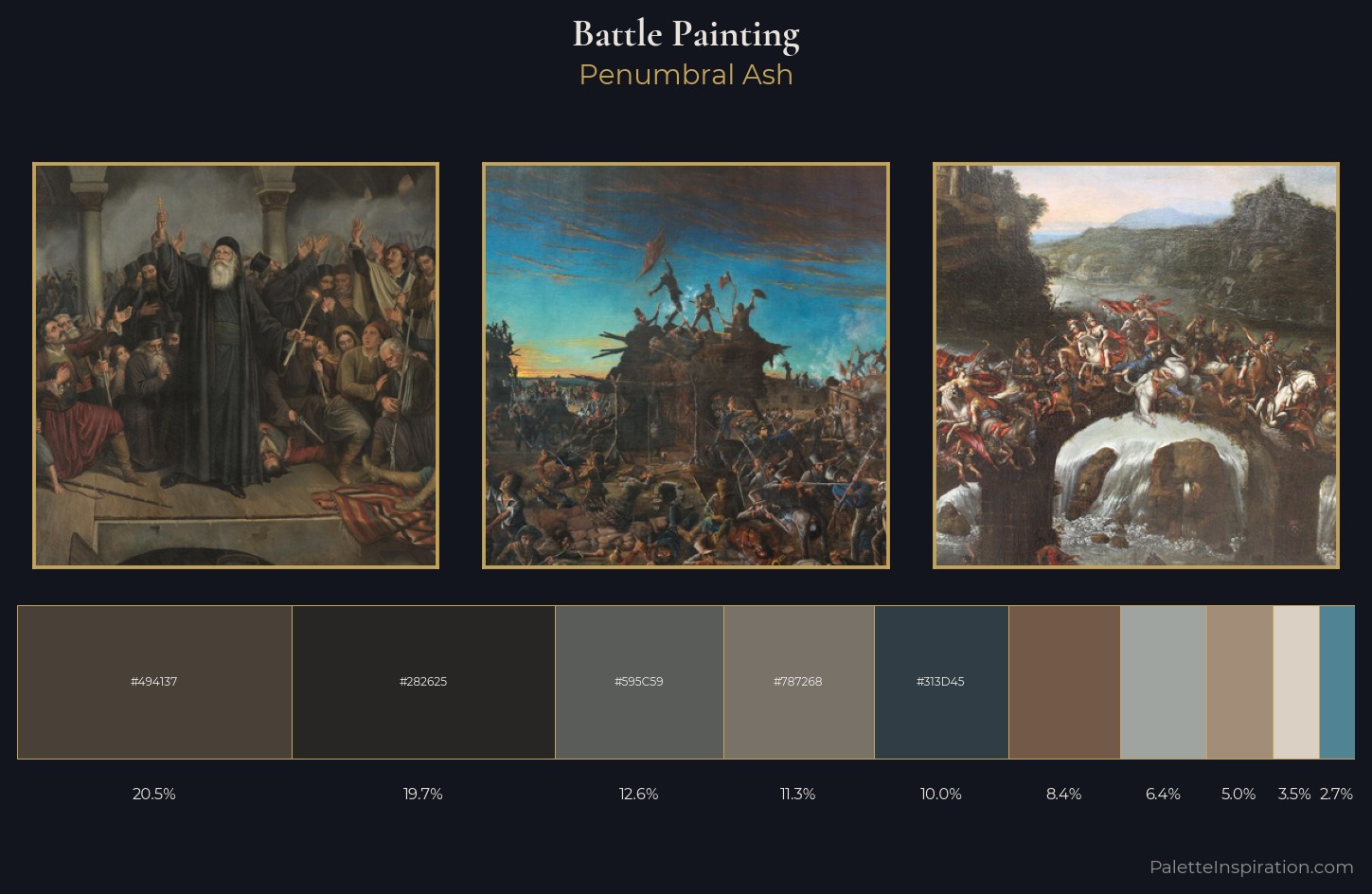
Penumbral Ash
Penumbral Partial shadow - the transitional zone between light and full dark, soft-edged.
Ash Mid cool-gray - the neutral residue of fire, between white and charcoal.
Palette Analysis
The value structure of battle painting is mid-key: quiet, controlled, and cohesive. The palette achieves thermal balance - reds and blues, ochres and greens, each holding the other in check. Chroma hovers near zero; colour declares itself through subtle shifts in hue rather than outright saturation. The saturated accent, #725948, registers at 8.3% - sparse enough to feel like a deliberate surprise. From deepest dark to palest light, the palette traverses 59 units of the value scale - a span that creates natural depth.
Example use cases
- theater design
- jewelry brands
- tobacco-adjacent retail
- event branding
- film & entertainment
I Love This!
Use This Palette
Copy, export, or download for your project
Copy, export, or download for your project
Copy:
Download:
Share: