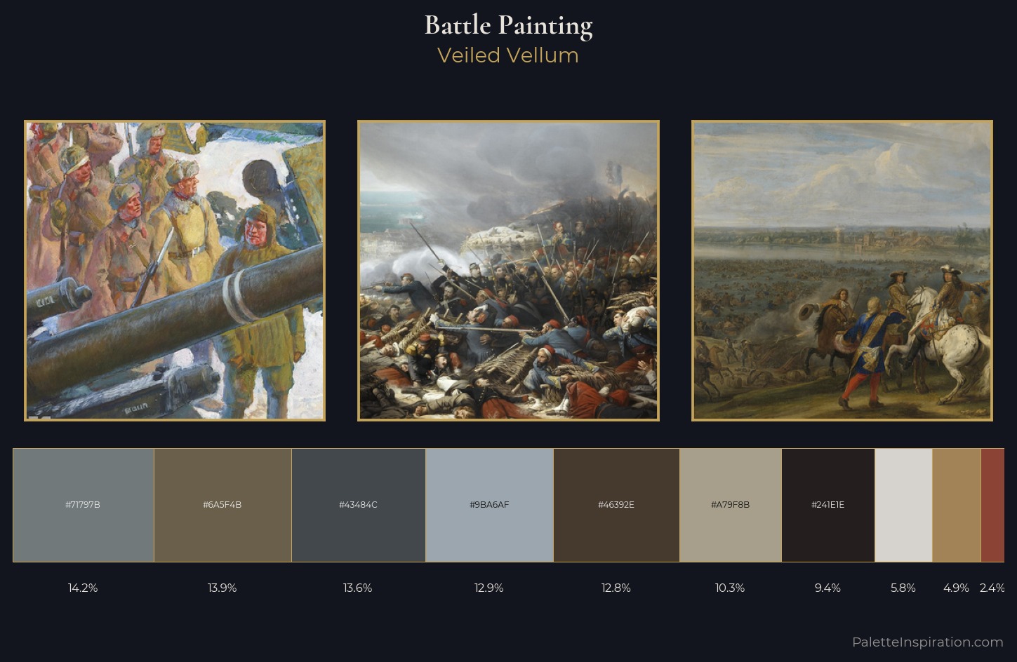
Battle Painting Palette 16
Veiled Vellum
Veiled Partially obscured light - mid-dark with a hazy, scrim-filtered quality.
Vellum Smooth pale tan - the color of prepared calf-skin vellum, warmer than parchment.
Palette Analysis
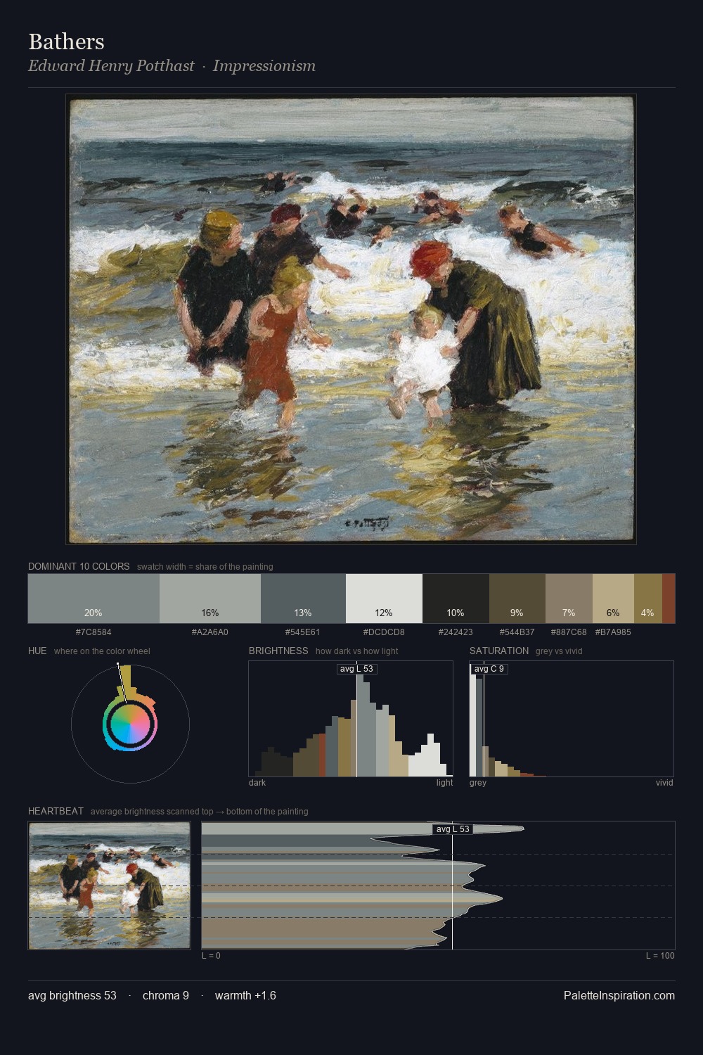
battle painting distributes its values across the middle register, creating harmony without high contrast. The palette tilts toward cool - blues and silver-greys carry the structural weight. All colours lean toward grey, building depth through value rather than colour punch. The most saturated colour, #46392E, is reserved to 12.8% of the surface, where it acts as a focal punctuation. The value range spans 63 units across the palette, providing the full gamut from deep shadow to near-white and ensuring clear tonal hierarchy. The palette has the character of outdoor light: cool, mid-bright, with colour rendered faithfully rather than expressively.
Example use cases
- exhibition design
- foundation branding
- estate management
- art education
- museums & galleries
I Love This!
Use This Palette
Copy, export, or download for your project
Copy, export, or download for your project
Copy:
Download:
Share: