Battle Painting Palette 4
Veiled Parchment
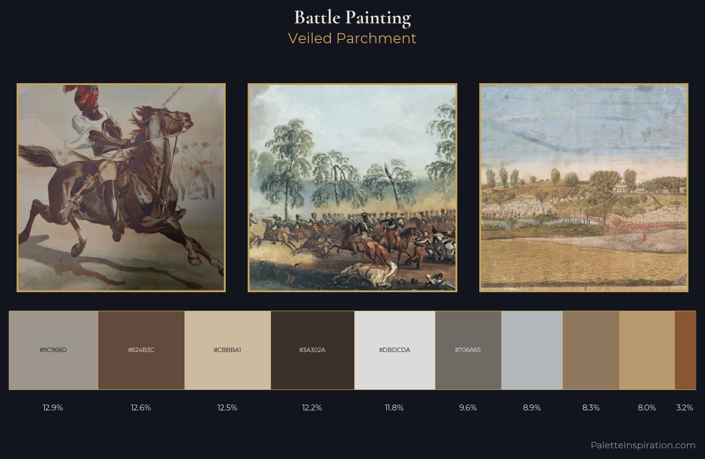
Veiled Partially obscured light - mid-dark with a hazy, scrim-filtered quality.
Parchment Aged warm neutral - the color of old manuscript parchment, tan and slightly yellowed.
Palette Analysis
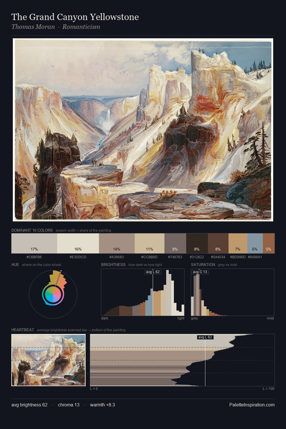
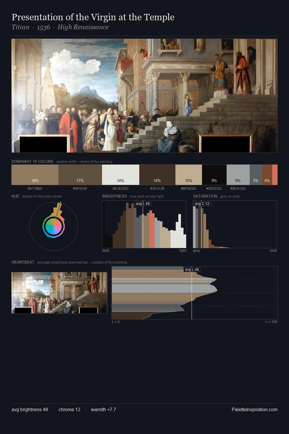
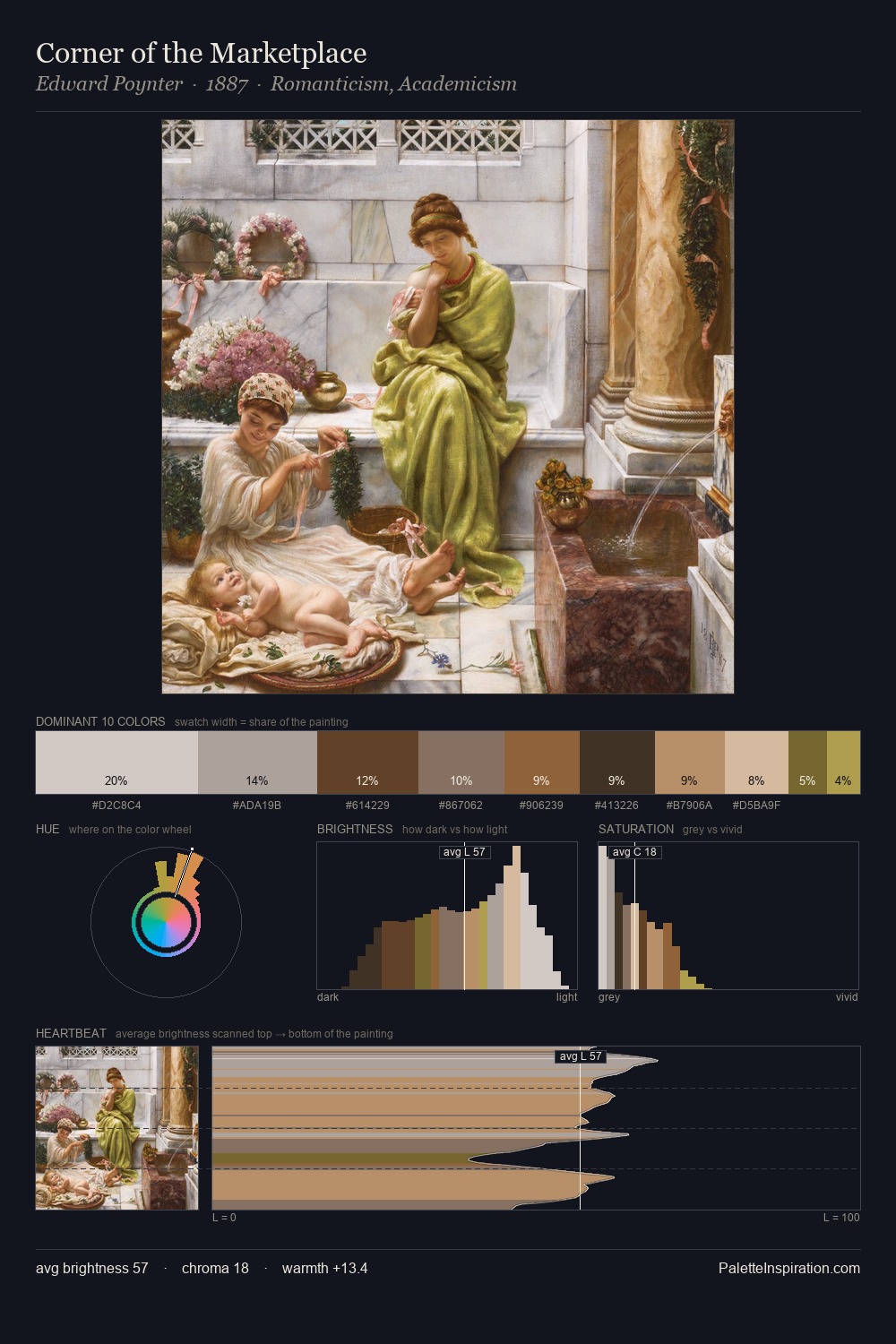
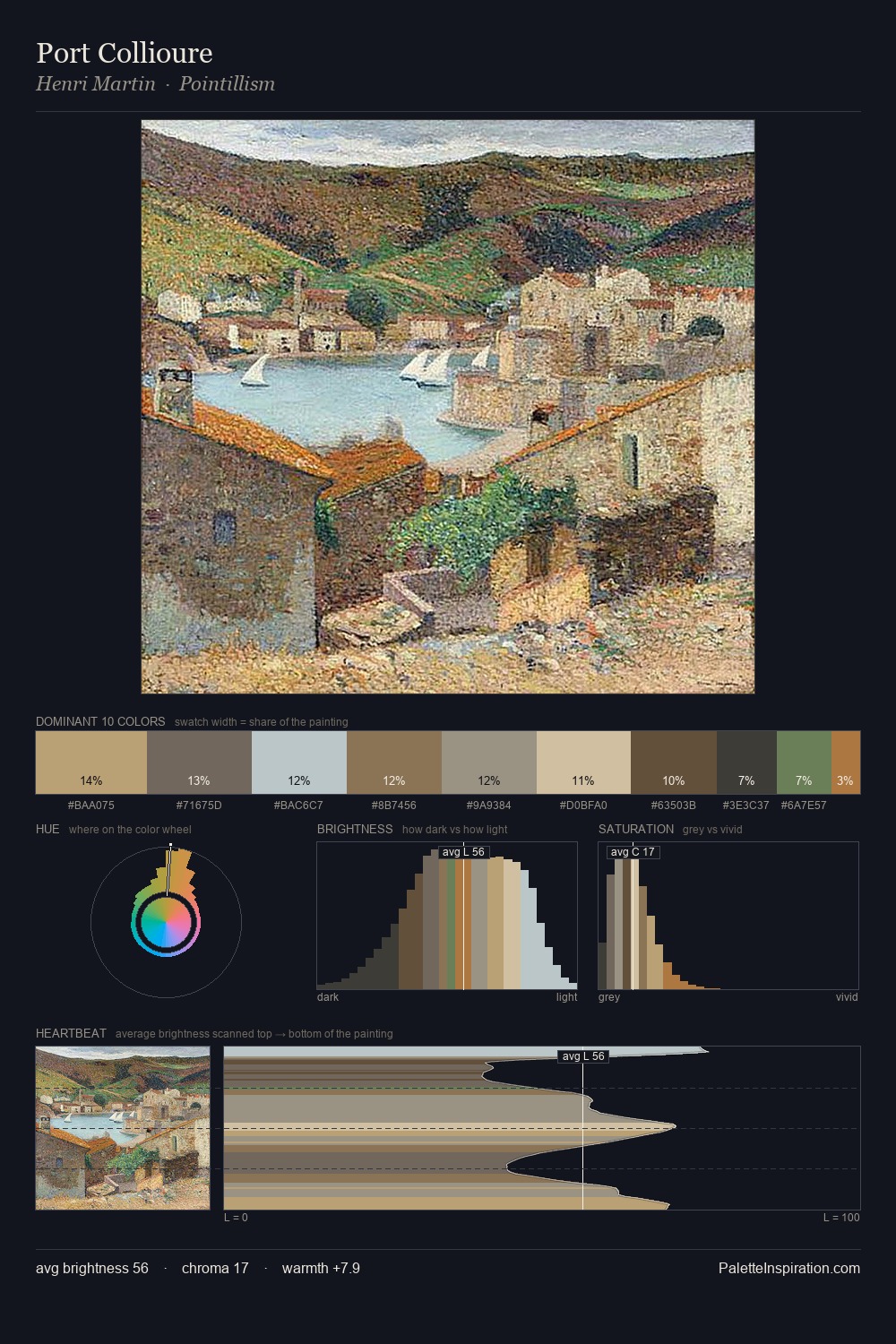
battle painting distributes its values across the middle register, creating harmony without high contrast. Warm and cool tones are held in careful balance - neither family dominates, creating tension and resolution simultaneously. Every colour is desaturated; the palette proceeds through near-neutrals and gently-coloured greys. #B89A71 functions as the palette's exclamation mark: highest chroma, lowest percentage (8.0%). From deepest dark to palest light, the palette traverses 57 units of the value scale - a span that creates natural depth.
Example use cases
- exhibition design
- foundation branding
- estate management
- art education
- museums & galleries
I Love This!
Use This Palette
Copy, export, or download for your project
Copy, export, or download for your project
Copy:
Download:
Share: