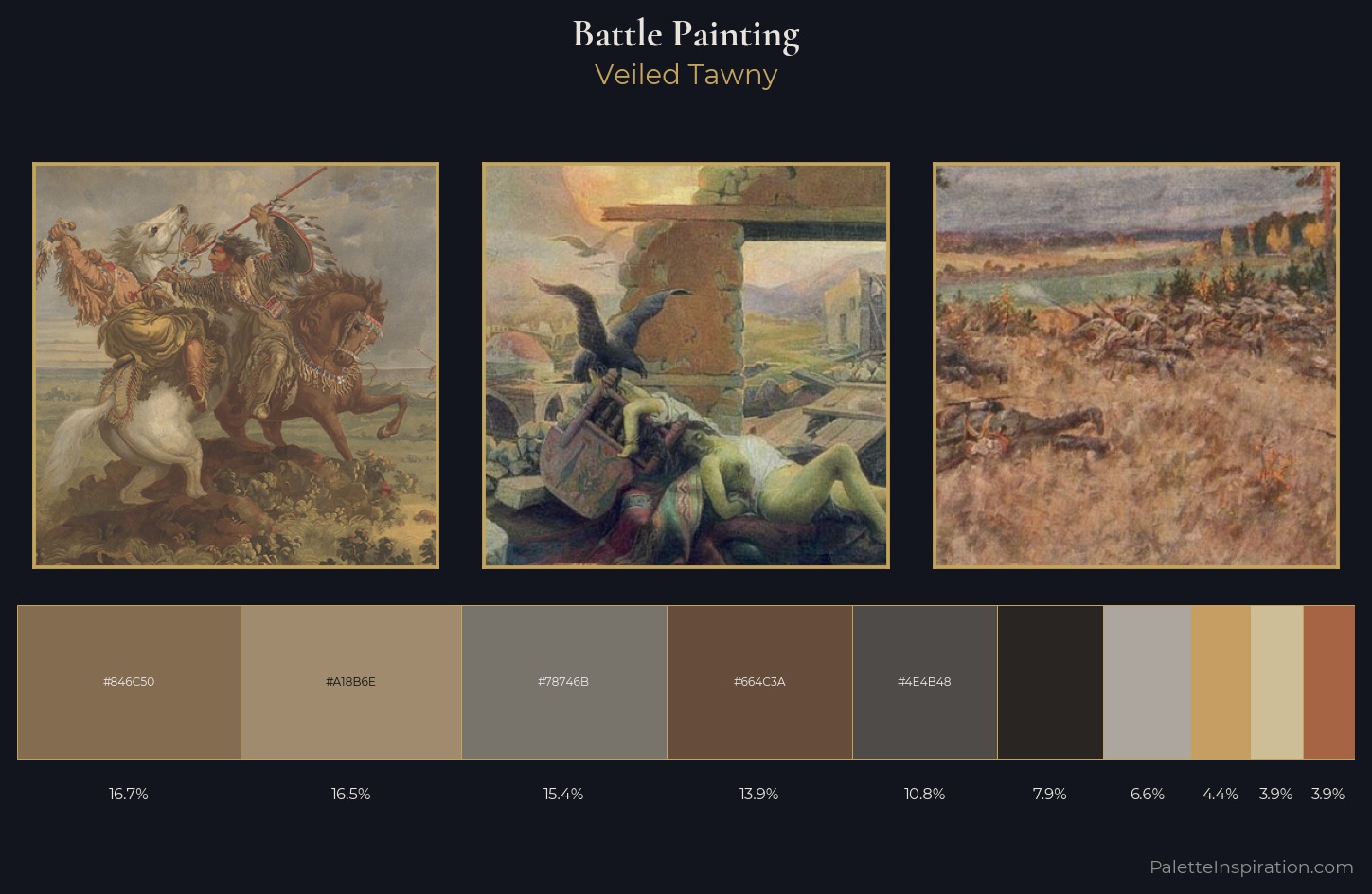
Battle Painting Palette 14
Veiled Tawny
Veiled Partially obscured light - mid-dark with a hazy, scrim-filtered quality.
Tawny Warm orange-brown - a traditional term for the color of tanned leather or lion fur.
Palette Analysis
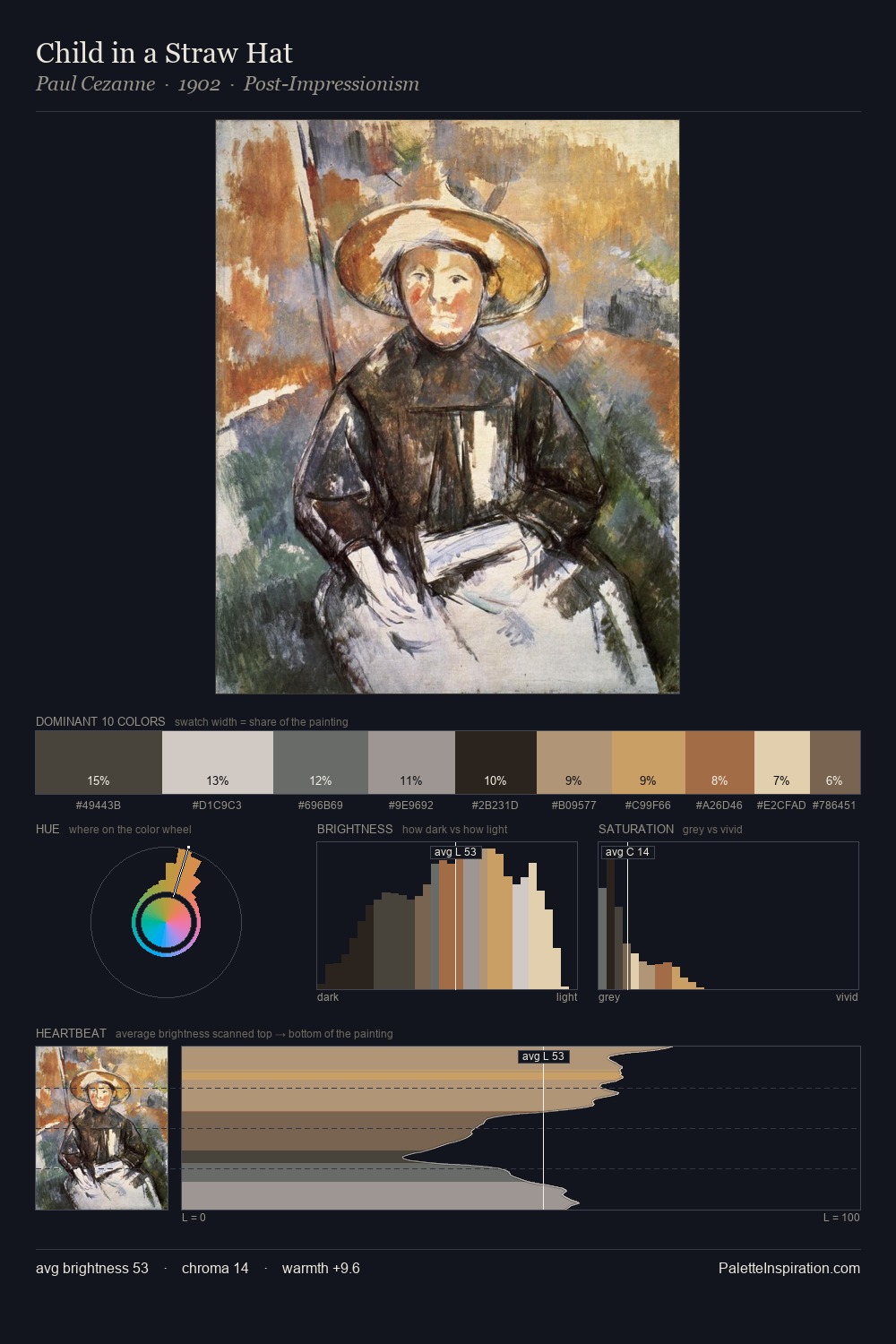
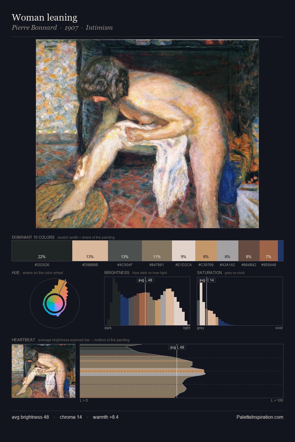
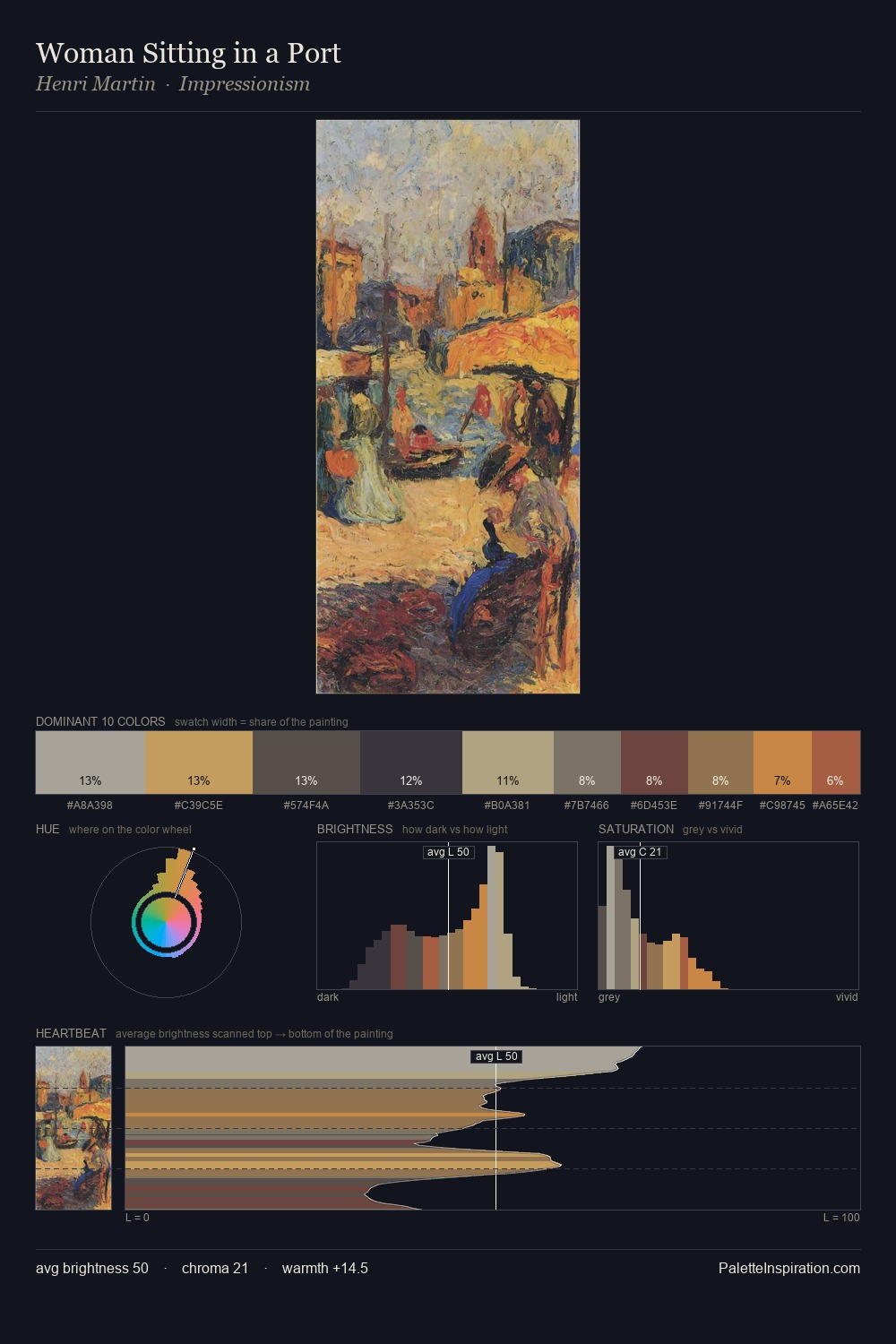
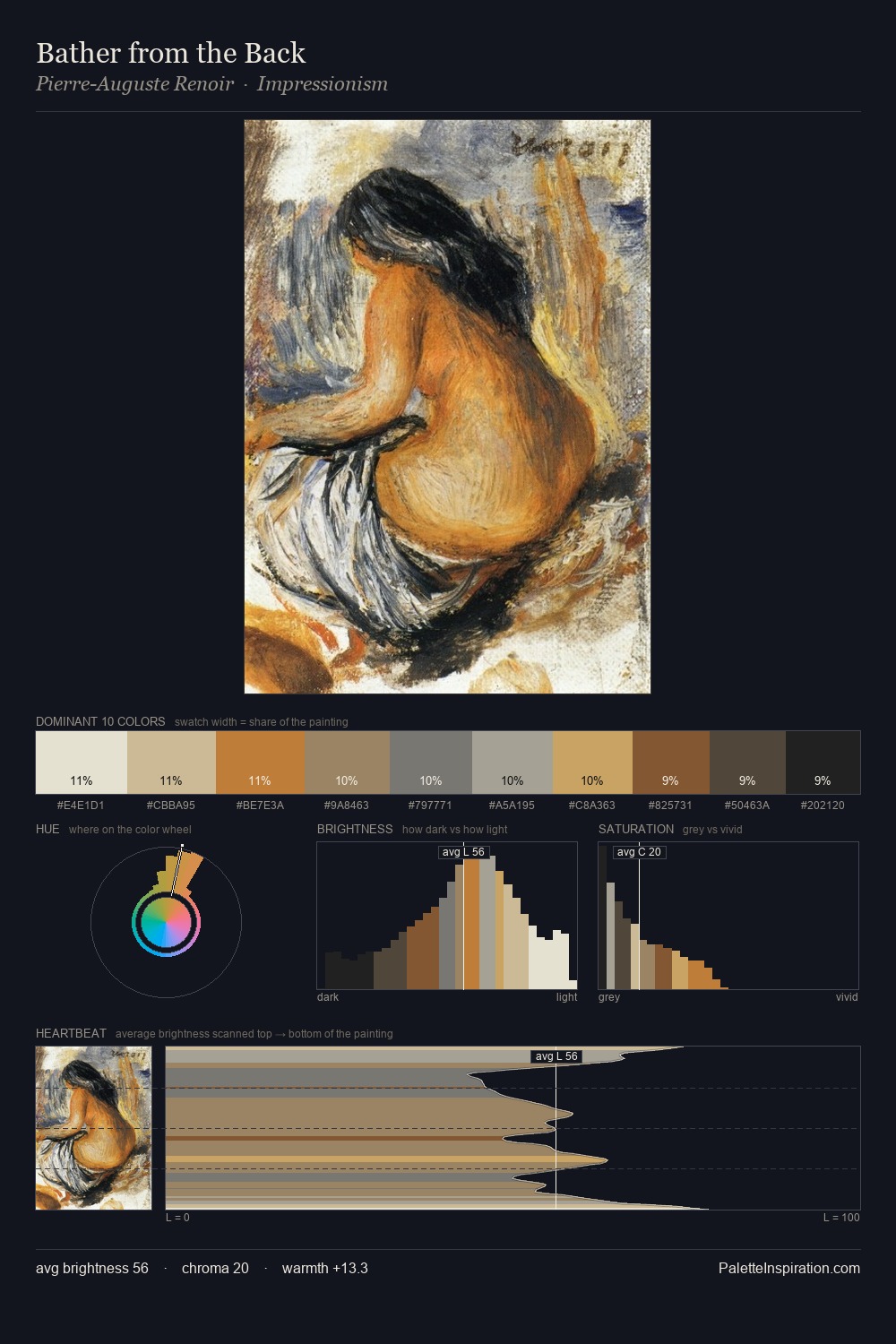
battle painting occupies the comfortable middle of the value scale, avoiding both extremes to hold the eye in a sustained middle grey. The palette orchestrates warmth above all else - reds, ambers, and siennas take the lead. Saturation is deliberately withheld - the beauty here lies in the near-monochromatic gradations rather than colour difference. The highest-chroma note - #A66445 - appears at just 3.9%, deployed as a precision accent against the quieter ground. Value range is moderate at 54 units - enough contrast for legibility, not so much as to fragment the tonal unity.
Example use cases
- exhibition design
- foundation branding
- estate management
- art education
- museums & galleries
I Love This!
Use This Palette
Copy, export, or download for your project
Copy, export, or download for your project
Copy:
Download:
Share: