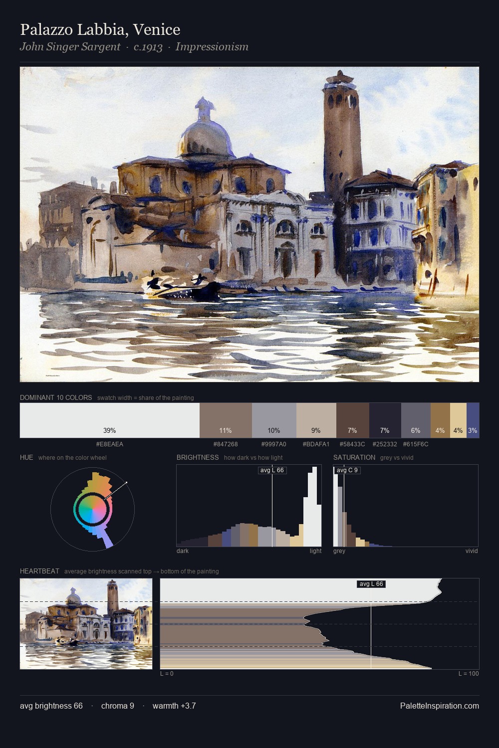
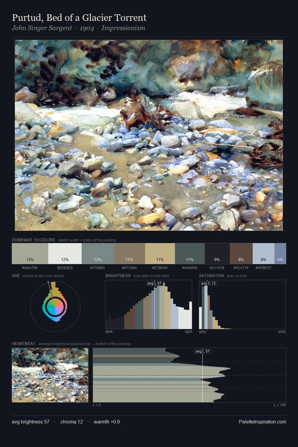
Battle Painting Palette 2
Soft Ivory
Soft Low-contrast, gentle chroma - mid-key values and low saturation, approachable and calm.
Ivory Warm creamy white - the color of natural ivory, warmer than pure white.
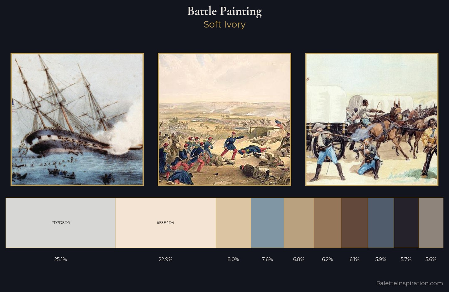
Palette Analysis
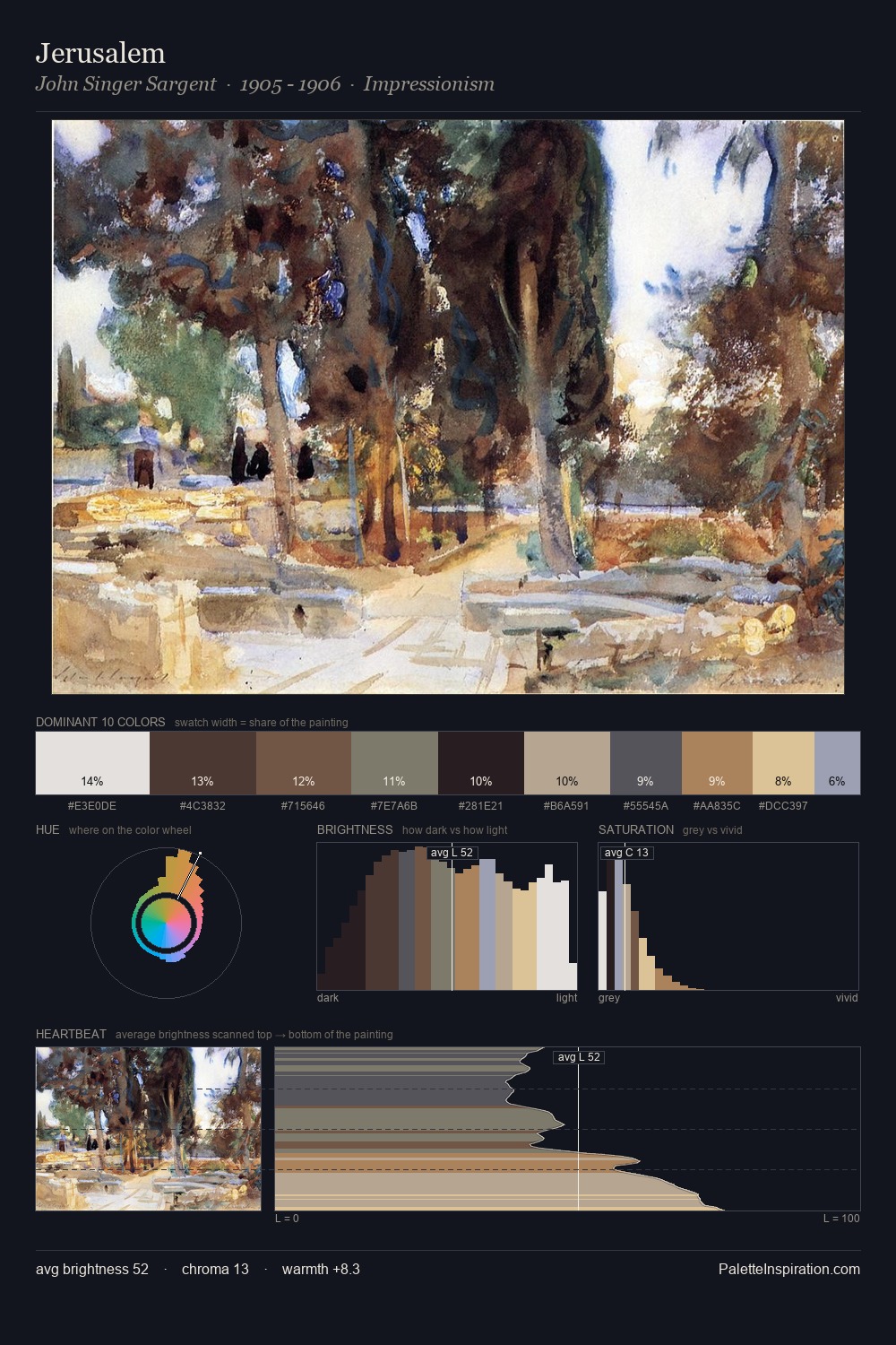
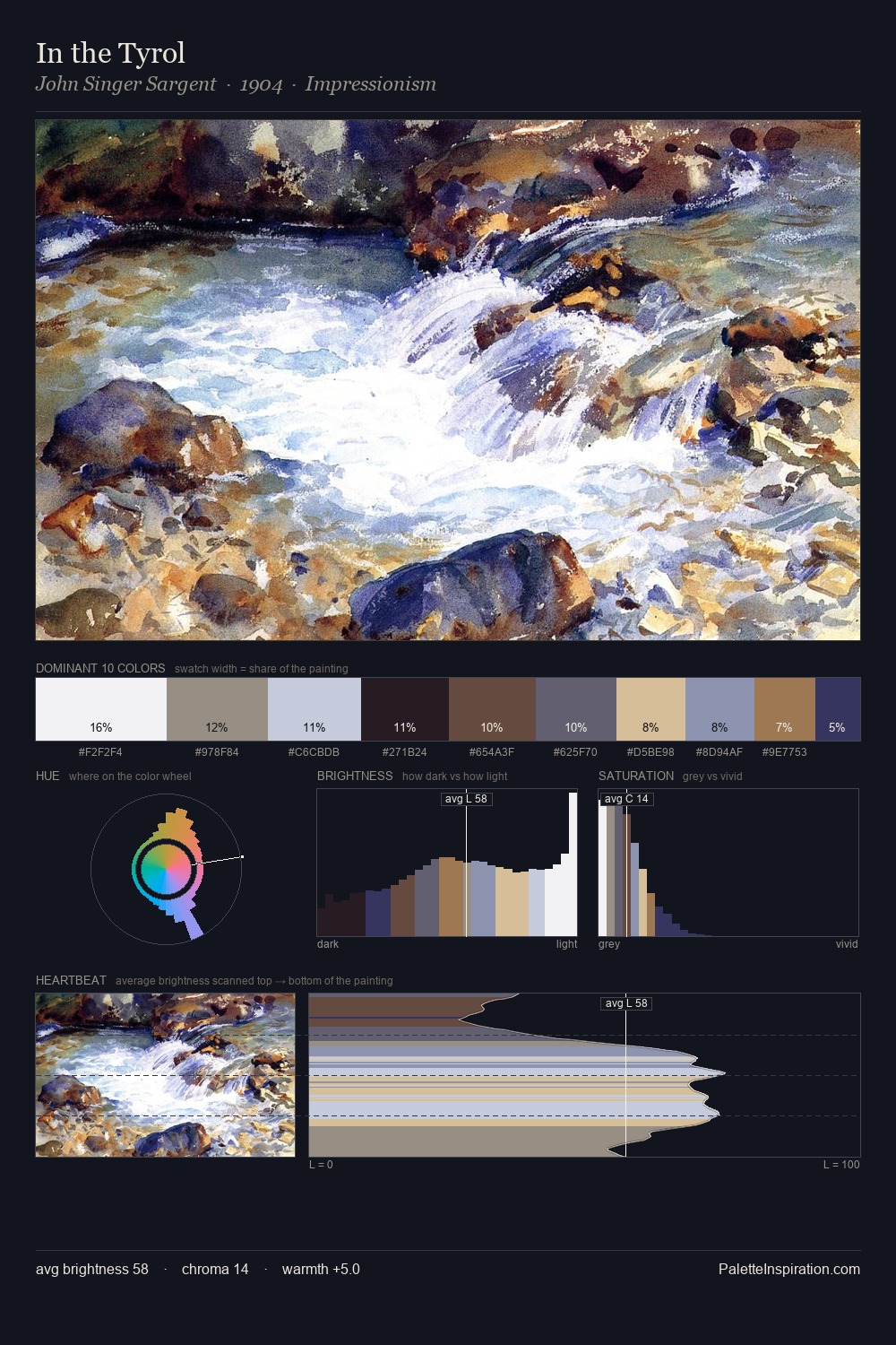
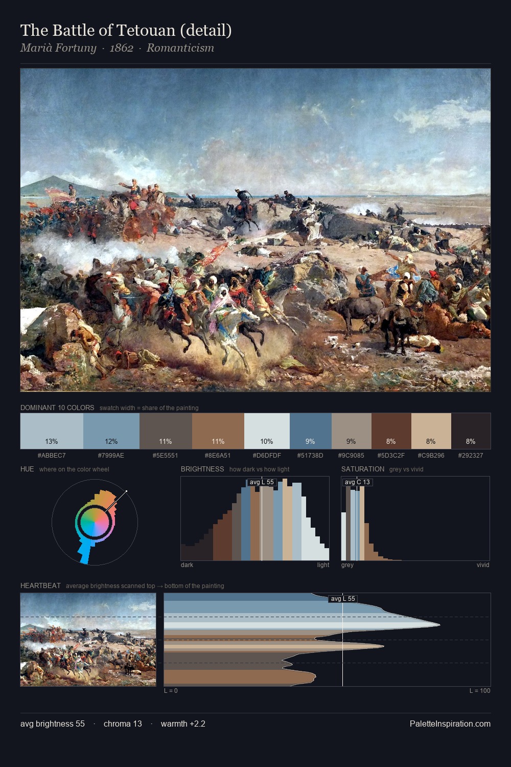
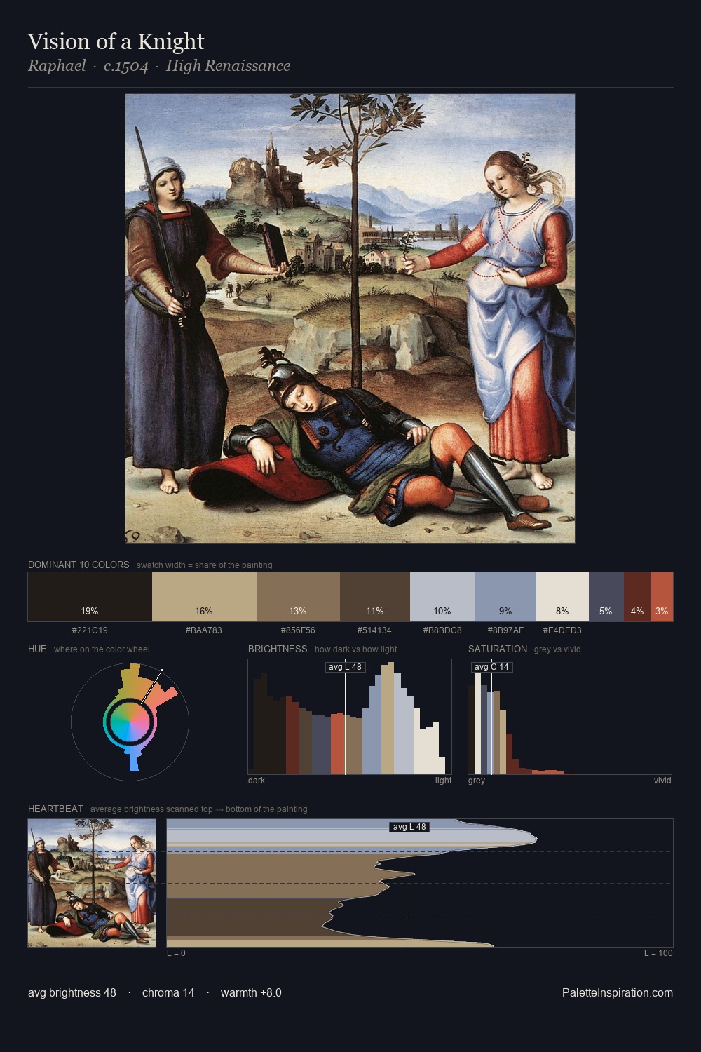
battle painting is strongly light-biased - shadow is suggested rather than declared. Warm and cool are kept in productive tension, creating the kind of chromatic harmony that sustains the eye. All colours lean toward grey, building depth through value rather than colour punch. #D7D8D5 claims 25.1% of the surface, functioning as the work's tonal foundation. The highest-chroma note - #62473B - appears at just 6.2%, deployed as a precision accent against the quieter ground. A value spread of 67 units gives the palette both depth and air - shadows are genuinely dark, lights genuinely light.
Example use cases
- food packaging
- leather accessories
- travel & outdoor
- natural cosmetics
- interior design
I Love This!
Use This Palette
Copy, export, or download for your project
Copy, export, or download for your project
Copy:
Download:
Share: