Battle Painting Palette 3
Soft Apricot
Soft Low-contrast, gentle chroma - mid-key values and low saturation, approachable and calm.
Apricot Soft warm orange - peach-adjacent, the color of ripe stone fruit.
Palette Analysis
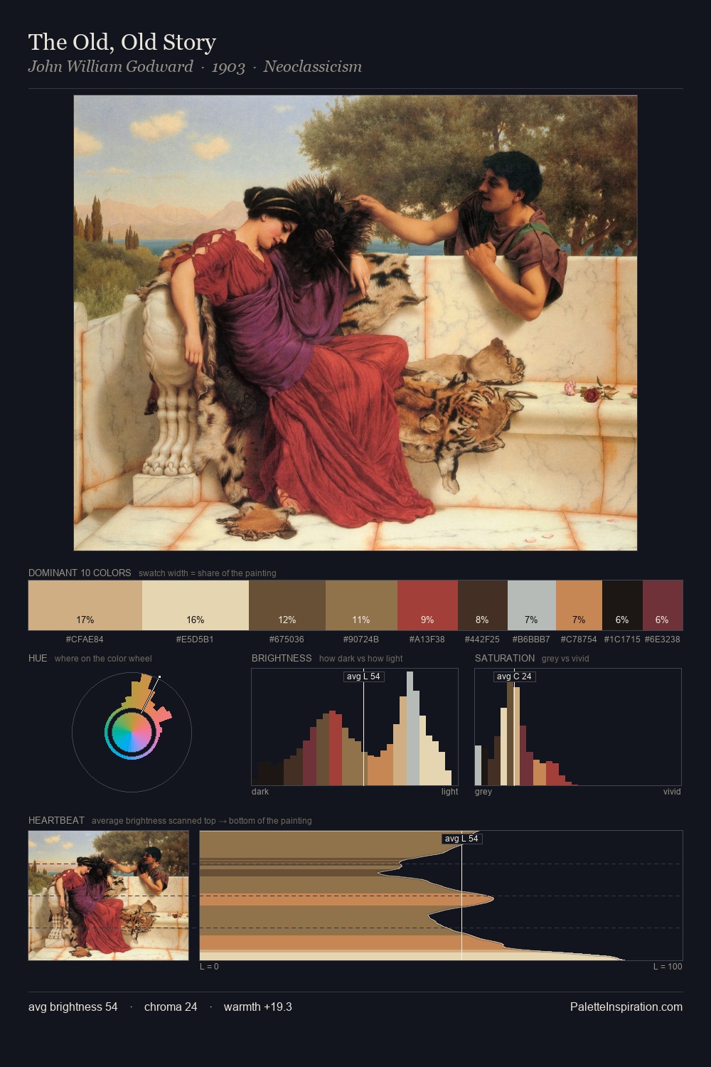
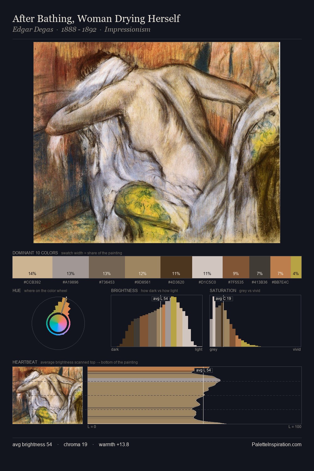
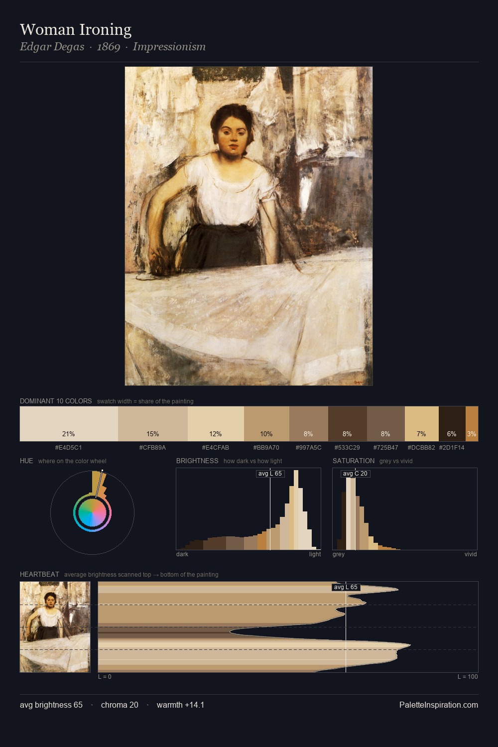
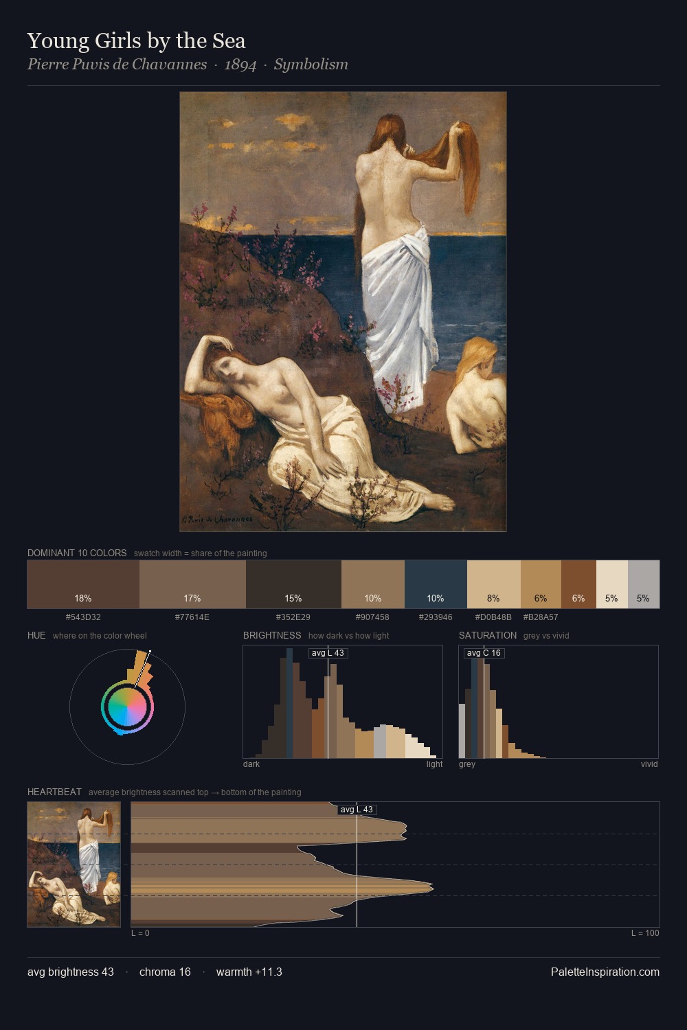
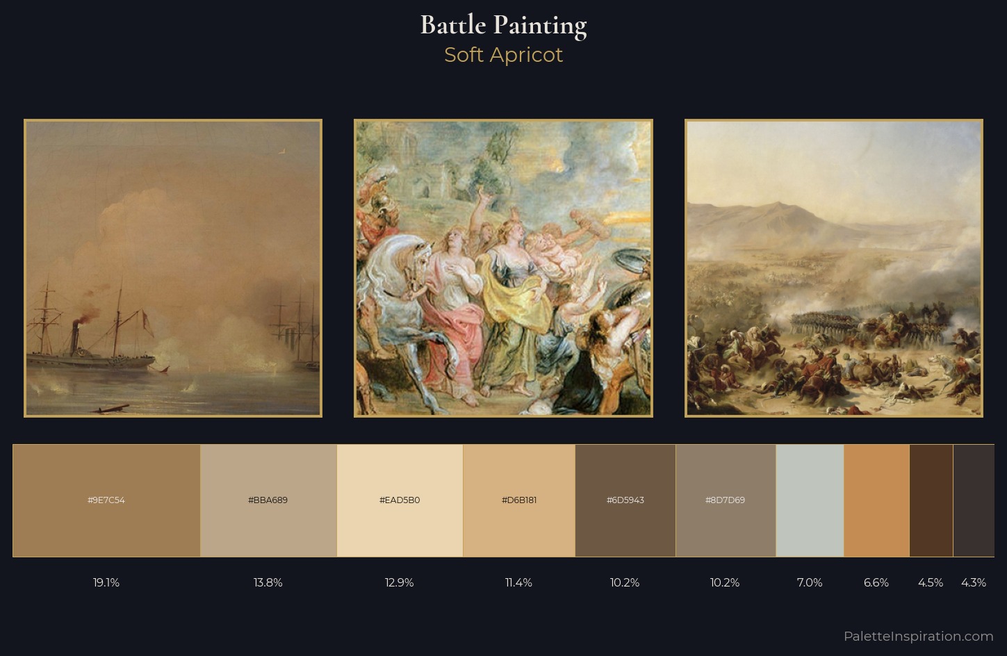
battle painting works in the upper reaches of the value scale, creating an atmosphere of brightness and expansiveness. Warm hues command this palette; it favours the reds, oranges, and yellows of firelight and earth. Saturation is deliberately withheld - the beauty here lies in the near-monochromatic gradations rather than colour difference. The highest-chroma note - #513724 - appears at just 4.5%, deployed as a precision accent against the quieter ground. The value range spans 56 units across the palette, providing the full gamut from deep shadow to near-white and ensuring clear tonal hierarchy.
Example use cases
- ceramics & pottery
- boutique hospitality
- menswear
- heritage food brands
- craft & artisan brands
I Love This!
Use This Palette
Copy, export, or download for your project
Copy, export, or download for your project
Copy:
Download:
Share: