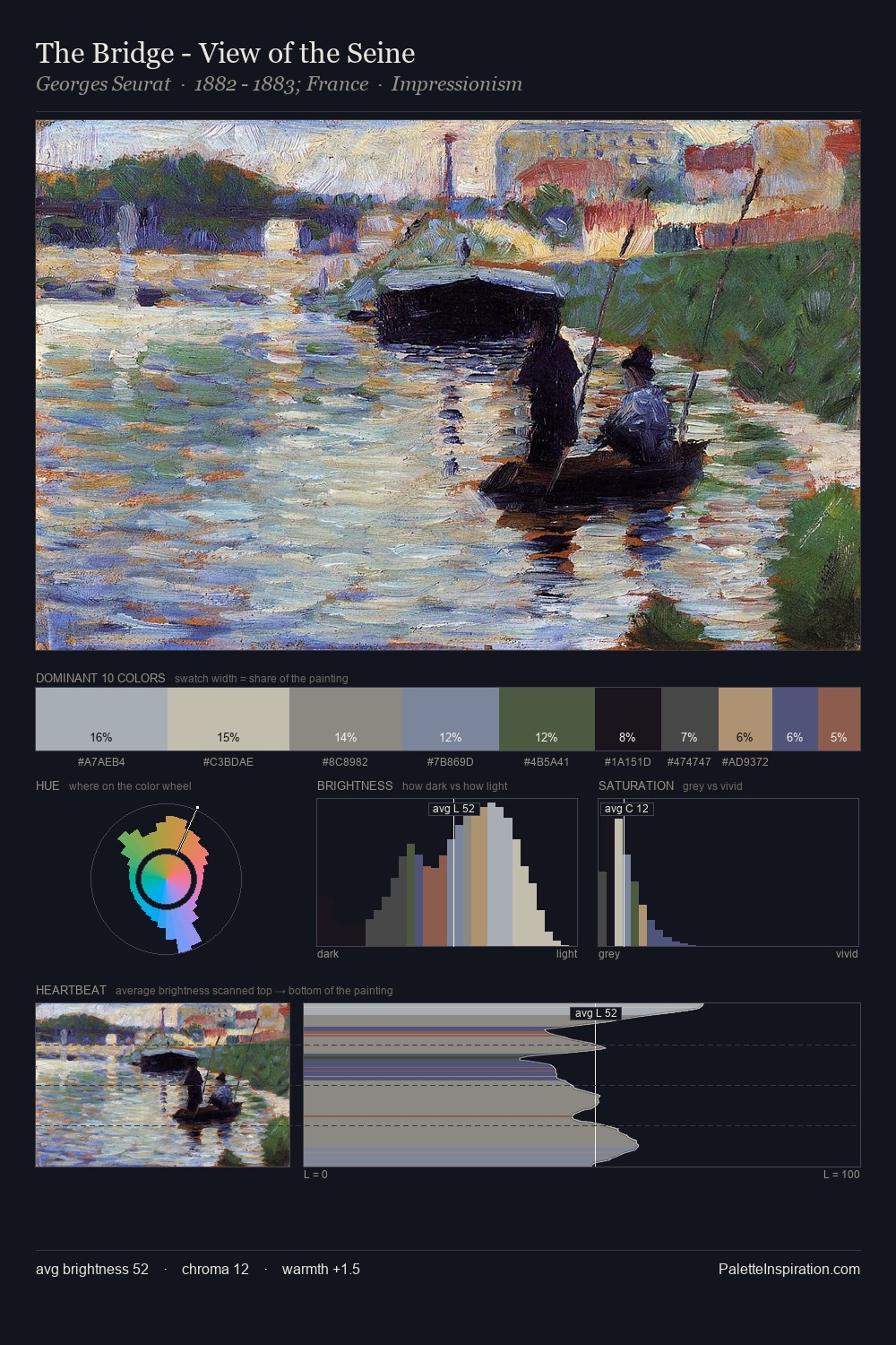
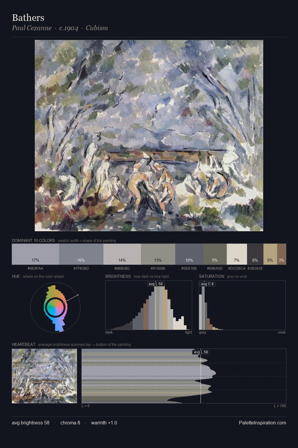
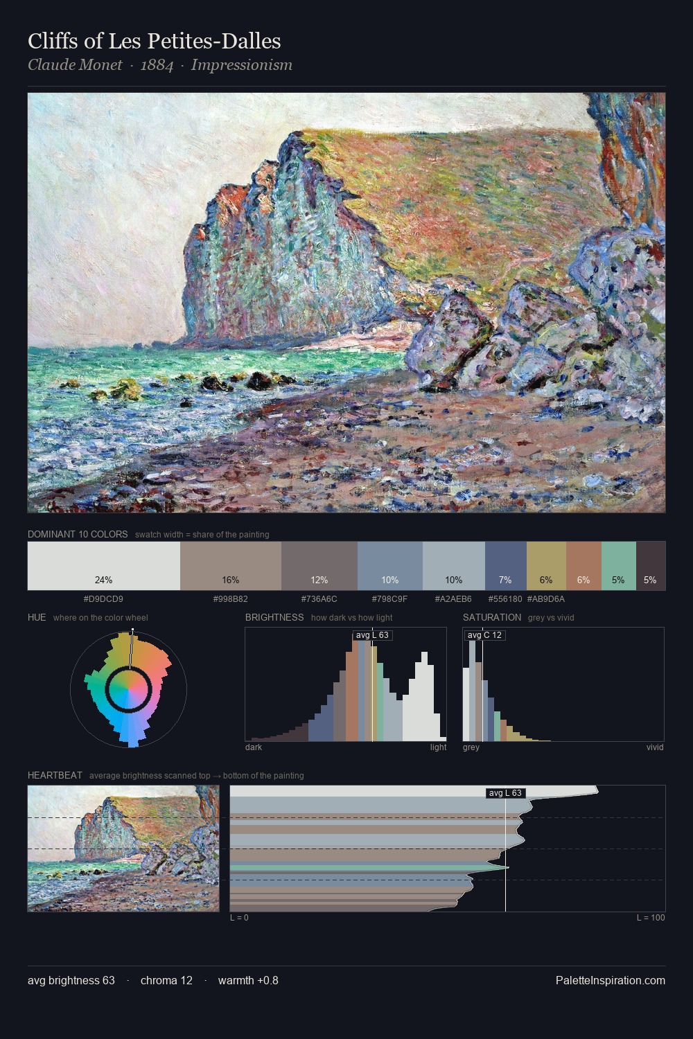
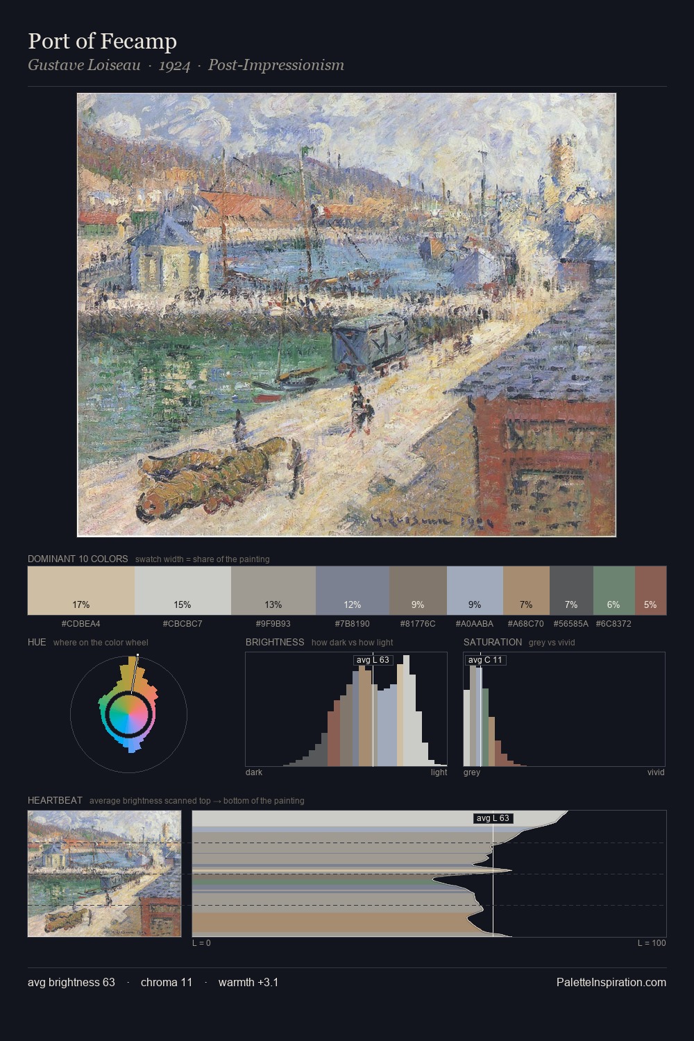
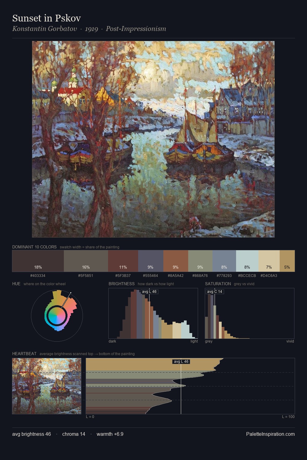
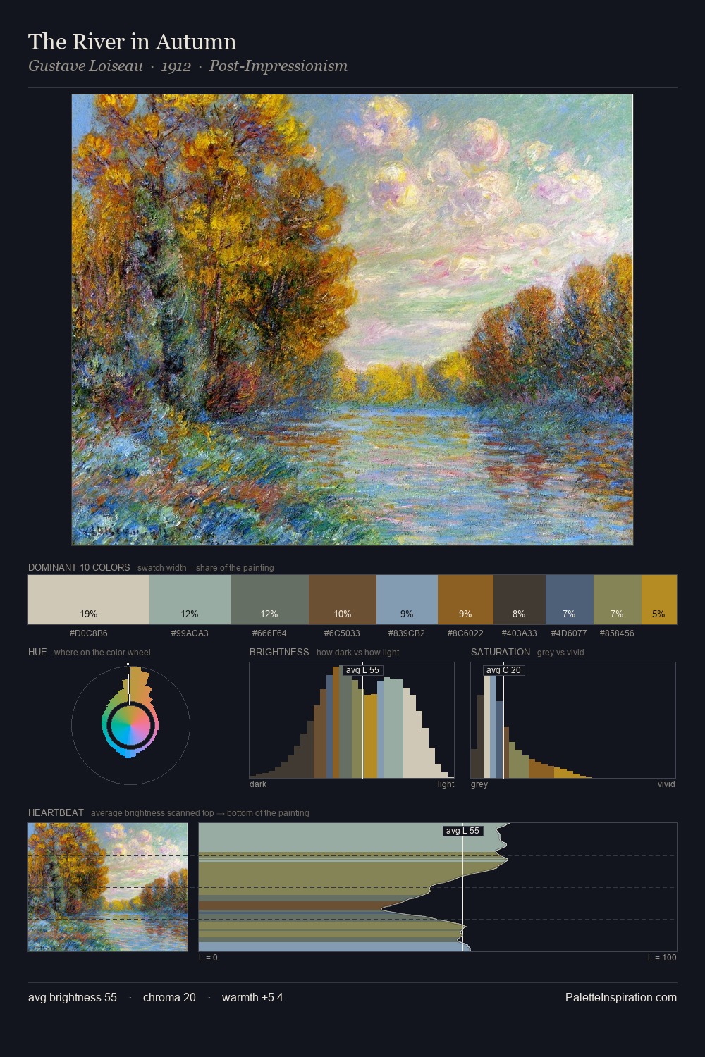
Post-Impressionism Palette 9
Soft Vellum
Soft Low-contrast, gentle chroma - mid-key values and low saturation, approachable and calm.
Vellum Smooth pale tan - the color of prepared calf-skin vellum, warmer than parchment.
Palette Analysis
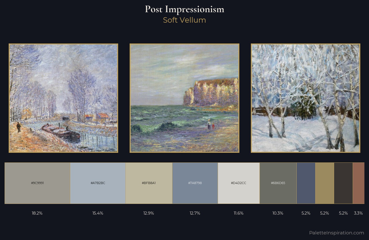
Light floods Post-Impressionism; the palette keeps values pale and airy across its range. Cool hues prevail: blues, greens, and greys anchor the palette's emotional temperature. Chroma hovers near zero; colour declares itself through subtle shifts in hue rather than outright saturation. Only 3.3% is devoted to #916451, yet that small allocation delivers the palette's entire chromatic tension. The value range of 53 units sits in the comfortable middle: enough depth, enough light, neither extreme. The mid-to-high key, cool bias, and moderate chroma point to outdoor observation - sky and diffused daylight as the dominant light source.
Example use cases
- exhibition design
- foundation branding
- estate management
- art education
- museums & galleries
I Love This!
Use This Palette
Copy, export, or download for your project
Copy, export, or download for your project
Copy:
Download:
Share: