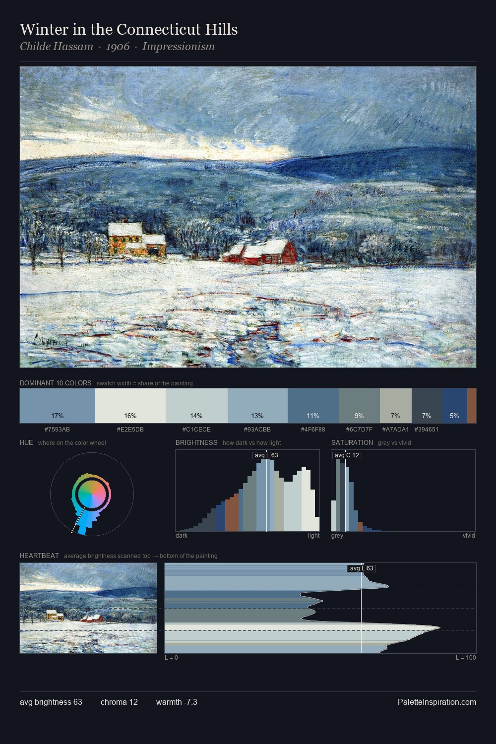
Post-Impressionism Palette 4
Silvery Alabaster
Silvery Cool metallic sheen - mid-to-high key, desaturated, with a gray-blue cast.
Alabaster Warm off-white - creamy stone white, luminous and slightly translucent.

Palette Analysis
Post-Impressionism is strongly light-biased - shadow is suggested rather than declared. Temperature is cool-dominant, with blue and green families claiming the largest areas. Every colour is desaturated; the palette proceeds through near-neutrals and gently-coloured greys. Only 12.9% is devoted to #99AAC8, yet that small allocation delivers the palette's entire chromatic tension. Value range is moderate at 54 units - enough contrast for legibility, not so much as to fragment the tonal unity. The mid-to-high key, cool bias, and moderate chroma point to outdoor observation - sky and diffused daylight as the dominant light source.
Example use cases
- print magazines
- beauty brands
- real estate
- high-end packaging
- editorial design
I Love This!
Use This Palette
Copy, export, or download for your project
Copy, export, or download for your project
Copy:
Download:
Share: