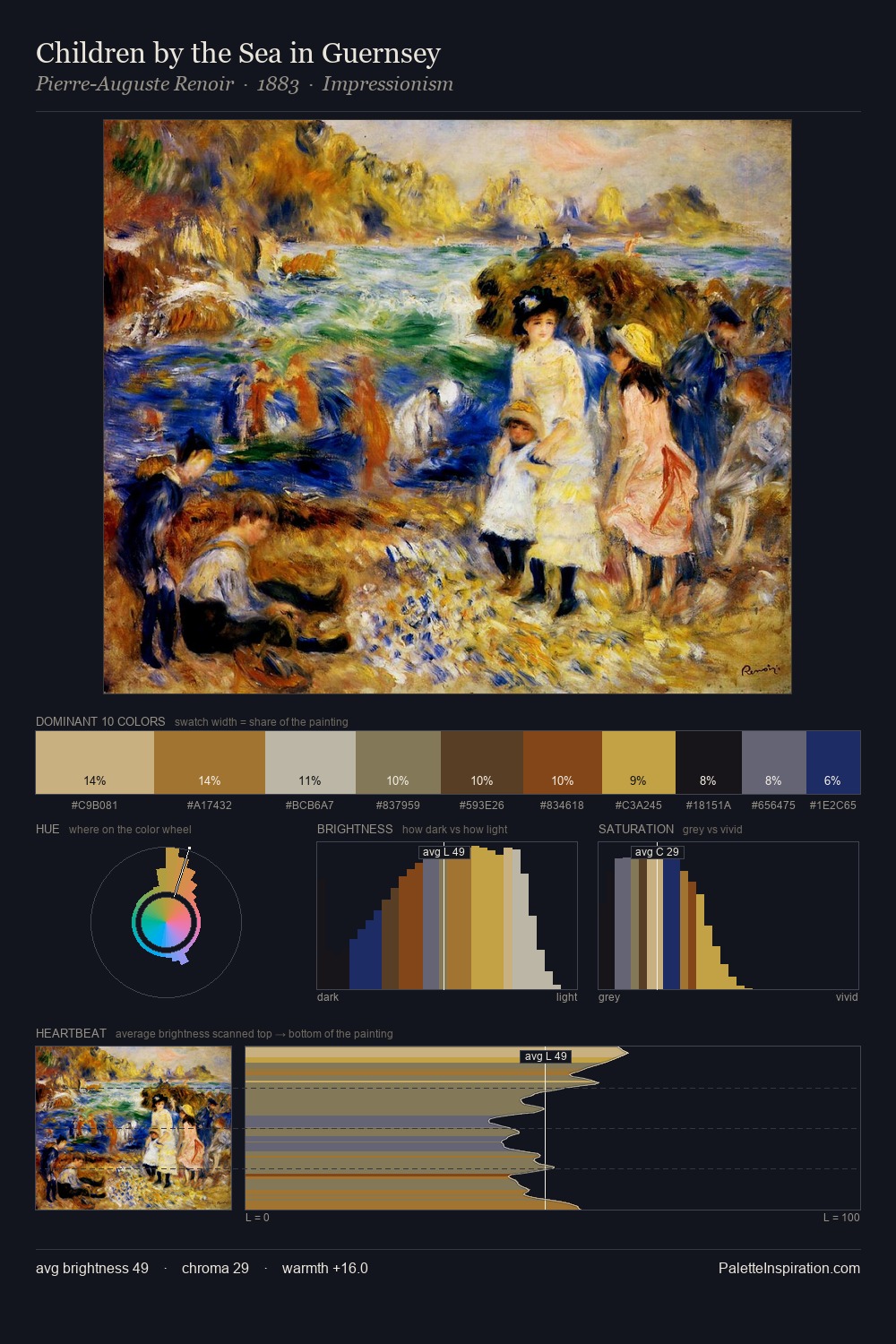
Post-Impressionism Palette 15
Veiled Apricot
Veiled Partially obscured light - mid-dark with a hazy, scrim-filtered quality.
Apricot Soft warm orange - peach-adjacent, the color of ripe stone fruit.

Palette Analysis
Mid-key values give Post-Impressionism its characteristic quietness - nothing blazes, nothing disappears. Cool hues prevail: blues, greens, and greys anchor the palette's emotional temperature. Chroma is moderate: colours carry enough saturation to be read as colour, but the palette stops well short of garish intensity. #E1C24E is not a small accent - at 18.8% it qualifies as a major presence and gives the palette its chromatic identity. At 56 units of value range, the palette has the tonal breadth to sustain complex spatial readings. The palette has the character of outdoor light: cool, mid-bright, with colour rendered faithfully rather than expressively.
Example use cases
- ceramics & pottery
- boutique hospitality
- menswear
- heritage food brands
- craft & artisan brands
I Love This!
Use This Palette
Copy, export, or download for your project
Copy, export, or download for your project
Copy:
Download:
Share: