Post-Impressionism Palette 32
Penumbral Caramel
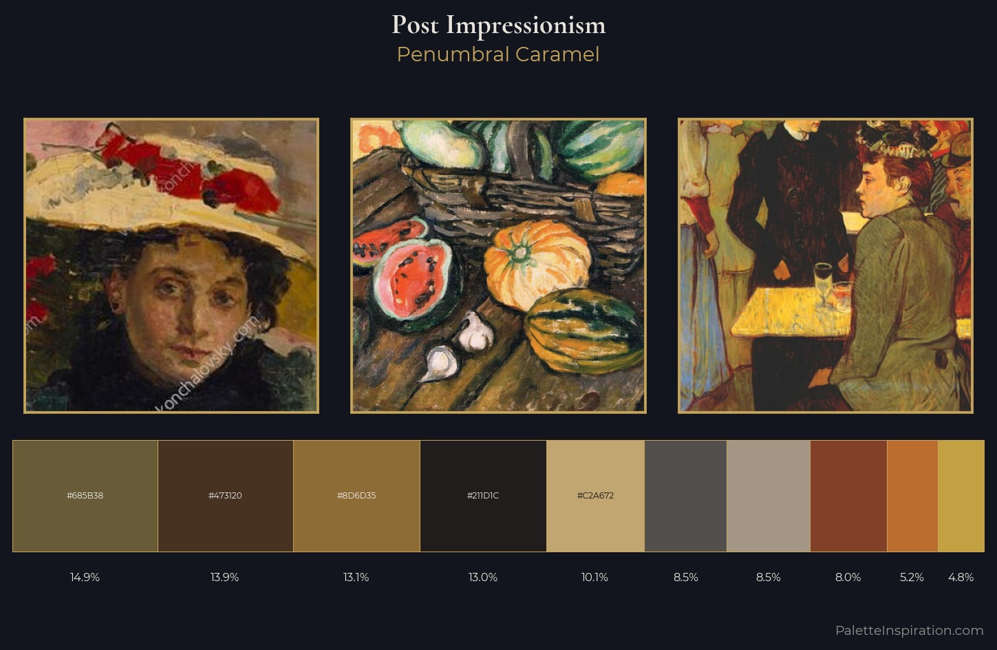
Penumbral Partial shadow - the transitional zone between light and full dark, soft-edged.
Caramel Warm mid-brown - the color of cooked sugar, smooth and amber-toned.
Palette Analysis
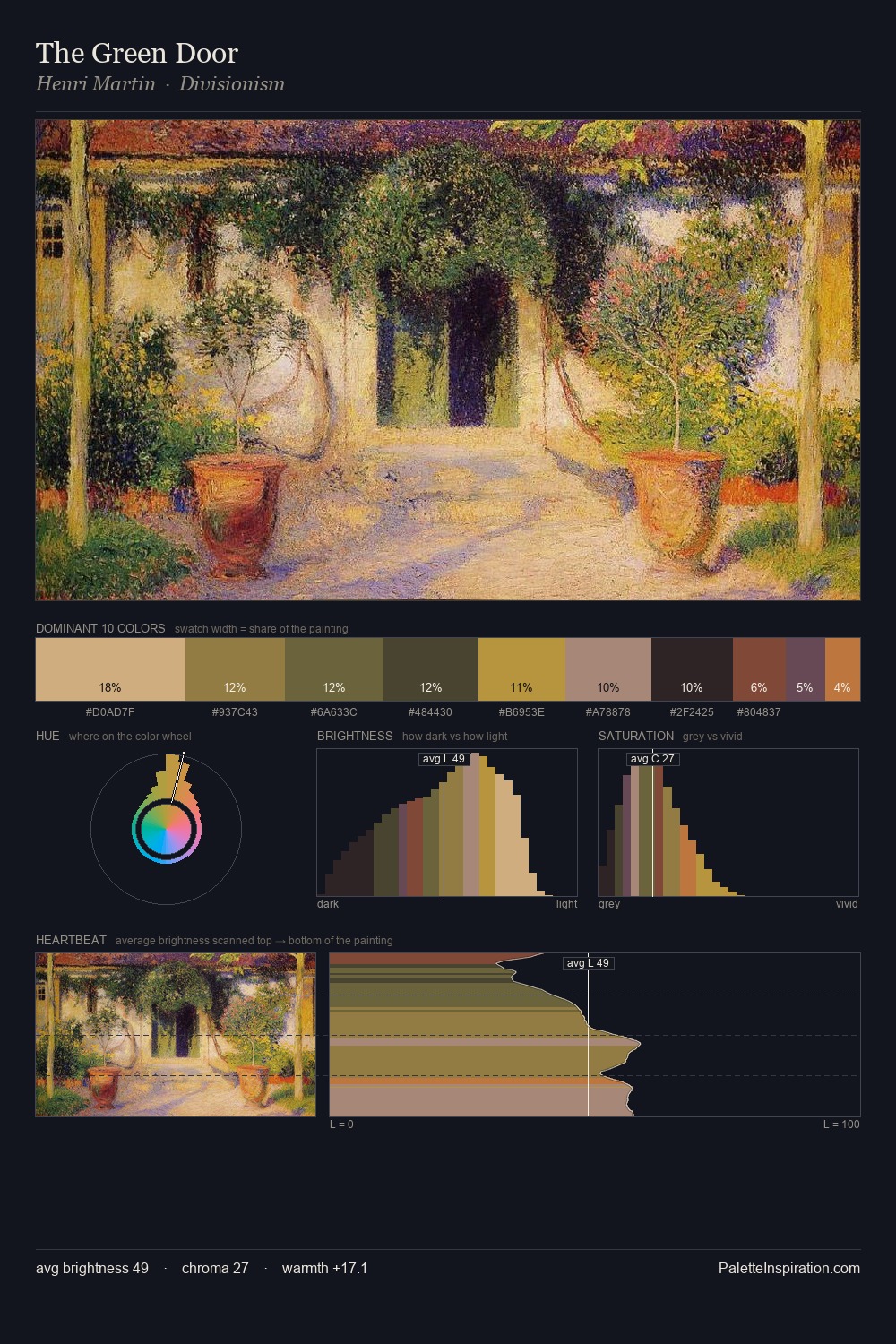
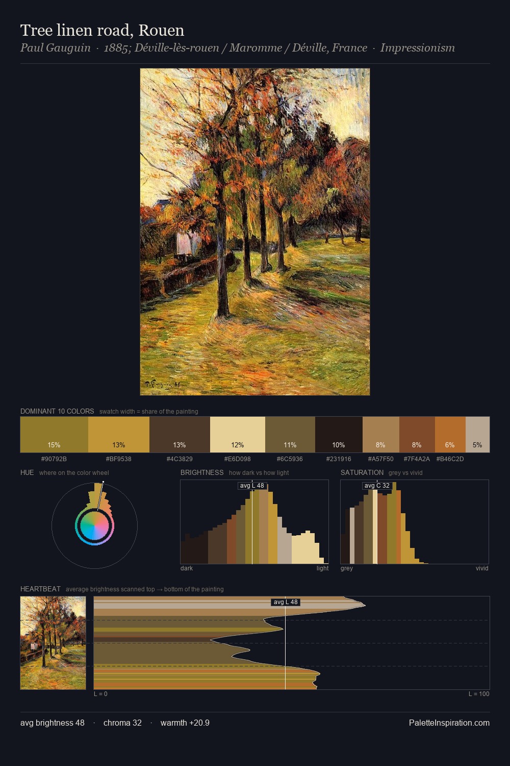
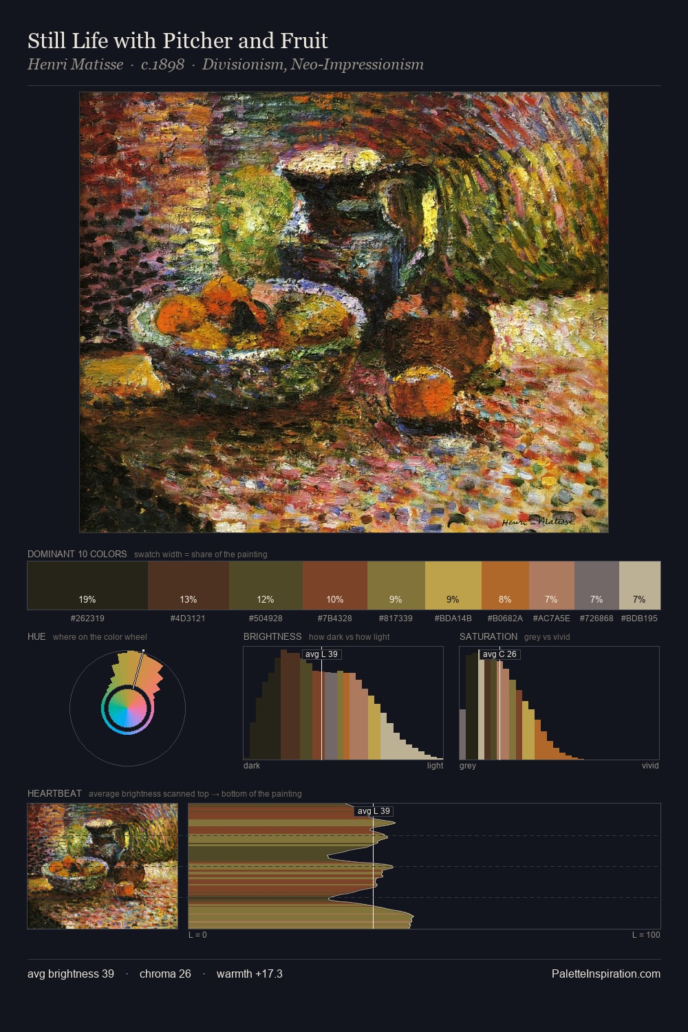
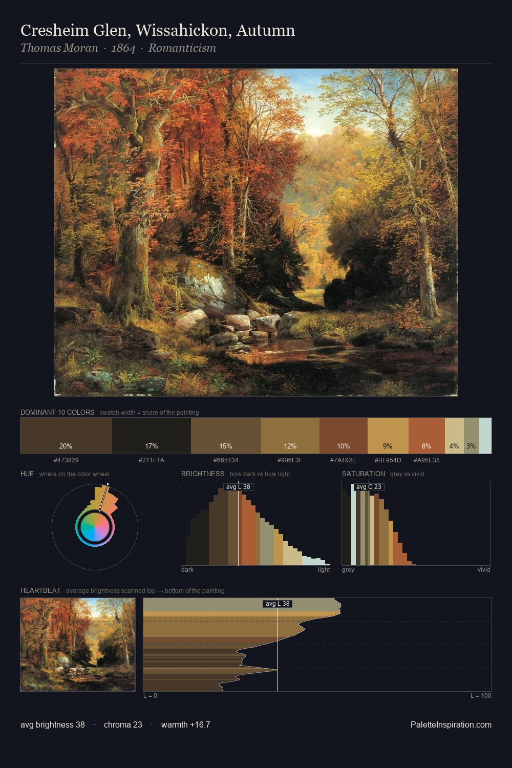
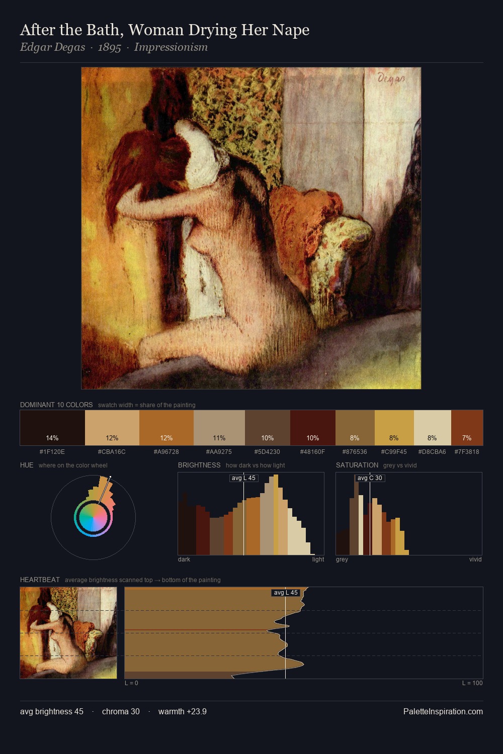
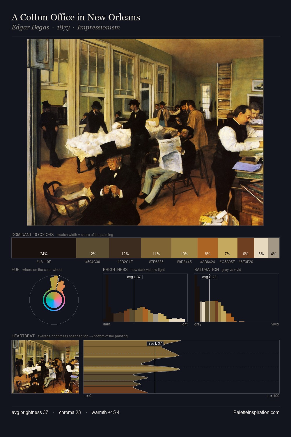
Values in Post-Impressionism rest in the mid-range - neither dramatically lit nor steeped in shadow. Warm and cool are kept in productive tension, creating the kind of chromatic harmony that sustains the eye. Saturation is deliberately withheld - the beauty here lies in the near-monochromatic gradations rather than colour difference. #C1A142 delivers the chromatic peak at only 4.8% - a small shot of colour with outsized visual impact. The value range of 51 units sits in the comfortable middle: enough depth, enough light, neither extreme.
Example use cases
- theater design
- jewelry brands
- tobacco-adjacent retail
- event branding
- film & entertainment
I Love This!
Use This Palette
Copy, export, or download for your project
Copy, export, or download for your project
Copy:
Download:
Share: