Post-Impressionism Palette 5
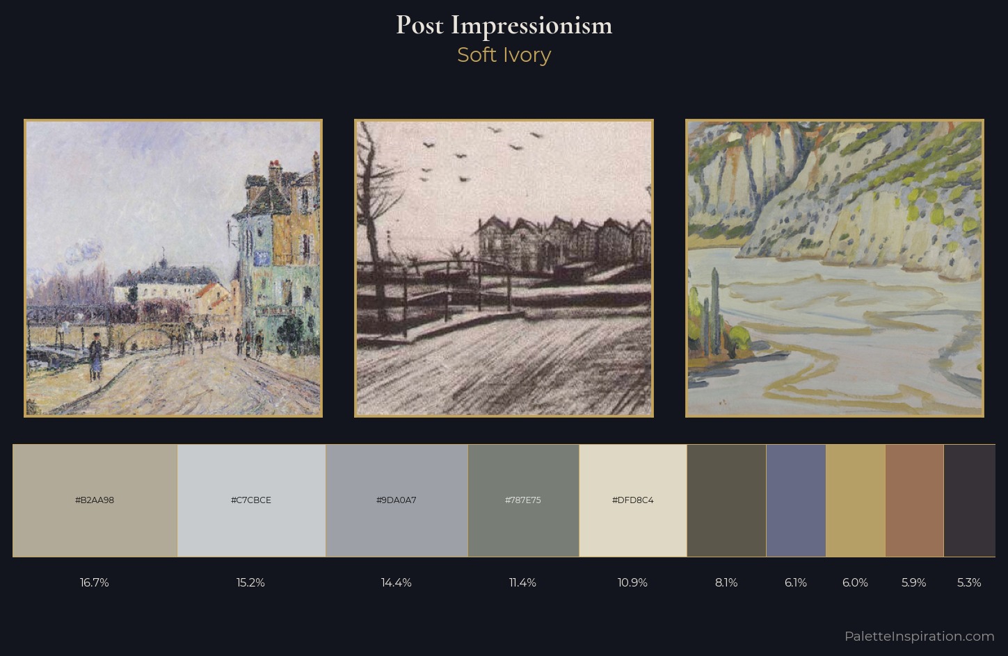
Soft Ivory
Soft Low-contrast, gentle chroma - mid-key values and low saturation, approachable and calm.
Ivory Warm creamy white - the color of natural ivory, warmer than pure white.
Palette Analysis
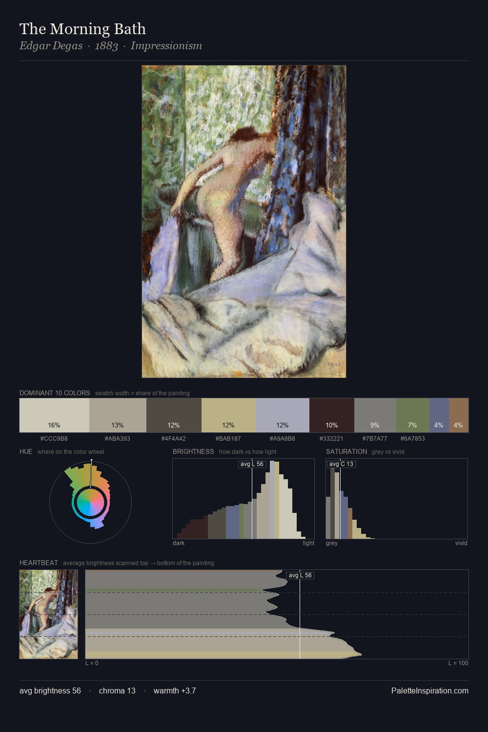
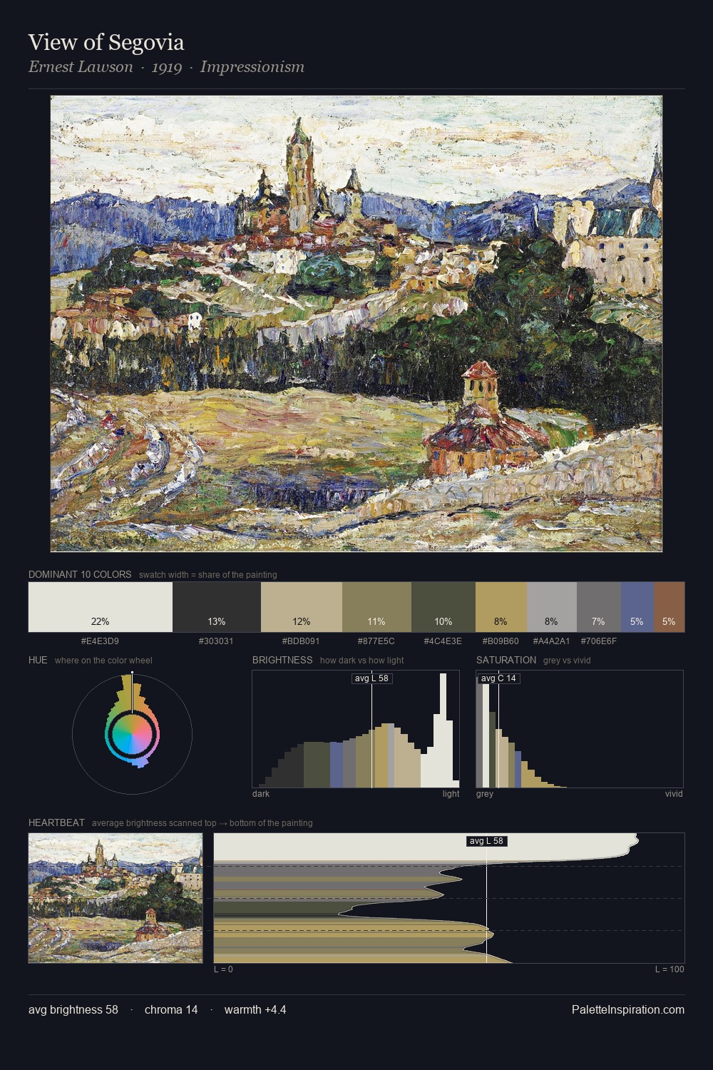
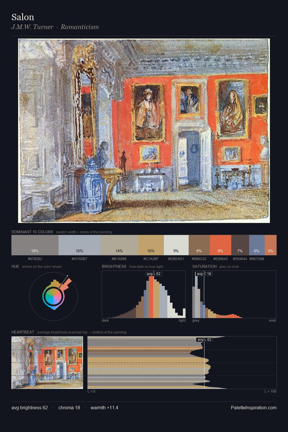
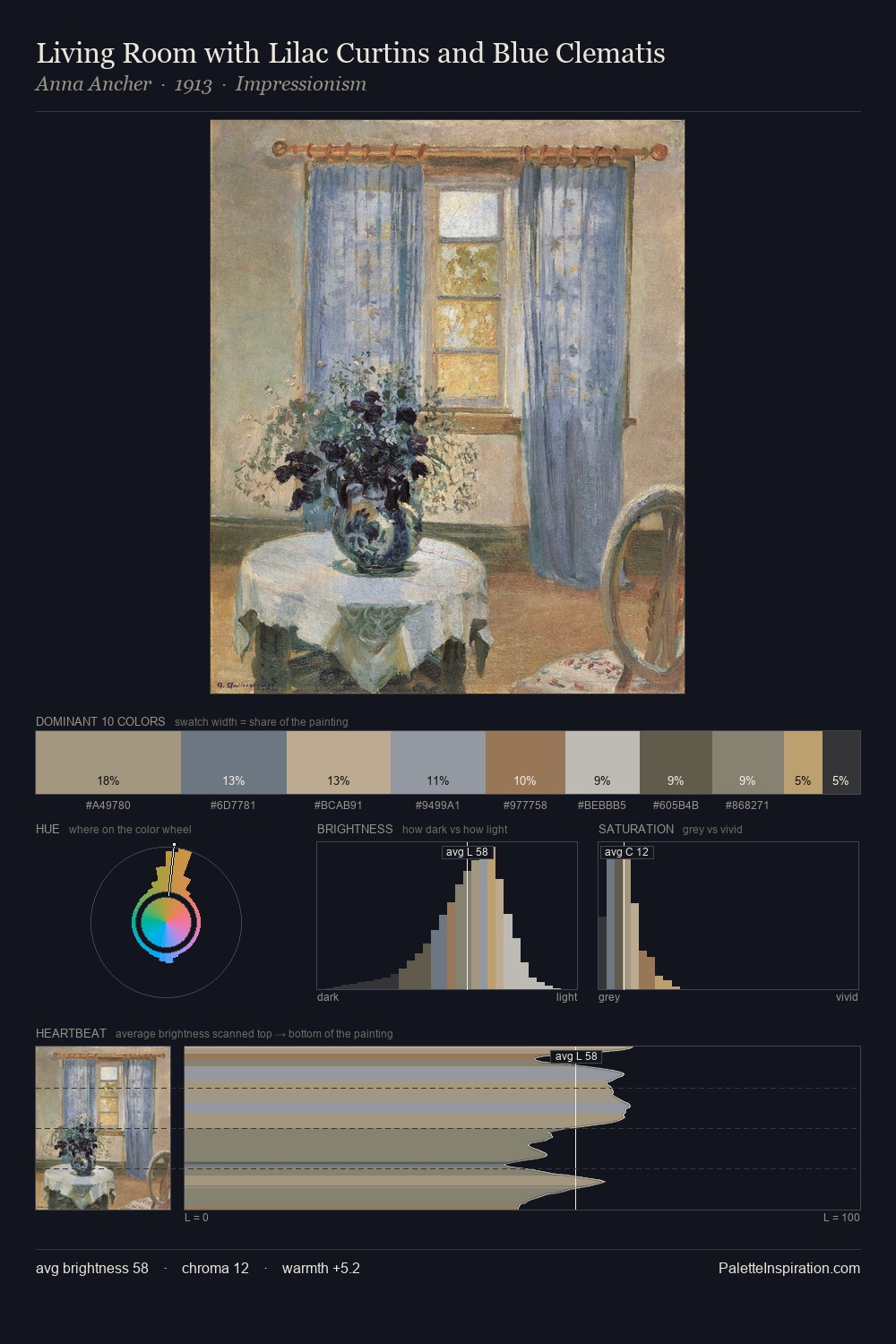
The high-key values of Post-Impressionism give it an effulgent, almost bleached quality. A distinctly cool atmosphere runs through this palette: sky, water, and mist given colour form. Chroma hovers near zero; colour declares itself through subtle shifts in hue rather than outright saturation. #987055 delivers the chromatic peak at only 5.9% - a small shot of colour with outsized visual impact. From deepest dark to palest light, the palette traverses 56 units of the value scale - a span that creates natural depth. The palette has the character of outdoor light: cool, mid-bright, with colour rendered faithfully rather than expressively.
Example use cases
- exhibition design
- foundation branding
- estate management
- art education
- museums & galleries
I Love This!
Use This Palette
Copy, export, or download for your project
Copy, export, or download for your project
Copy:
Download:
Share: