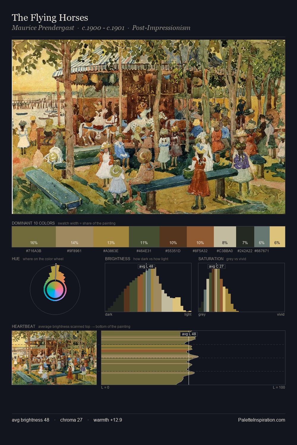
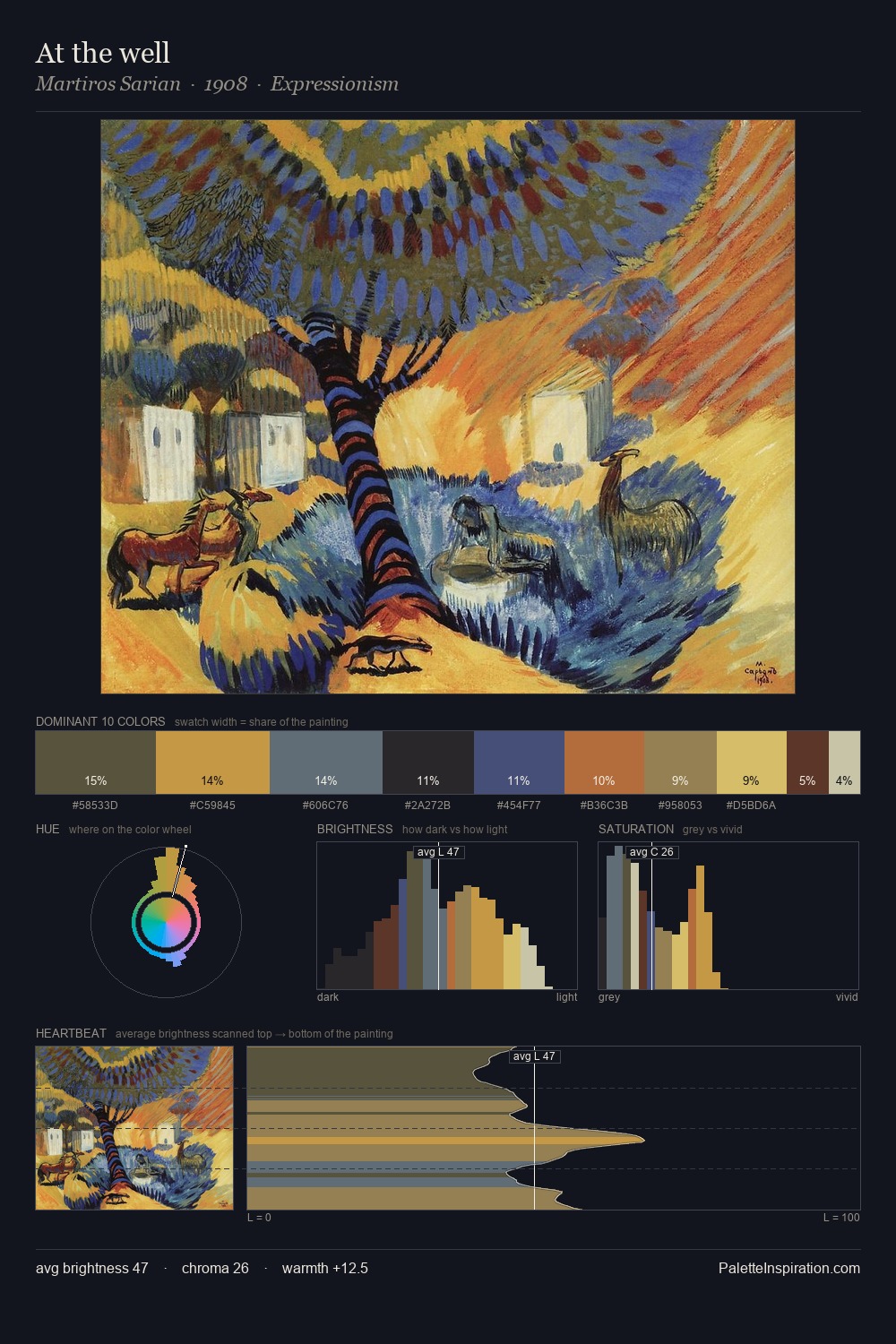
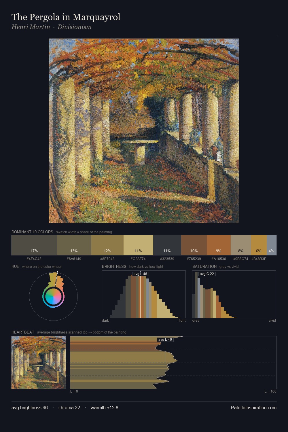
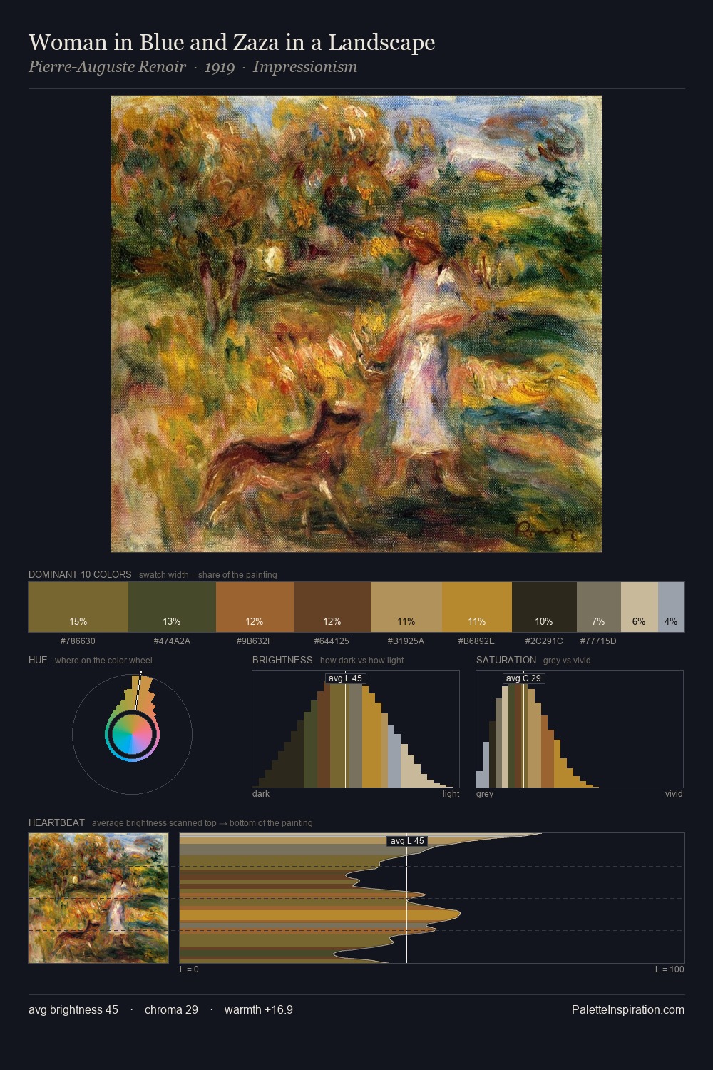
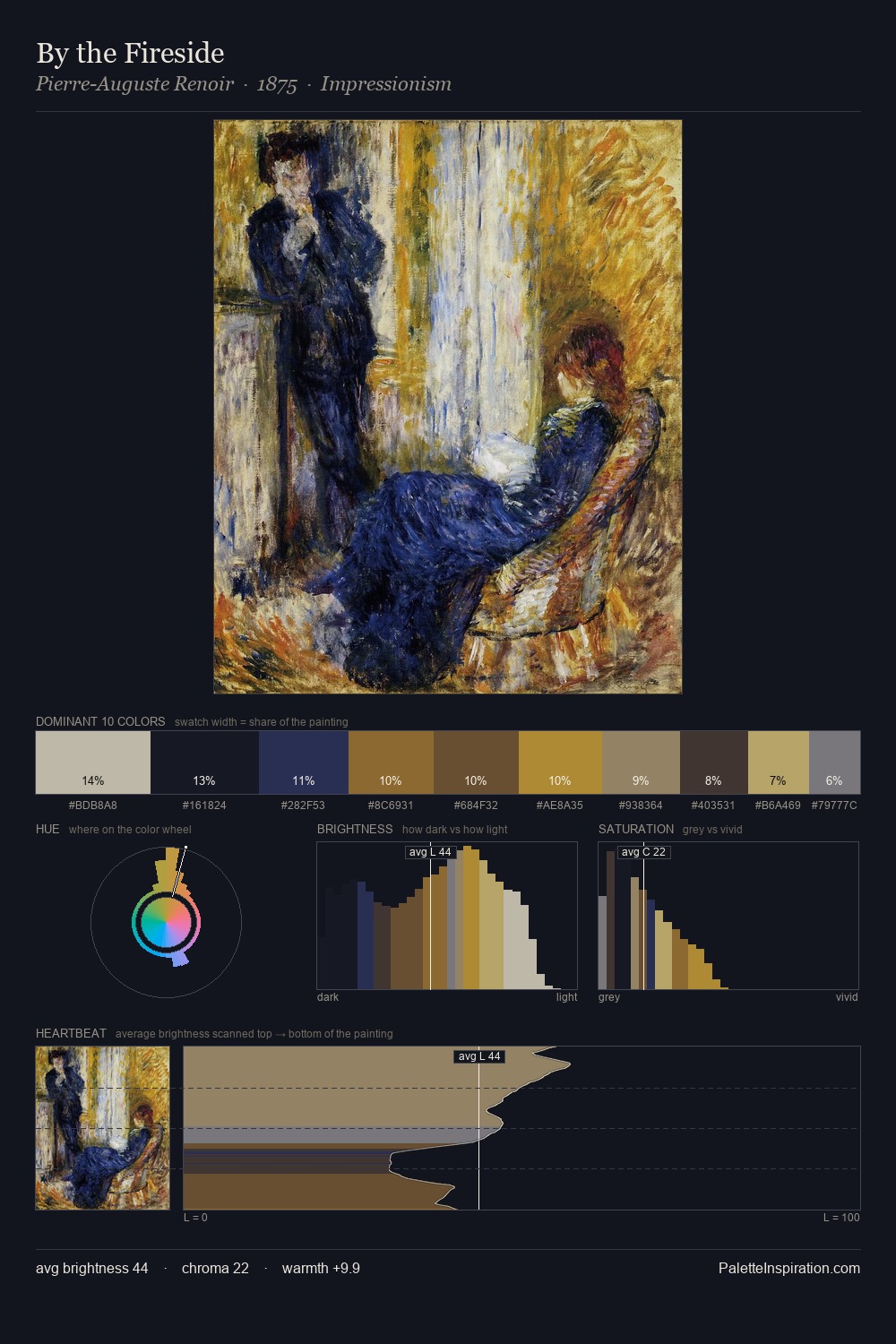
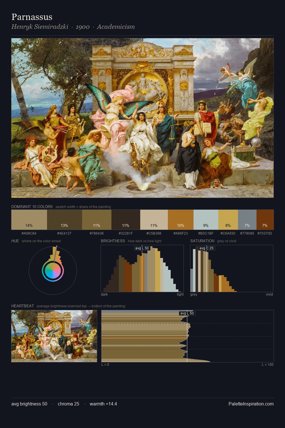
Post-Impressionism Palette 19
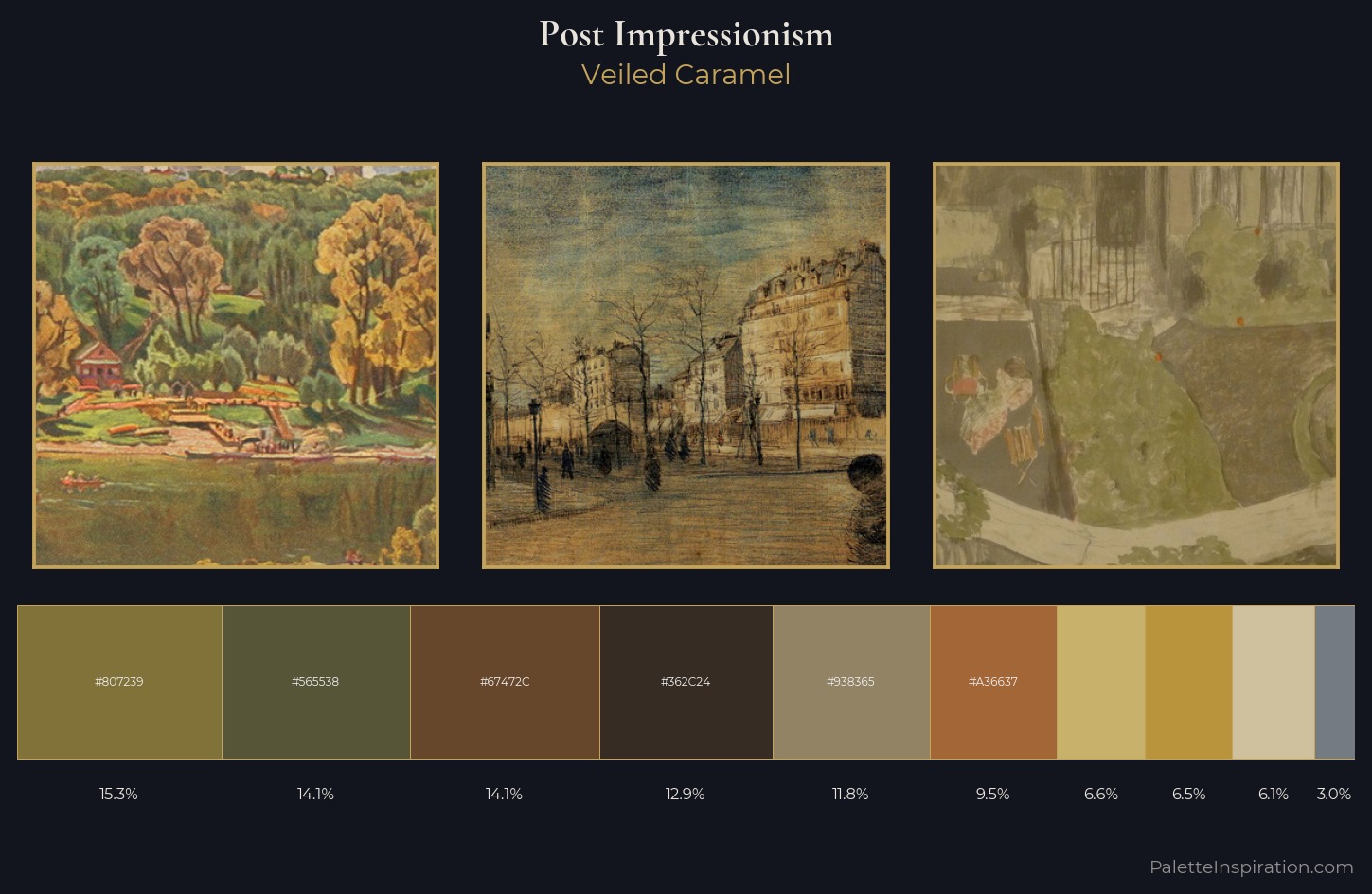
Veiled Caramel
Veiled Partially obscured light - mid-dark with a hazy, scrim-filtered quality.
Caramel Warm mid-brown - the color of cooked sugar, smooth and amber-toned.
Palette Analysis
Post-Impressionism distributes its values across the middle register, creating harmony without high contrast. Blues and teal-greys govern the palette, lending it an aquatic or atmospheric quality. Chroma is moderate: colours carry enough saturation to be read as colour, but the palette stops well short of garish intensity. The saturated accent, #A36637, registers at 9.5% - sparse enough to feel like a deliberate surprise. The value range of 51 units sits in the comfortable middle: enough depth, enough light, neither extreme. The mid-to-high key, cool bias, and moderate chroma point to outdoor observation - sky and diffused daylight as the dominant light source.
Example use cases
- music labels
- luxury hospitality
- editorial photography
- leather goods
- premium streaming
I Love This!
Use This Palette
Copy, export, or download for your project
Copy, export, or download for your project
Copy:
Download:
Share: