Post-Impressionism Palette 3
Palette Analysis
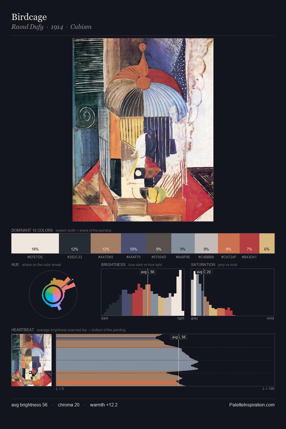
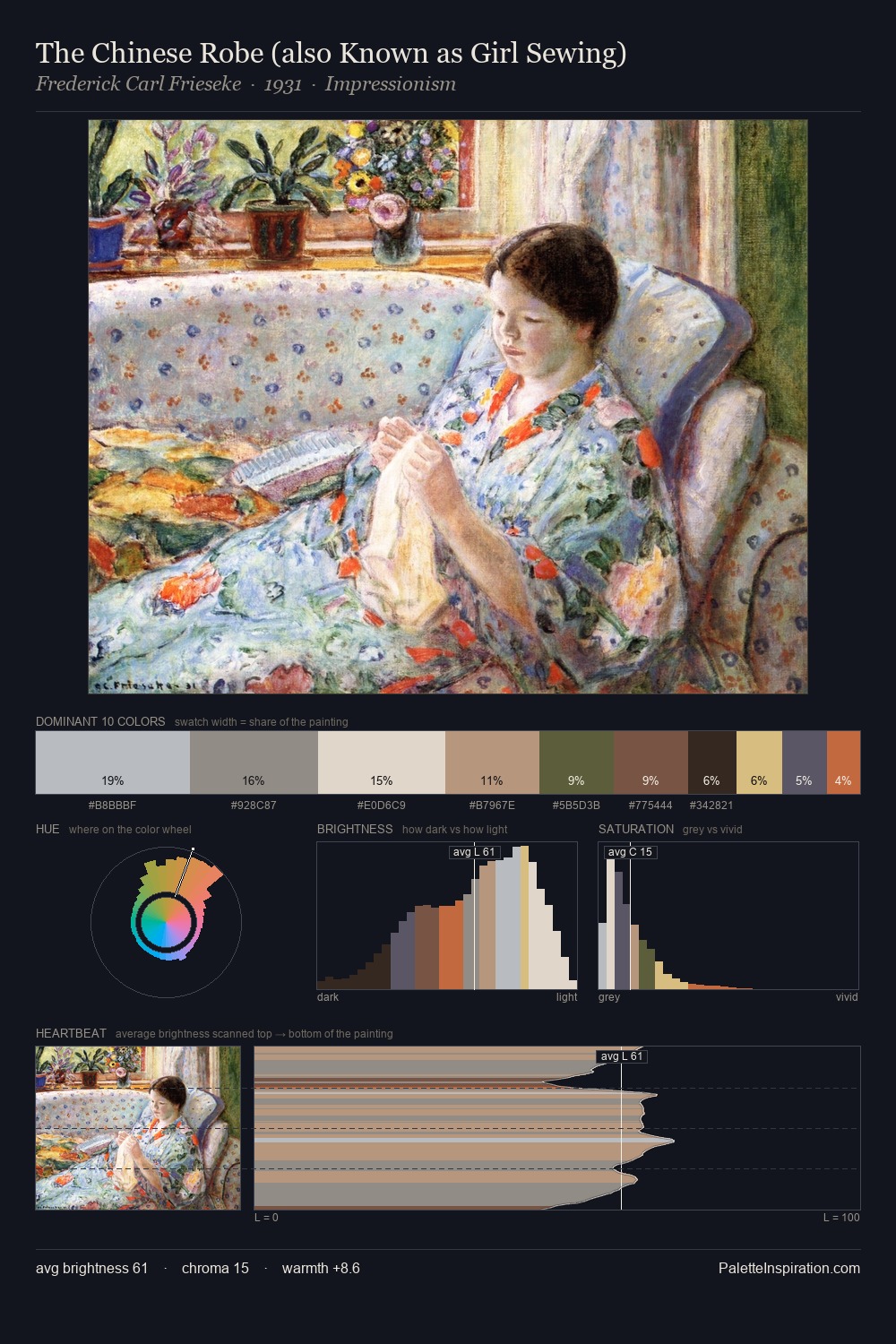
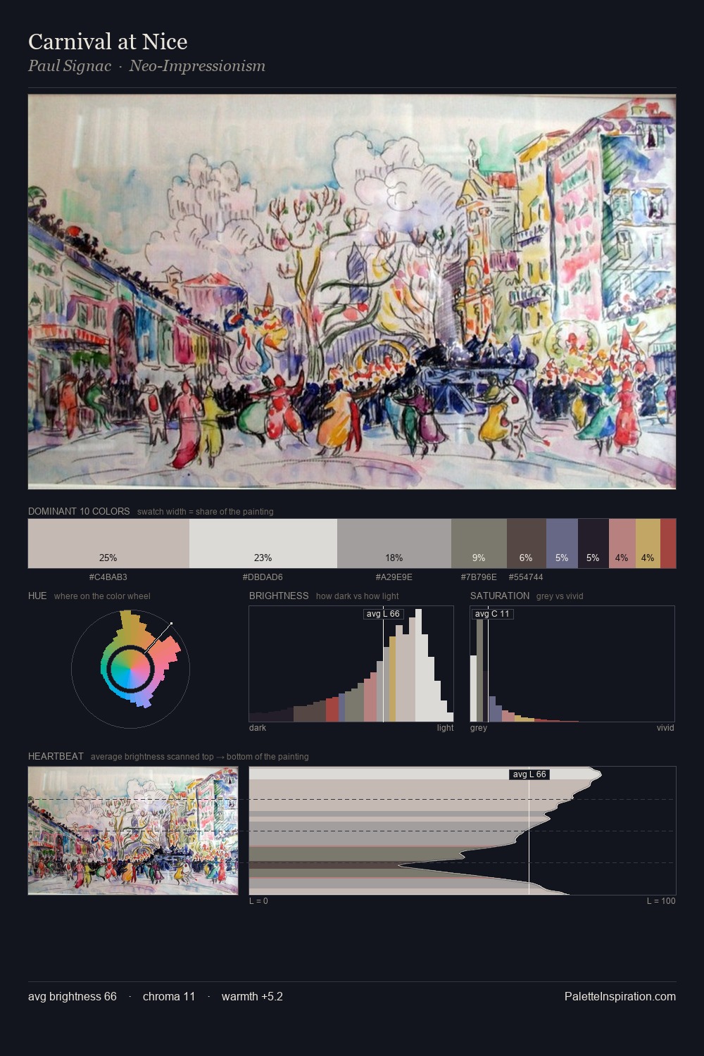
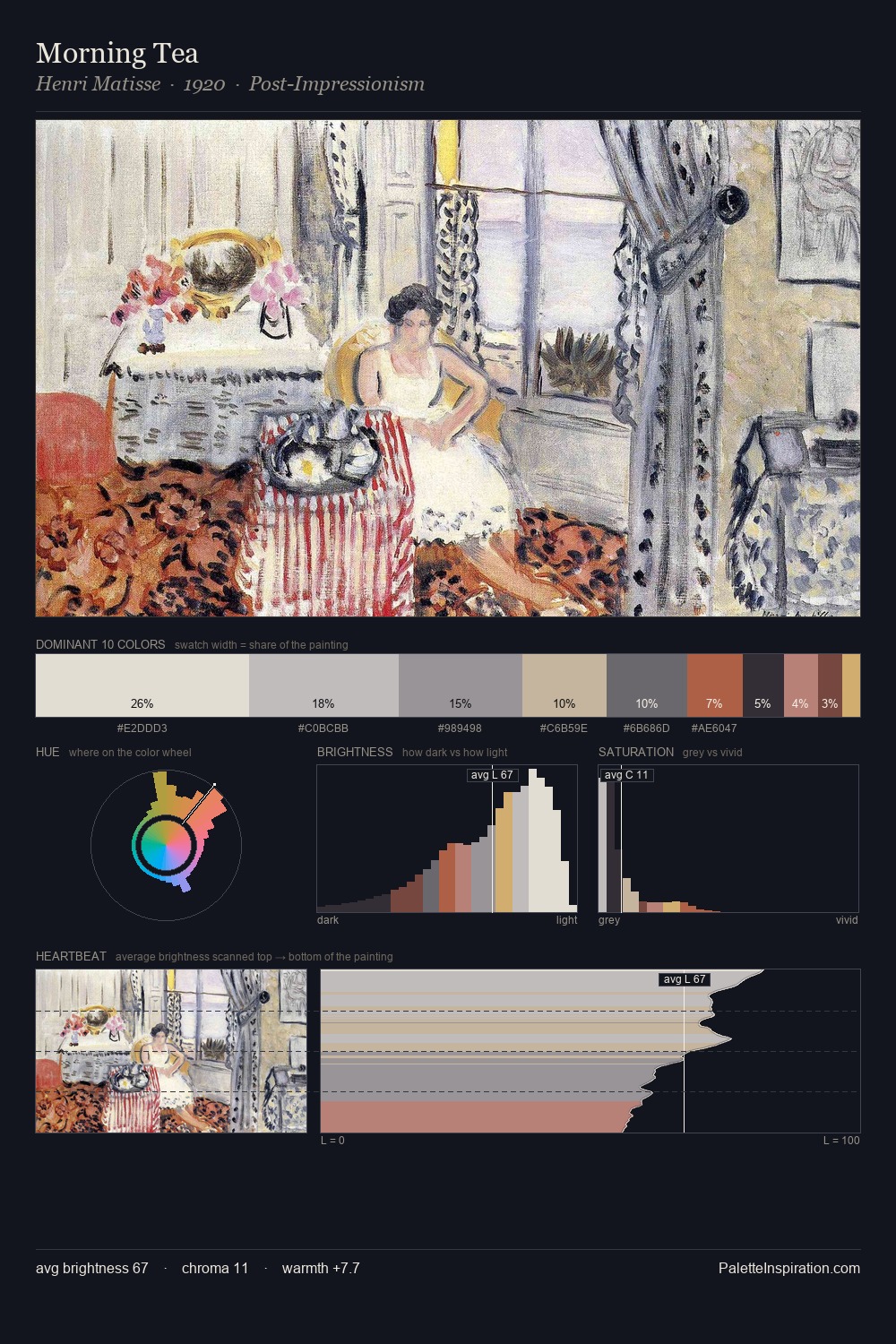
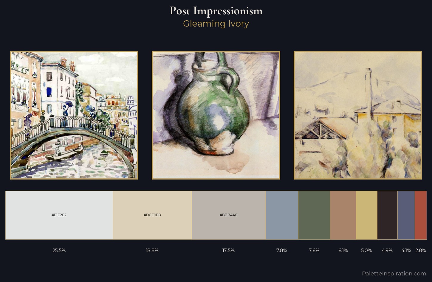
The high-key values of Post-Impressionism give it an effulgent, almost bleached quality. A distinctly cool atmosphere runs through this palette: sky, water, and mist given colour form. Saturation is deliberately withheld - the beauty here lies in the near-monochromatic gradations rather than colour difference. 25.5% of the palette belongs to #E1E2E2, a concentration that makes it the unmistakable visual centre. At 6.1%, #AA836B carries the palette's sharpest chromatic charge: an accent that earns its place precisely because it is withheld. 63 units of value range underpin the palette's structural clarity: the eye always knows where light falls. High luminosity and cool temperature suggest the plein-air condition: unfiltered daylight and open sky.
Example use cases
- hospitality branding
- boutique hotels
- restaurant identity
- home goods
- florist branding
I Love This!
Copy, export, or download for your project